The free online companion to The New Economics: A Manifesto
Third Release: March 3rd 2022
© Steve Keen
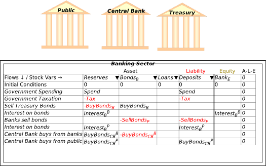
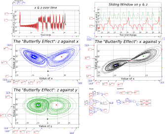
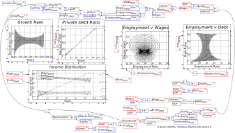
Table of Contents
1 Preface 5
2 Introduction: A Manual with Attitude 6
3 Installation 8
4 Understanding money: “Minsky for Dummies” 13
4.1 Fiat Money 15
4.2 Bond Sales 24
4.3 Credit Money 33
4.4 A significant extension: Nonfinancial Assets 34
4.4.1 Ab initio creation of banks 35
4.4.2 Financial Assets and Bubbles in Nonfinancial Asset valuation 37
5 The User Interface 41
5.1 Text Formatting 48
5.2 Multiple copies of variables and parameters 49
5.2.1 A Keen Rant: Rehabilitating Bill Phillips 49
5.3 Plots in Minsky 51
5.4 Building a “Phillips Curve” in Minsky 55
6 System Dynamics Basics 58
6.1 Predator-Prey model 60
6.2 Organizing a model 67
6.2.1 Bookmarks 68
6.2.2 Using intermediate variables 72
6.3 Documenting a model 72
6.3.1 The Equations, Parameters, Variables, Plots and Godleys Tabs 74
6.4 Exporting and importing a model 75
6.5 A Keen Rant: How not to handle time 76
6.6 Mathematics and Minsky 79
6.7 Integrals versus differentials 80
6.8 A first model, done two ways 80
7 Godley Tables 91
7.1 Creating a Godley Table 91
7.2 The simplest possible monetary model of a pure credit economy 92
7.3 Defining the flow elements of a Godley Table 95
7.4 Getting creative with Godley: Modelling the pandemic 107
7.5 A Keen Rant: Using Minsky to Revisit the Keen-Krugman Debate 111
7.6 A Mixed Godley Table-Flowchart model 125
8 Money 129
8.1 Modelling the Origins of Fiat Money in Minsky: pp. 33-39 of Manifesto 130
8.1.1 Check the equations 141
8.2 Modelling Modern Fiat Money in Minsky: pp. 39-50 of Manifesto 144
8.3 An integrated view of deficits and credit: pp. 59-65 of Manifesto 151
8.3.1 The actual event: Coolidge Surplus and private sector credit binge 161
8.3.2 Coolidge Surplus with no private sector borrowing 162
8.3.3 Coolidge Balanced Budget with the credit binge 162
8.3.4 Coolidge runs a Deficit with the credit binge 162
8.3.5 Coolidge runs a Deficit with no credit 163
8.3.6 Coolidge runs a Deficit to reproduce the 1920s boom without credit 163
8.3.7 Disentangling cause and effect 163
8.4 A Modern Debt Jubilee: pp. 65-68 of Manifesto 167
9 Complexity 180
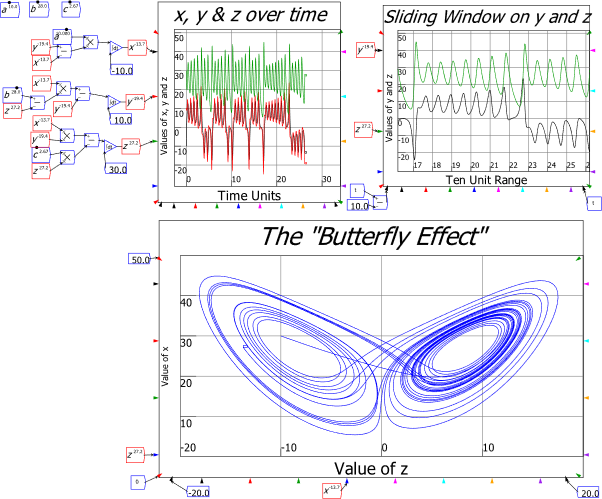
9.1 Lorenz model 180
9.2 A complex systems model of economic instability 183
9.3 Nonlinear Functions in Nonlinear Models 189
9.4 The switch function 191
10 Energy 193
10.1 Forget the “Cobb-Douglas Production Function” (an optional read) 196
10.2 Generalizing the Leontief Production Function 199
10.3 A Goodwin model with Energy 206
10.3.1 Derivation 210
10.4 A Goodwin model with matter and energy 214
10.5 Derivation: constant technology and population 217
10.6 Growth and pollution 221
11 Analyzing a Model 224
11.1 Of linearity and nonlinearity 226
11.2 The absolute basics of stability analysis 228
11.3 Analyzing a complex model 234
11.4 Analyzing the Keen model of Minsky’s Financial Instability Hypothesis 240
11.5 Why the Jacobian? 248
12 Model fitting notes from a non-statistician 251
13 Conclusion 254
14 Appendix: the credit dynamics of house prices 255
14.1 The argument 255
References 258
-
Preface
I closed The New Economics: A Manifesto (Keen 2021) with an observation on the following remark by John Blatt in his brilliant book Dynamic Economic Systems (Blatt 1983):
At present, the state of our dynamic economics is more akin to a crawl than to a walk, to say nothing of a run. Indeed, some may think that capitalism as a social system may disappear before its dynamics are understood by economists. (Blatt 1983, pp. 4–5, emphasis added)
I noted that, when I first read this in 1991, “I thought it was a good piece of hyperbole. I now regard it as a depressingly prescient prediction”, because:
Given the role that Neoclassical economists have played in humanity making only trivial responses to the challenge of climate change to date, the social system that gets us through that challenge—if we do get through it—will be far more a command than a market economy. (Keen 2021, p. 204)
There is therefore a bitter irony in me releasing a book on dynamic modelling in economics that I hope would meet Blatt’s standards, right at the time that I expect his bleak prediction to start coming true. The forces humanity has unleashed, by ignoring the damage its production systems have done to the biosphere, will transform that biosphere into something almost certainly inimical to the survival of those production systems, and certainly inimical to their management by the disaggregated market system that is the hallmark of capitalism. Instead, if human civilization survives, it will be because of a centralized, coordinated command system, whose only antecedent is the War Economy of WWII.
What then is the point of show how to do dynamic modelling of a monetary production economy properly, when I expect that system to fail sometime in the next two decades, and probably sooner than later?
I see two immediate reasons. One is that, having failed to use systems thinking as the ecological crisis unfolded, we are going to need the capacity to think in a systemic way to manage our attempts to cope with the crisis. The second is that, unless an alternative paradigm develops in economics, the old ways of thought—the Neoclassical ways—will keep disturbing our thinking, even as we attempt to cope with the myriad crises which that way of thinking caused.
Minsky is far from complete: there are many ways in which I would extend the program, had I the funding to support it. But as it stands, it is capable of doing far more sophisticated modelling than is the norm in economics, and of supporting a way of thinking about the economy and the planet’s ecology that could have prevented us experiencing this crisis in the first place. I hope that this book will enable you to use not just Minsky, but also the integrated, systems way of thinking about the economy that should always have been the foundation of economics.
This manual is also incomplete: it lacks a chapter on fitting models to data, but with The New Economics: A Manifesto now published in the USA as well as the UK, I need to have this manual available immediately for those who wish to learn how to model in Minsky.
I will periodically post updates of this book to https://www.patreon.com/ProfSteveKeen and http://www.profstevekeen.com/minsky/.
-
Introduction: A Manual with Attitude
Technically, this book is a free companion to The New Economics: A Manifesto (Keen 2021)—hereinafter referred to as Manifesto—with two main functions:
In practice, it has developed a 3rd function: it’s somewhere for me to rant about issues that I didn’t get to cover in Manifesto. This was partly for reasons of lack of space: the publisher’s guidelines limited the book to just 25,000 words. But it’s mainly because the audience for Manifesto was very broad, whereas the intended audience for this book is very narrow: I want to reach young economists who wish to construct realistic dynamic models of capitalism.
The main rants are:
-
That Bill Phillips (of the Phillips Curve) was a far greater economist—and person—than the mainstream economics caricature of the Phillips Curve has made him out to be;
-
That economists should stop modelling in “discrete time” or periods, and instead should model in continuous time, using differential equations; and
-
That “Loanable Funds”, Paul Krugman’s preferred model of banking, is utterly misleading about the role of banks, debt and money in macroeconomics.
There’d be a lot less text to read if I treated this as a standard “how to” manual for Minsky itself, which is what I would do if Minsky were just another, better way to do what you—an established or nascent economic modeler—are currently doing with different tools. But that’s not the case, even for Post Keynesian economists who are currently working in the Godley and Lavoie stock-flow consistent tradition. For those who’ve only been exposed to or developed Neoclassical models, whether that’s the old-fashioned IS-LM and AS-AD models, or the currently dominant practice of DSGE modelling, Minsky does not and indeed cannot do what you currently do—and I want to persuade you that this is a good thing.
Minsky is a system dynamics program. It works only in continuous time—not “periods”: see section 6.2 (starting on page 67) for the rant about why Minsky does not use “periods”—and it is designed to model systems that operate far-from-equilibrium, rather than systems that are assumed to return to their equilibrium values after an exogenous shock. Its unique feature, the “Godley Table”, enables the correct modelling of monetary dynamics, which are absent from mainstream economic models. Each of those facets of the program, and several others, reflect the needs of an approach to modelling that I believe is superior to the dominant methods in both Post Keynesian and Neoclassical economic modelling.
The key foundation here is its use of system dynamics. “System” means an interacting set of factors that cannot be understood in isolation from one another. This puts it in the category that Neoclassicals call “general” as opposed to “partial”. But for Neoclassicals, “general” goes hand in hand with “equilibrium”, whereas the second word in the phrase “system dynamics” transcends “equilibrium”. An equilibrium is a state that a system can be in, but, in all likelihood, the interacting forces in a system will be such that its equilibria are unstable, so that they therefore describe conditions that the system will never display.
System dynamics models in general demonstrate the behaviour of a system of equations that the modeler believes mimic the behavior of a real-world system which changes over time. There are many other system dynamics programs out there—Stella, IThink, Vensim, Modelica, AnyLogic, Matlab’s Simulink, Wolfram’s System Modeler, Insight Maker, to mention but a few. What distinguishes Minsky from the pack are its “Godley Tables”, which are designed to make it easy to model the dynamics of monetary systems. System dynamics itself can be challenging, and it involves many concepts that may be foreign to you when you first use such a program. But Godley Tables are easy: if you have used a spreadsheet, you can design a model of a monetary system using Godley Tables.
Minsky is also Open Source, which means that (a) it is free and (b) its source code is available for anyone for anyone to inspect and, if they wish, modify.
To use Minsky, you first have to download it from one of its online repositories. The main site is SourceForge (https://sourceforge.net/projects/minsky/), and it is also available for more technically savvy users at https://github.com/highperformancecoder/minsky. The SourceForge system recognizes the operating system of the computer you’re using to access SourceForge, and delivers the appropriate version: Windows builds for windows users, Mac builds for Mac users and source code tarballs for anyone else. For most popular Linux distros, a prebuilt packaged Minsky is available from the OpenSUSE Build Service (OBS):
https://software.opensuse.org//download.html?project=home%3Ahpcoder1&package=Minsky
In this manual I exclusively use the Windows version of Minsky, which, at the time of publication of this book (31st December 2021), is version 2.35. This version has a vast number of improvements over the previous release, thanks to a £200,000 grant from the Friends Provident Foundation of the UK. The next major release—expected sometime in January 2022—will implement Minsky’s user interface in Javascript, rather than its current GUI of Tcl/Tk.
Pre-release versions of Minsky are made available as “betas”, to enable users to test extensions to the program out before a final release. User feedback is an essential part of the software development process, and we’d be delighted to have you help us out by testing the new versions, reporting bugs, suggesting improvements to features, etc. If you’d like to assist us in this work, please download MinskyBeta from https://sourceforge.net/projects/minsky/files/beta%20builds/, and sign up to the beta-testers program at https://sourceforge.net/p/minsky/mailman/. Both release and beta versions of Minsky can be installed at the same time.
-
Installation
To install Minsky on a Windows PC, double click on the MSI (“MicroSoft Installer”) file that you have downloaded from SourceForge. This will bring up the dialog box shown in Figure 1.
Figure 1: Installer dialog box for Minsky

Click on “Next” and you will see the license agreement dialog box:
Figure 2
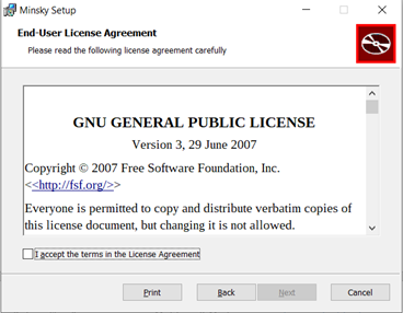
Click on the “I accept the terms in the License Agreement” checkbox (this is a standard Open-Source license, involving no user fees) and the Next button will become available. Click on it, and the install destination dialog box appears.
Figure 3
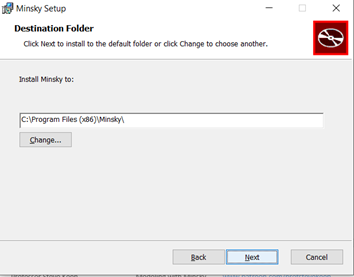
Figure 4

Click on Install, and after a short delay, you screen should go blank, except for the form shown in Figure 5. Click on “Yes”, and the installation will commence.
Figure 5

When it finishes, you have one more dialog box to contend with—see Figure 6.
Figure 6

You are now ready to use Minsky. Press the Windows key on your keyboard to bring up the main Windows menu (or the equivalent on a Mac or Linux box), choose Minsky, and you’re ready to delve into the world of system dynamics and monetary modelling.
I urge you to not just read this book, but also to build the models in it yourself as you read it. Have this book open, physically or on screen, with Minsky on your computer, and create the models as you read. Ideally, you would be doing this in a workshop with a tutor guiding the process—something I used to do with my students at Kingston University. Especially now in the age of Covid, this isn’t possible—so it’s up to you to follow the instructions in this book, and then replicate them in your own Minsky models on your computer. You will doubtless make mistakes. But you will learn from mistakes and ultimately learn how to use Minsky to learn economics, and to create models of your own, for your own purposes. This can range from just the fun of being able to simulate chaotic systems—see Figure 7—to building a robust, large-scale model of a national economy.
Figure 7: The Lorenz model of turbulent flow in Minsky
You will also almost certainly encounter bugs, ranging from minor annoyances—such as, at present, text boxes for plots running outside the plot boundaries—to fatal crashes, where the program hangs and suddenly you find yourself staring at the desktop. There will, hopefully, be very few of the latter—the funding that we received from Friends Provident Foundation in 2018 has allowed us to dramatically improve the program’s stability, as well as to add numerous features. But they will happen nonetheless: bugs are a given in any computer software.
If you find a bug, please report it to the beta-testers list, which you can find at https://sourceforge.net/p/minsky/mailman/. The user groups that exist there are:
-
minsky-betatesters:
Subscribe |
Archive |
Search — A list for people who’d like to test beta versions of
Minsky
-
-
If you plan on being an active user of Minsky, please sign up to at least minsky-users and minsky-betatesters. In the former you can get feedback and advice from other users; in the latter, you can report bugs (or feature requests) that will enable us to improve Minsky over time.
Finally, consider signing up to Minsky‘s page on Patreon, https://www.patreon.com/HPCODER. The minimum signup amount is US$1 per month (plus sales or value added taxes, which vary from country to country). Ideally, this would provide sufficient funds to enable Minsky‘s programmer Dr Russell Standish to work full-time maintaining and extending Minsky. At present (October 2021), it raises a small amount—$520 a month from 86 patrons. This at least covers Russell’s costs in producing compiled versions, which take about 4 hours to generate, but it’s a long way short of enabling him to work full-time on Minsky itself. I would prefer to see twenty times the revenue coming in, and forty times the number of Patrons. If you like using Minsky, and if this manual teaches you anything at all, please help make that wish come true.
-
Understanding money: “Minsky for Dummies”
This is a very technical book, for the simple reason that it explains how to build economic models using a mathematical program. But a lot can be done with Minsky without doing mathematical modelling, because many of the issues in dispute these days in economic theory and policy come down to “How are you going to pay for it?”
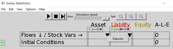
To really answer that question, you have to understand the dynamics of our monetary system—and that means you have to understand double-entry bookkeeping, because that’s the way banks and governments create money, and keep track of financial transactions. Minsky was built to do that, with its unique feature of “Godley Tables”. You can use the Godley Tables alone to answer many of the questions that dominate political debate today:
And so on. In this chapter I’ll show how to pose and answer questions like these using Minsky, without having to write a single equation. Instead, I’ll just use the unique feature of Minsky, its “Godley Table” (see Figure 8).
Figure 8: The “Godley Table” icon

You can place a Godley Table on Minsky‘s design canvas in two ways:
-
By choosing “Insert/Godley Table” from the Insert menu; or
-
By clicking once on the Godley Table icon on the toolbar (see Figure 9), and then clicking again to place the icon somewhere on the canvas.
-
You may be used to using “click and drag” to insert objects in other programs, like Paint, This doesn’t work in Minsky—instead you click once to attach an object to the cursor, and then a second time to place the object somewhere on the canvas.
-
At some stage in the future we might support both “click, then click and place” and “click and drag”, but for the moment, we only support the first method.
Figure 9: Minsky’s Toolbar, with the Godley Table icon the 3rd from the right

Once you’ve inserted the Table on the canvas somewhere, it will look like Figure 10.
Figure 10: Minsky’s canvas with a single Godley Table
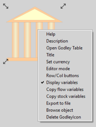
To use the Godley Table, either double-click on the icon, or click on your right-mouse-button and choose “Open Godley Table” from the menu—see Figure 11.
Figure 11: The right-click (context-sensitive) menu for a Godley Table
That will bring up a new window for editing the Godley Table—see Figure 12. This is a free-standing Windows/Mac/Linux window, so you can switch between it and the canvas using Windows commands and their Mac and Linux equivalents (Alt-Tab is the keyboard shortcut to move between windows in Windows). You can have multiple Godley Table windows open at once, as well as the window for the main canvas.
Figure 12: A Godley Table open for editing in its own window
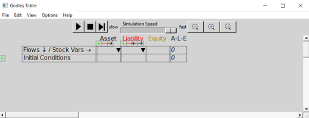
The top row of the Table has tools for running a model, and for zooming in and out on the Table itself. The most useful tools at this stage are the magnifying glasses, which let you zoom out, zoom in, or set the size of the Table to its default. Figure 13 shows the same blank table as in Figure 12 after six clicks on the zoom in tool.
Figure 13: A magnified view of a Godley Table
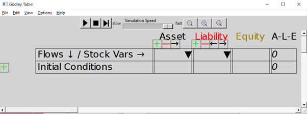
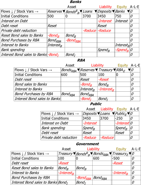
The next row shows that all accounts in a Godley Table have to be classified either as an Asset (a claim that you have on someone else), a Liability (a claim that someone else has on you), or Equity (the gap between Assets and Liabilities).
The Table starts with room for just one Asset, one Liability, and one Equity column, but of course a significant model is going to have more than one of each. That’s what the symbols on the next row are for: the
adds a new column, the
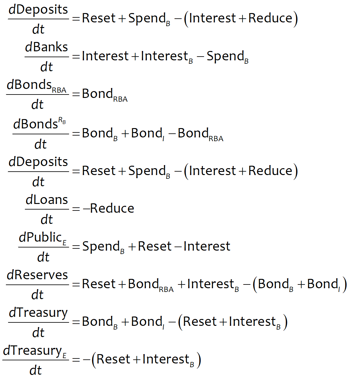
deletes an existing column, and the symbols move a column to the left or right. Now let’s build a simple model that, without the need for any equations, will show how a modern monetary system works.
-
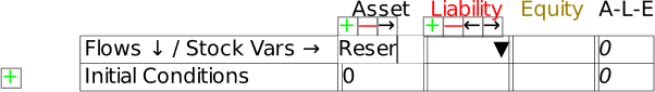
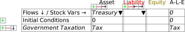
Fiat Money
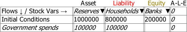
To use the table, you first have to name the Assets, Liabilities and Equity columns on the table. That’s where the next row—which starts with “Flows ¯¤ Stock Vars ®“—comes in. If you click in one of the cells on that row and start typing, you are providing a name for one of the stocks in the Table (ignore the upside-down triangle there for now—we’ll come to that soon). In Figure 14, I’ve clicked in the Asset cell and I’ve started to type the word “Reserves”. Once I press the Enter key (or click outside the cell using the mouse), I’ve defined the stock “Reserves”.
Figure 14: Naming a stock in a Godley Table
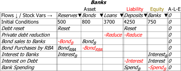
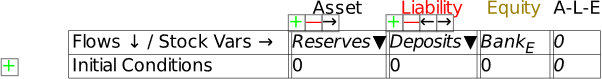
Click in the cell below Liability and enter “Deposits” (without the inverted commas of course!), and in the cell below Equity, type Bank_E. The underscore tells Minsky to subscript the next character, so when you press Enter, or click outside the cell, the program will display BankE in that cell (the subscript stands for “Equity”). When you’re finished, you’ll have the basic elements of the simplest possible model of banking—in fact, one that’s too simple, because it doesn’t include the key thing that defines a bank, its capacity to make loans.
Figure 15: A basic Godley Table with 3 stocks: Reserves, Deposits and BankE
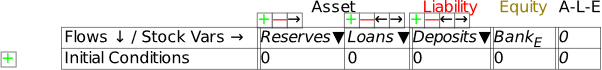
We’ll add that by using the
key below the Asset heading. That creates an additional blank cell next to Reserves. If you type “Loans” into this cell, you have Figure 16: the starting point for understanding our monetary system: a banking sector with the Assets of Reserves and Loans, the Liability of Deposits, and the difference between them, the banking sector’s equity BankE—which must be positive, since one rule of banking is that a bank must have more Assets than Liabilities.
Figure 16: The minimum stocks to show the credit and fiat money roles of banks
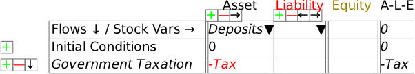
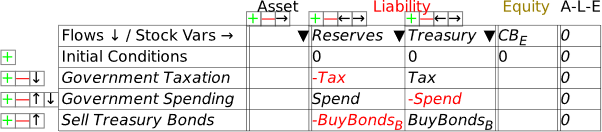
If we were going to build a simulation model, then the next row would be critical: this shows the initial amounts in the various accounts. But since this chapter is about using Minsky without building a simulation, we’ll skip over it and instead click on the key at the beginning of the row. This adds a row for recording a financial transaction. Let’s start with government taxation, using the name “Tax” as a placeholder for the flow of money out of Deposits. If you type “” into the cell beneath Deposits, you’ve recorded what taxation does—it takes money out of the bank accounts of the public. At this stage, Minsky lets you know that your entry isn’t complete, because you have only one entry for Tax, when every financial operation requires two entries per row.
Note: One limitation of Minsky at present is that entries in the rows must be variables—words like “Tax”, “Spend”, etc.—rather than numbers like “900”, “1100”, etc. This is because Minsky was developed to build dynamic equation, and the entries in those equations are variables rather than constants.
Figure 17: Taxation entered as a deduction from Deposits
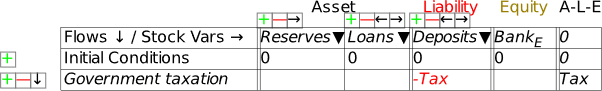
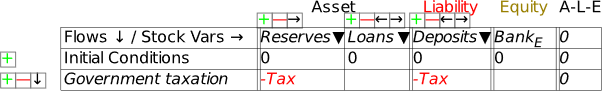
To complete this row, you need to add another entry so that the “Fundamental Law of Accounting”—that —is enforced. It should be obvious that the correct thing to do is to add another “” to the Reserves column as well: it doesn’t make sense to do insert in the Loans column (which we’ll model in the next section), or to Bank Equity. Therefore, taxation reduces not only Deposits, but also Reserves (Figure 18).
Figure 18: A fully entered double-entry bookkeeping record of taxation
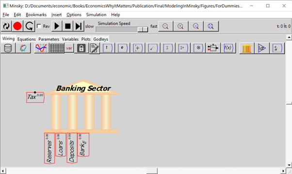
Once you’ve made these entries in the Godley Table, your canvas should look like Figure 19 (where I’ve also used the “Title” menu item on the right-click menu to name this table “Banking Sector”). The stocks you’ve defined in the table are shown at the bottom of the icon; the single flow that you’ve defined is shown on the left-hand side.
Figure 19: A Minsky model with the Godley Table shown in Figure 18.
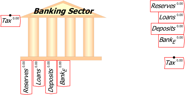
If you were defining an actual model right now, the next stage of the process would be place the mouse over the icon, and use the right-click menu to “Copy stock variables” and “Copy flow variables”. Figure 20 shows the model with both operations done, and the stock variables (Reserves, Loans, Deposits and BankE) placed on the canvas. Then you’d go about defining the flows using the stocks, additional parameters and variables, etc. But we’ll leave that for now and just continue using Minsky’s capability to model the interlocking financial assets and liabilities that define a monetary economy.
To make the canvas less cluttered, I’m going to use the right-click menu to turn off display of these variables: the option “Display variables” is ticked by default, and a click on that turns it off so that all you see is the bank icon itself.
Figure 20: The stock and flow variables copied and placed on the canvas
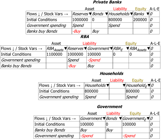
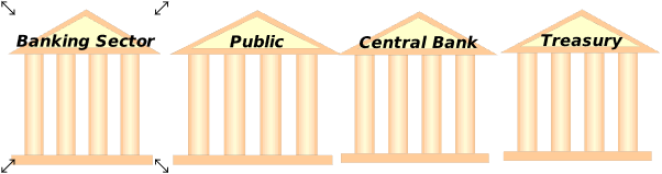
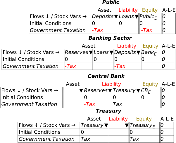
At this stage, we’re simply seeing the financial system from the point of view of the banking sector. A complete model involves seeing it from all perspectives, including here the public (where Deposits, which are a Liability of the banking sector, are an Asset of the public), the Central Bank (since Reserves, which are an Asset of the banking sector, are a Liability of the Central Bank), and the Treasury (which is the originator of the taxation operation).
To do this, we need to add an additional three Godley Tables—one each for the Public, the Central Bank, and the Treasury. In Figure 21, I’ve named them all appropriately using the Title option on the right-mouse menu (you can also name a table when working on the Godley Table itself: “Title” is an option on the Edit menu, and the right-click menu also has a Title option).
Figure 21: The model with 3 more blank Godley Tables
 To populate these tables, we make use of one feature I haven’t yet explained, the upside-down triangle or wedge , in the cells for naming stocks. If you click on one of these wedges, Minsky returns a list of all the Liabilities (or Assets) that haven’t already been recorded as an Asset (or Liability) for some other entity in the model.
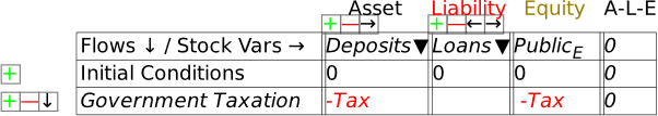
Open up the Godley Table for the Public and click on the wedge in the Asset cell, and one entry will appear in a drop-down menu: Deposits—see Figure 22.
Figure 22: Using the Assets and Liabilities Wedge
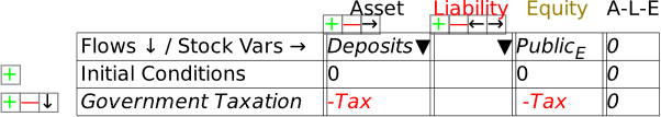
Click on Deposits to choose it, and Minsky will show Deposits as an Asset of the Public, and auto-populate the column with all the operations that have been entered on the Banking sector table that affect Deposits—so far, this is only the negative entry for taxation. This gives us Figure 23. Notice that the A-L-E column has the entry in it, showing that the matching double-entry for this table hasn’t yet been entered.
Figure 23: Deposits as an Asset for the Public
The only sensible option here is that taxation reduces the equity position of the non-bank public sector. Name the Equity cell PublicE, add the entry “” on the Government Taxation row, and this operation is now shown from the public’s perspective: taxation takes money out of the public’s bank accounts, and reduces its equity. This is a fundamental proposition in MMT—Modern Monetary Theory—and it’s obviously true, when you see the world through the double-entry bookkeeping eyes of Minsky.
Figure 24: Taxation shown from the public’s point of view
Next, let’s add the public’s liability in this model—loans from the banking sector. If you click on the wedge under Liabilities, the drop-down menu will reveal two choices: Loans and Reserves. Click on Loans, and you’ll get Figure 25. We’ll add flows to the Loans column in the next section—in this one we’re focusing on government operations.
Figure 25: Auto-populating the Public’s Liabilities
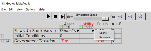
Figure 26: The Public’s Godley Table completed
That’s taken care of Deposits, which is shown as a Liability of the Banking Sector and an Asset of the Public. Now we must do the same for Reserves. These, as is well known, are a Liability of the Central Bank: in effect, Reserves are the deposit accounts of private banks at the Central Bank. Open the Central Bank’s Godley Table, click on the wedge in the Liabilities cell, and choose “Reserves”. That generates Figure 27.
Figure 27: The Central Bank Godley Table with Reserves entered
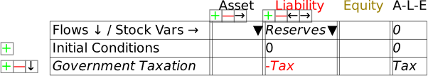
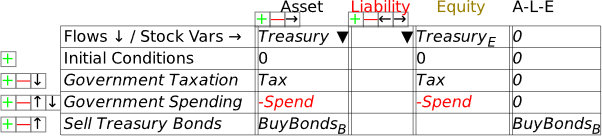
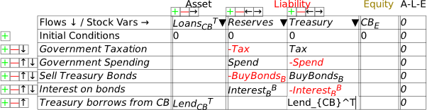
As with the earlier exercise with the Public’s table, we have just a single entry for Tax: there’s nowhere obvious to record it a second time, since it’s not the Central Bank that does the taxing, but the Treasury. Therefore, the sensible thing to do here is to add an additional Liability for the Central Bank, the deposit account of the Treasury—which I simply call Treasury (see Figure 28). I’ve also named the Equity column for the Central Bank CBE.
Figure 28: Treasury account added to Central Bank Godley Table
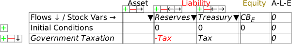
This now gives us a Liability for the Central Bank—the Treasury’s account—which is an Asset for the final entity in this model, the Treasury itself. Bring up the Treasury’s Godley Table, click on the wedge for Assets, choose “Treasury”, and you’ll have Figure 29.
Figure 29: The Treasury’s Godley Table on initial entry of its Asset, the Treasury account at the Central Bank
To complete the model at this stage, you need to enter the balancing entry for Tax—and the obvious place for it to go is in the Equity column for Treasury: taxation increases the Equity of the Treasury (Figure 30). This is the obverse side of the MMT point that “the Public sector’s surplus is the Government sector’s deficit”: taxation subtracts from the Equity of the public and increases the equity of the government.
Figure 30: Treasury Equity shown
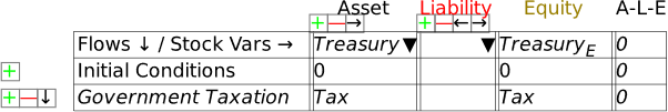
This is also the point at which a genuine Fiat money system differs from a commodity-backed system—a “Gold Standard”, for example—or from one like the Eurozone, where national treasuries cannot produce the currency they spend. In such systems, Tax would add to the Treasury’s stock of Gold (or Euros), while government spending—which I’ll introduce shortly—would run that stock down.
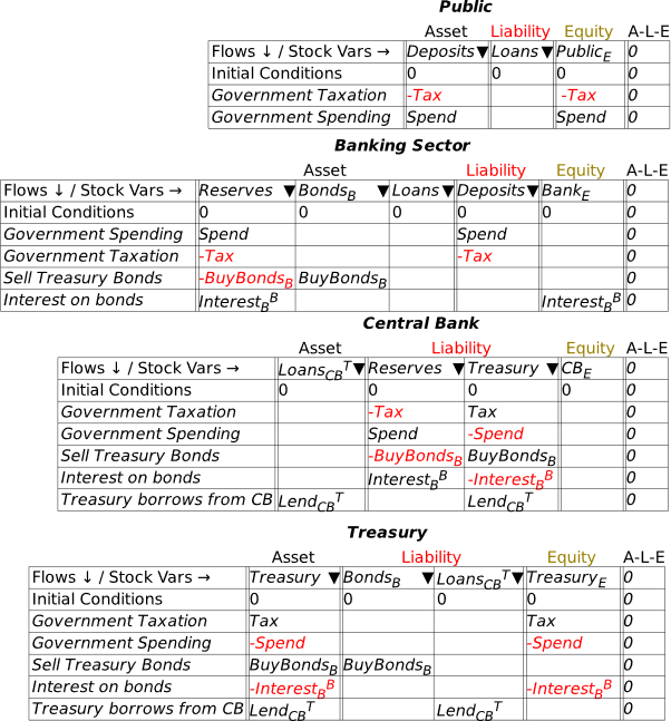
We now have a complete model of the impact of taxation in a Fiat money system, in that every Asset is shown as another entity’s Liability, and all flows are recorded four times: twice in each table they appear in, and once each as affecting an Asset and a Liability. Via double-entry bookkeeping, this gives us eight entries for the one operation.
To see this whole system, click on the Tab labelled “Godleys”, and you’ll see all the Godley Tables at once. They’ll be a jumble when you first click on the tab, but you can easily move them around to produce an arrangement like Figure 31.
Figure 31: The complete basic model, with all four Godley Tables
We can now add government spending to the model, and it’s effectively the opposite of Tax: government spending increases the public’s equity and reduces the government’s. You can start anywhere you like in the system—from the Public’s Godley Table, or the Treasury’s, Central Bank or the Banking Sector—and Minsky will point out where the matching entries are needed. I started with the Banking Sector’s view in Figure 32:
Figure 32: Adding government spending into the model
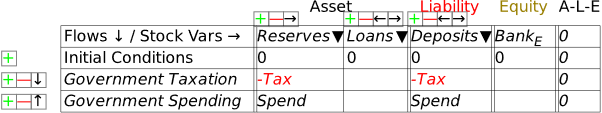
A minute or so later, I had the picture shown in Figure 33.
Figure 33: The complete model with government spending as well as taxation
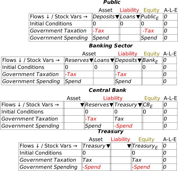
This lets us see the key points of Modern Monetary Theory—not because I’ve been explaining the theory itself, but because the “theory” is fundamentally on an accurate portrayal of the accounting. A government deficit creates net financial assets for the public, and simultaneously creates negative net financial assets for the government: the government deficit is the private sector surplus.
To complete the picture of a modern fiat money system, we need to include bond sales by the Treasury to the Banking Sector in the initial auction, sales by the Banking Sector to non-banks (which can include other financial institutions, such as Pension and Hedge Funds), and purchases by the Central Bank of bonds from both the Banking Sector and the Public.
-
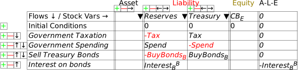
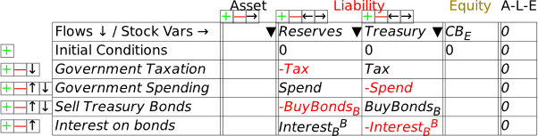
Bond Sales
In the model to date, if the Treasury spends more than it taxes, the Treasury’s account at the Central Bank will go into overdraft—notice in Figure 33 that the only flow entries in the Treasury’s account at the Central Bank are and . So if is greater than , then over time, this account will turn negative.
For an ordinary customer of an ordinary bank, that’s a serious problem. A negative deposit account might not be approved in the first place—so that any intended transaction which sends an ordinary depositor’s account into negative territory would be rejected for insufficient funds. If an overdraft is approved by the bank, it attracts a punitive interest rate, normally higher than the interest rate on loans themselves. If the customer breaches the terms of the bank’s overdraft—by not making an interest payment, or breaching any of the many caveats that a bank can attach to an overdraft agreement—it can lead to the bank initiating bankruptcy proceedings against its customer.
But what is the situation for the Treasury and the Central Bank? In a country which issues its own currency, the Treasury is the effective owner of the Central Bank. Though specific laws can change the situation, technically, the Central Bank is obliged to let the Treasury do what it wants, even if that means a negative balance on the Treasury’s account at the Central Bank. It would be quite possible, in an accounting sense, for the government to simply operate with an overdraft account at the Central Bank: it doesn’t have to sell bonds at all.
However, most countries have passed laws forbidding the Treasury from operating in overdraft mode, except in exceptional circumstances like the pandemic—where, for example, the Bank of England initially allowed Treasury to operate its overdraft account, rather than having to sell bonds to avoid going into overdraft. Some countries also require the Central Bank to charge the Treasury interest on either overdrafts or loans. But even in countries which do that, the interest is returned to the Treasury as part of the operating profits of the Central Bank. This is why there is a “magic money tree”: a currency-issuing country can create money by running a deficit, and it does not have to borrow from either private banks or the public to finance that deficit.
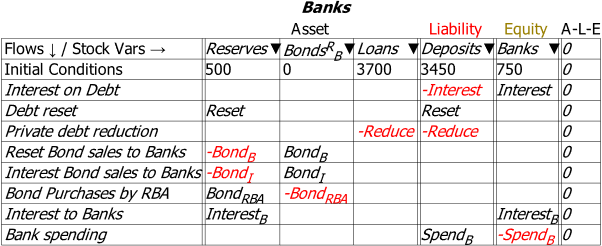
What do bond sales in fact do? Let’s add them to the model and find out. This requires one more Asset column for the Banking Sector, which is the sector that initially purchases Treasury Bonds. I’ve named the Asset for Banks BondsB, to indicate that these are Bonds owned by the banks—rather than, say, the Central Bank or the Public—and labelled the transaction BuyBondsB in Figure 34.
Figure 34: Banks buy Bonds from the Treasury
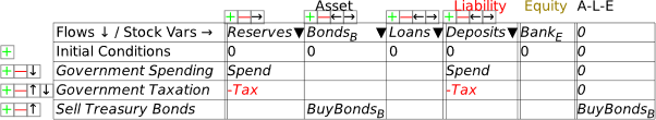
That’s showing the increase in the Banking Sector’s Assets from buying the bonds, but how do they finance the purchase? In other words, where is the second entry required by double-entry bookkeeping to show the purchase? The only viable option is that the funds used to purchase the bonds come from Reserves—and these Reserves were created by the deficit: the excess of Spend over Tax. So, as well as creating money for the private sector, the deficit creates excess Reserves, which the Banking Sector uses to buy the bonds. As long as the value of bonds sold be Treasury is equal to or less than the deficit, the Banking Sector has the Reserves needed to buy them: see Figure 35.
Figure 35: Bond purchase balanced by showing bonds are bought using Reserves created by the deficit
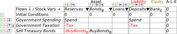
This completes the Banking Sector’s Godley Table, but it leaves the Central Bank’s incomplete—see Figure 36.
Figure 36: The Central Bank’s Godley Table after the Banking Sector’s Table has been completed
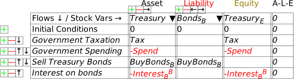
The obvious way to complete the Central Bank’s Table is that the proceeds from the sale of Bonds tops up the Treasury account: see Figure 37.
Figure 37: The Central Bank’s Table with the sale of Bonds fully recorded
This shows the real purpose of bond sales, from the Government’s point of view: they enable the Treasury’s account at the Central Bank to avoid going into overdraft. If the revenue bond sales (BuyBondsB here) equals , then there’s no change to the balance in the Treasury account from running a deficit.
What bonds certainly are not is borrowing money from the banks in the way that individuals do when they take out a mortgage. When you take out a mortgage, it’s because you haven’t got the money needed to do what you want to do—buy a house. If you don’t get the mortgage, you can’t afford to buy the house.
But the government has already created the money it needs to do whatever its proposed activities are by running the deficit itself. Secondly, the Reserves that are used to buy the bonds were created by the government running a deficit. If the deficit didn’t exist, then (at least initially—there’s a change coming when we consider interest payments on bonds) the banks wouldn’t have the funds needed to buy the bonds.
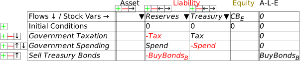
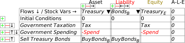
The final step in recording the impact of the bond sales is to add BondsB as a Liability of the Treasury. Open the Treasury’s Godley Table and it will look like Figure 38. Click on the wedge below Liability, and the drop down will show BondsB as an Asset (for the Banking Sector) that hasn’t yet been recorded as some other entity’s Liability.
Figure 38: Treasury Godley Table before BondsB is recorded as a liability
Select BondsB and Minsky automatically balances the table: see Figure 39.
Figure 39
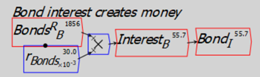
To complete modeling bond sales to banks, we need to include the payment of interest on those bonds. In Figure 40, I’ve labelled this InterestBB—the subscript is there to indicate that it’s interest on bonds, the superscript to indicate that it’s paid to the banks, to distinguish it from interest paid to the public when, at a later stage, banks sell some of these bonds to the public. A superscript is entered into Minsky using the ^ character, which is normally the Shifted character on the 6-key on your keyboard (So the string you type into the cell is Interest_B^B).
Figure 40: Payment of interest to banks on Treasury Bonds
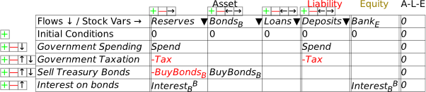
I’ve already made the obvious deduction that this interest payment increases the equity of the banking system—which is one obvious reason that, when the Treasury offers to sell bonds to the banking sector, the offer is always taken up. To do otherwise is to turn down an offer to turn a non-tradeable, non-income-earning asset—Reserves—into a tradeable, income-earning asset—Bonds. To complete the model at this stage, we now need to add this flow to the Central Bank’s and the Treasury’s Godley Tables. When you open up the Central Bank’s Godley Table, it will look like Figure 41: the addition to Reserves is already shown, but the second balancing entry is still needed.
Figure 41
The obvious thing is that the interest payments come out of the Treasury’s account. Make the entry in the Treasury column, and you have Figure 42.
Figure 42
This change in turn cascades into the Treasury’s Godley Table now—see Figure 43.
Figure 43
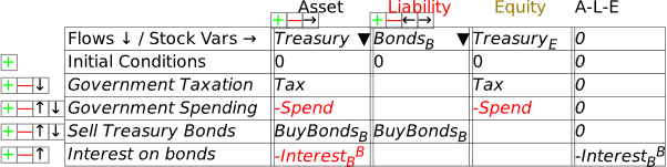
The obvious closure of this entry is that paying interest reduces the Treasury’s equity—and by precisely as much as it increases the equity of the banking sector. So just as a deficit creates net financial assets for the non-bank public (by crediting their deposit accounts with more money from government spending than is removed by taxation), the interest payments create net financial assets for the banking sector—see Figure 44.
Figure 44
So how does the Treasury pay the interest? In practice, there could be many methods. What I’ll model here is the most sensible for a currency-issuing government: it borrows from the Central Bank.
In practice, this is forbidden in most countries, by legislation that prevents the Treasury borrowing directly from the Central Bank. However, the same outcome can be achieved in a two-step process: the Treasury sells bonds to the private banks to the value of the interest on outstanding bonds, and the Central Bank then purchases these bonds from the private banks on the secondary market.
If you’ve followed me this far, you should be familiar with the steps needed to show this: we add an Asset to the Central Bank’s Godley Table—LoansCBT (which uses another of Minsky‘s formatting tricks: encase the characters CB in a pair of curly brackets——and Minsky subscripts the two characters together), and use to show the actual loans. Figure 45 shows the entries on the Central Bank’s table (with the actual entry of the text string into the Treasury column, before Minsky formats it).
Figure 45
If the loan from the Central Bank to Treasury equals the interest payments on the bonds, then the Treasury’s account at the Central Bank can avoid going into overdraft. It doesn’t change the aggregate picture: the Treasury’s negative equity from the deficit creates positive equity for the non-bank public, while interest payments on bonds creates negative equity for the Treasury and identical positive equity for the banking sector.
Even without attempting to build a mathematical model, this exercise in laying out the structure of the financial system eradicates a lot of popular myths in mainstream economic thinking:
-
A deficit doesn’t take money from the public—in the sense of the government borrowing from the public to finance its deficit—but actually puts money into the hands of the public;
-
The deficit creates Reserves for the banking sector, and those Reserves are what banks later use to buy government bonds;
-
The deficit creates net equity for the non-bank public, while interest on government bonds creates net equity for the banking sector.
This symmetry—that a deficit for the government means a surplus of precisely the same magnitude for the non-government sectors—is apparent in Figure 46. The sum of the non-bank Public’s and the banking sector’s net equity position is ; this is the opposite of the Government’s net equity .
Figure 46: Full system with bond sales to banks
The final two steps to show to cover the fundamentals of fiat money are sales of bonds by the banking sector to the public, and purchases of bonds by the Central Bank from both banks and the public. Figure 47 shows the full system—which, if you want to learn how to use Minsky, you should try to complete for yourself. It needs:
-
Two additional stock variables—BondsCB for bonds owned by the Central Bank, and BondsP for bonds owned by the public;
-
The relevant flows for these stocks: sales of bonds by the Banking Sector to the Public, SellBondsP; purchases of bonds by the Central Bank from the Banking Sector, BuyBondsCBB; and purchases of bonds by the Central Bank from the Public, BuyBondsCBP.
As with the previous stages of this exercise, several insights can be gleaned from these Tables that contradict widespread beliefs about government money creation. One of these is even something that I used to believe—that money is only created to the extent that the Central Bank buys government bonds. But in fact, Central Bank purchases of Treasuries are irrelevant to money creation, and indirectly slightly reduce the amount of money created, because they reduce payments of interest to the banking sector and the non-bank public to whom banks have sold bonds they purchased in the primary bond auction (in practice, these bonds are normally purchased from banks by non-bank financial institutions).
Figure 47: Full MMT system with bond transactions between Treasury, Banks, Central Bank and the Public
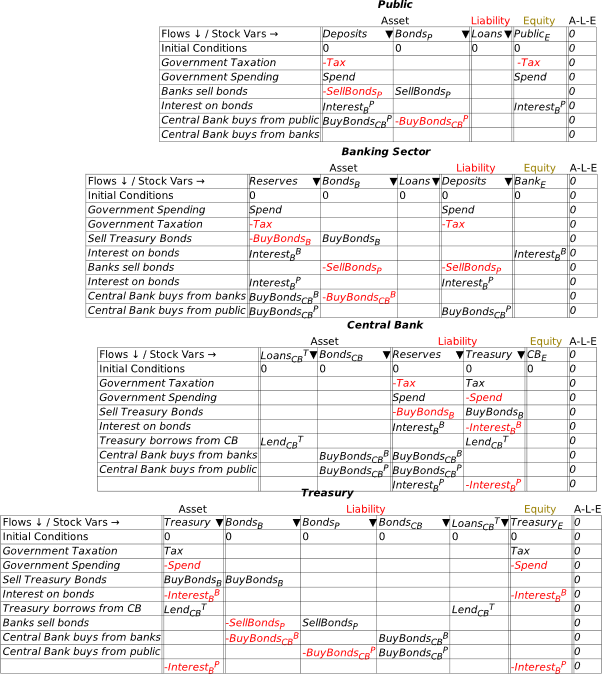
The reason why Central Bank bond purchases from the banking sector don’t affect the amount of money created by a deficit is apparent in the second table in Figure 47: the purchase reduces the monetary value of the bonds held by banks, and replaces them by an equivalent value of Reserves. The Banks would hope to make a trading profit out of this sale, but the sale itself simply swaps one Asset for the Banks (Bonds) with another Asset (Reserves). In practice, this reduces the process of the Treasury selling bonds to the banks in the first place: it replaces Bonds with Reserves. It is therefore irrelevant to money creation, because since the level of Assets remain constant, so too do Liabilities and Bank Equity.
This is an important general point that will recur frequently in this book, and when building models using Godley Tables: for money to be created, an operation must affect both the Asset and the Liability/Equity sides of the Banking Sector’s ledger. Central Bank bond purchases from the Banking Sector only affect the Asset side, and therefore are irrelevant to money creation. The only effect they do have is to reduce money creation slightly, because the Treasury will no longer pay interest to the Banks on these bonds.
On the other hand, Central Bank purchases of Bonds from the public do create money: the sale of the Bonds credits both the public’s deposit accounts at banks, and the reserve accounts of the banks.
Conversely, the sale of bonds by the Banking Sector to the non-bank Public destroys money: the Public’s deposit accounts fall and their holdings of Bonds rise. But even in this case, the money being destroyed was initially created by the deficit itself: only if all the bonds initially purchased by the banks from the Treasury at the bond auction were sold to the public would the actual creation of money by the deficit fall to zero.
That covers government money creation. Now let’s turn to private money creation by the Banking Sector.
-
Credit Money
I’m now assuming that you have some fluency with Godley Tables—you have been following my explanation by reproducing these tables in Minsky yourself, haven’t you?—and so I’ll just cut to the chase, and enter the three necessary operations for private money creation in one go: new loans by banks, paying interest on loans, and loan repayment by bank customers. Use the words “Lend”, “Interest”, and “Repay” for these flows, and make the entries so that the checksum column always sums to zero (Figure 48).
Figure 48: The basic operations of fiat and credit money from the Banking Sector’s point of view
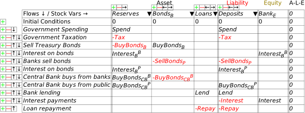
As an aside, if you have a background in accounting, you may prefer to see Minsky‘s operations using DR and CR rather than plus and minus entries. You can engage that from the Options menu on the Table: choose “DR/CR Style”. Then the model in Figure 48 will look like Figure 49 (I prefer the plus/minus approach, so that’s what I’ll stick with from now on).
Figure 49:Figure 48 in DR/DR style
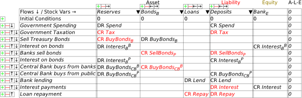
Following the general principle noted just above, that to create money, an operation must add to both the Asset and Liability/Equity sides of the banking sector’s balance sheet, it should be obvious that lending creates money while repayment destroys it. This simple fact is ignored by the mainstream model of lending, known as Loanable Funds, which treats banks as “financial intermediaries” that take in deposits from one set of customers (“Patient people”, to use Paul Krugman’s non-pejorative term) and then lends them out to other people (“Impatient people” in Krugman’s lexicon).
I’ll spend a lot of time on the macroeconomic impacts of private money creation in Chapter 8. For now, without writing a single equation, we’ve come up with a picture of the monetary aspects of a mixed fiat-credit money system that contradict the conventional wisdoms promulgated by economics textbooks and mouthed by politicians.
If you’ve followed the argument here to date—especially if you’ve done so by reproducing the model in Minsky for yourself—then you’re well on the way to understanding the monetary dynamics of capitalism. I’ll repeat a lot of the points here in subsequent chapters, but with the addition of defining a mathematical model, rather than stopping at laying out the balance sheets, as I do here.
-
A significant extension: Nonfinancial Assets
One weakness of Minsky was that it handled only assets which are also liabilities: something like a deposit account, for example, is an asset for the depositor, and a liability for the bank. But there are also assets—such as a house, gold, the market value shares (a share is only a liability for the issuing company up to its issue price), cryptocurrencies, etc.—which are assets of the holder, but a liability of no-one. These go by the general moniker of “non-financial assets”.
This term is a bit misleading, since, in most people’s eyes, things like houses and precious metals are very much financial assets. However, they are not “at call”: your house might be “worth” $2 million in the current market, but to realize that valuation you’re going to have to sell it, which could take 6-18 weeks even in a buoyant housing market.
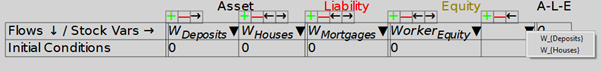
We have just added a means to handle such assets: you can define an Asset for a particular Godley Table as an Equity for that same Godley Table, once you have enabled multiple Equity columns (this is an option on the Options/Preferences main menu, and on the menu for Godley Tables). Once you have recorded some assets for a given entity on its Godley Table, the wedge dropdown on the Equity column will show assets on that same Godley Table that have not yet been allocated to another Table’s Liabilities.
Research alert: since we’ve just added this feature, and we are still fine-tuning it, I haven’t personally explored its implications yet. I believe, but I don’t yet know, that it will enable the modelling of (a) the “ab initio” creation of a monetary system, complete with the initial formation of banks, and (b) asset price booms and busts, and how they are generated and fuelled by the banking sector. Since these are very important topics that have been discussed but, to my knowledge, have not been modelled, these could both be excellent topics for a PhD.
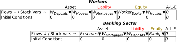
Figure 50 shows using this feature: the Asset WHouses is obviously an Asset that has no balancing Liability, while WDeposits is obviously also a Liability of the banking sector.
Figure 50: Dropdown Wedge on Equity column now shows unallocated Assets on the same Godley Table
Notice that WDeposits turns up twice on the Workers Godley Table in Figure 51.
Figure 51: Non-financial assets in a simple model
This feature should support modelling everything from the ab initio creation of banks in a fiat-credit money system (since banks were often established on the basis of ownership of land by their founders) to asset bubbles and their denouement in crashes—though to model all this will require a lot of additional work. But the basic structure needed to do this now exists in Minsky. I’ll sketch the basics of both topics and leave taking this further as an exercise for the reader.
-
Ab initio creation of banks
Modern Monetary Theory describes the functioning of an existing monetary system—consisting of a government with a Treasury, a Central Bank, and its own currency, a private banking system, and the non-bank public with deposit accounts at the private banks. One common and correct defense of the MMT proposition that a government spends first and taxes later is that, when a currency is first created, it must be spent into circulation before it can be taxed back. This pre-supposes the existence of banks at the time, but how can they come into being with the key prerequisite of having Assets that exceed their Liabilities?
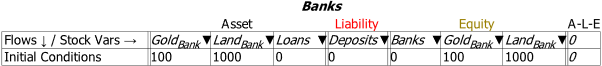
Nonfinancial assets provide the answer: banks are formed by wealthy people pledging various assets of theirs to the bank, so that it starts with positive nonfinancial assets. You can imagine something like the situation shown in Figure 52: a bank’s founders form a company and pledge various assets to the bank, so that it starts with an amount of nonfinancial assets—showing gold and land here—that give it net positive equity.
Of course, this involves someone valuing these assets (which are denominated in weight and area respectively) in terms of the new currency. That “someone” will be the ruler or political system establishing the currency—King Offa in the example I give in Manifesto—so there is, as usual, a foundational role for the government in establishing a financial system in a fiat money world. This “ab initio” situation is shown in Figure 52.
Figure 52: “Ab initio” formation of banks
Next, the bank would pledge these assets as collateral to back the bank. These would be valued at a discount—in Figure 53 I show this as a roughly 10% discount, but it would surely be larger in practice. As noted earlier, Minsky doesn’t support using constants like 1,000 as flow entries in Godley Tables. I’ve cheated here by typing 1000 inside parentheses, which is a LaTeX way of typing a string of characters: .
Figure 53: Nonfinancial assets pledged at a discount in return for State-issued currency
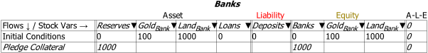
Swapping back to the Minsky convention of using variable names for flows, I’ll call this State-valuation of the nonfinancial assets backing the bank “Pledge”:
Figure 54: The same as Figure 53, but with the variable “Pledge” replacing the constant value 1000 in Figure 53

This is a feasible way to show how propertied interests can turn control over physical resources into the basis of a private monetary system. It would be relevant to the actual historical practice of “Free Banking” in the 19th century {Rockoff, 1974 #1171;Economopoulos, 1988 #1132;Flanders, 1996 #1161;Hickson, 2002 #1153;Lakomaa, 2007 #1157;Bodenhorn, 2008 #1146}, and also the logical “ab initio” proof of MMT’s assertion that government spending precedes taxation. Part of that process requires banks that can purchase government bonds (if we try to build a model that is congruent with current practices, where bonds are issued to avoid a Treasury overdraft at the Central Bank); this additional feature of Minsky helps show how that could happen. The State valuation of the nonfinancial assets pledged as collateral to establish a private bank gives the private bank both positive equity in financial assets, and the excess Reserves that will be needed to buy the bonds issued to cover the initial government deficit.
There is much more work required to this complete this model, but I’ll leave it at this level and invite research students to consider taking the concept further.
-
Financial Assets and Bubbles in Nonfinancial Asset valuation
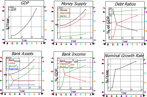
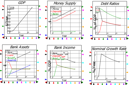
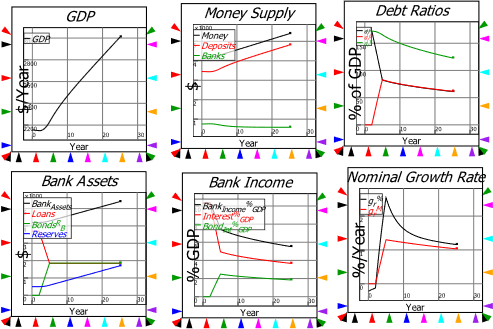
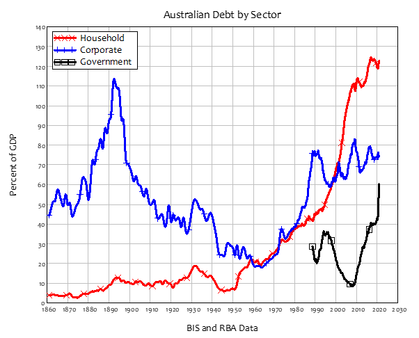
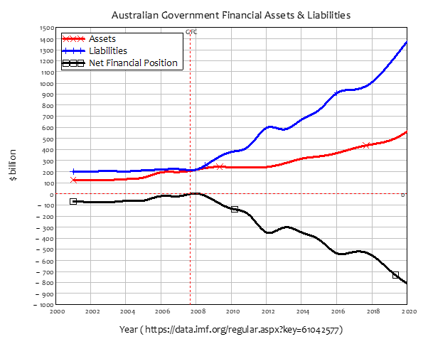
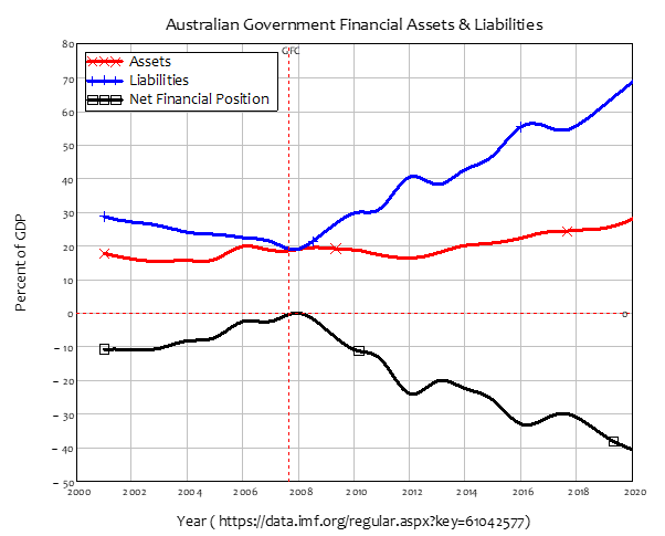
A more contemporary problem is the role of financial assets—fundamentally, bank debt—in determining the value placed on nonfinancial assets—primarily, housing. The empirical link is obvious—and as usual, is ignored by Neoclassical economists. The causal relation is easily inferred from the facts that (a) the supply of housing is very inflexible, so the volatility in the housing market comes from the demand side, rather than the supply side; (b) the demand side is dominated by mortgage credit—new mortgage debt—since houses are overwhelmingly purchased with borrowed money; (c) if you divide new mortgage debt by the average house price, you get a measure of how many “average” houses can be purchased; (d) given the inflexible supply, there is a strong relationship between mortgage credit (new mortgage debt) and the house price index; (e) there is therefore a relationship between change in mortgage credit and change in house prices.
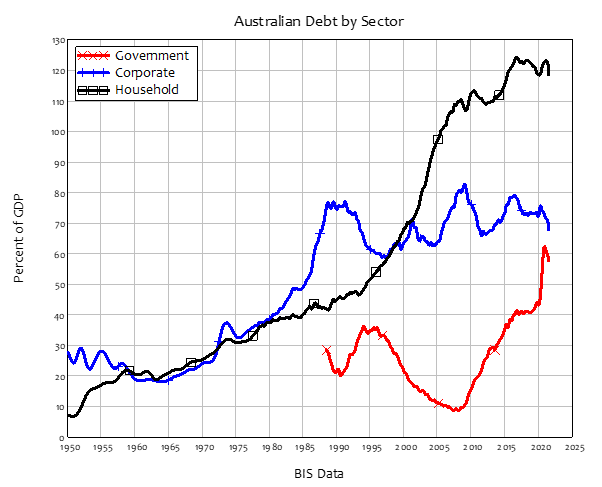
This relationship is apparent even in countries with very different house price and household debt histories, like the USA and Australia. The USA had a famous boom and bust in house prices, the “Subprime Crisis” {Silipo, 2011 #3925;Kaboub, 2010 #3922;Dymski, 2010 #3937;Wray, 2008 #3785;Bernanke, 2007 #5578} that led to the “Great Recession”. Australia, on the other hand, sailed through the “Global Financial Crisis”—as the “Great Recession” is known outside of America—with only a small dip in house prices, which are now 4 times as high, in real terms, as they were in the 1970s (in the USA, they are “only” 2.5 times as high). When you plot house prices in Australia and the USA against each other (the top left plot in Figure 55), you see two very different patterns: effectively always-rising prices in Australia; a boom, bust, and then rising prices once more in the USA.
Household debt also follows a very different pattern in both countries. Household debt in the USA rose strongly until 2008, and has fallen ever since—though with a slight blip at the beginning of the Covid-19 crisis. However, in Australia, household debt, like house prices, just keeps on rising (the top right plot in Figure 55).
However, when you plot the change in household credit against the change in house prices—the two bottom plots in Figure 55) you get a very similar pattern: rising house prices goes with rising household credit, and falling house prices with falling household credit.
Figure 55: House prices, household debt & the “credit accelerator” in the USA & Australia
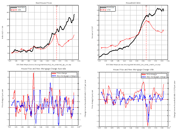
The link between rising household credit and rising house prices is therefore obvious: the question is, how to model it? In the Appendix, starting on page 255, I cover the mathematics of the relationship between rising household credit and rising house prices; here I show the stylized relationships between change in financial assets and change in the valuation of houses, using this new feature of Minsky.
Imagine that Homer Simpson wanted to buy a house off the real estate magnate Mr Burns. Homer first has to take out a mortgage with the bank, pay the money needed to buy the house to Mr Burns, pay interest on the mortgage (and principal, but I’m omitting that to focus on the nonfinancial assets issue here), maybe take out a Home Equity loan in his later years, and then sell the home at the end of his life. These transactions are shown in Figure 56.
Figure 56: The Bank and financial-assets-only view of house purchase and sale
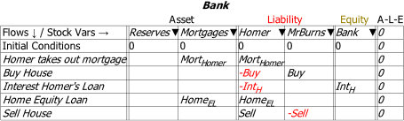
This view shows the changes in financial assets and liabilities, but omits changes to the distribution and valuation of the nonfinancial asset which is the subject of the transaction—the house. These are shown in Figure 57, in the final three rows of the Godley Tables for both Homer and Mr Burns.
The purchase of the house by Homer—the 3rd last row of his Godley Table—converts an amount of dollars worth of financial assets (Homer’s bank account) into an identical valuation of a nonfinancial assets (the house). If the purchase price was $450,000, Homer’s bank account declines by $450,000, and he then owns a house with an initial valuation of $450,000. The reverse applies to Mr Burns—the 3rd last row of his Godley Table. Similarly, the eventual sale of the house (from Homer back to Mr Burns in this simple example) does the reverse. This will be at a different price to the original purchase however—so there will be a change in the value of the house when it is sold that will turn up as a capital gain or loss. In this case, a gain for Mr Burns will be an identical loss for Homer. The question to be explored in a proper model is what causes the change in valuation—which will come down to the dynamics of mortgage debt (and demographics and other issues) explored in the Appendix.
With respect to Minsky‘s internal logic, the interaction of nonfinancial with financial assets means that the rule no longer applies. If house prices are rising, then Homer makes a capital gain, which captures the reason that people get caught up in asset bubbles in the first place: it’s a way to escape the trap of net financial assets summing to zero, by stepping into another trap of asset price bubbles and private debt.
Figure 57: The full transaction set, including changes in nonfinancial assets (house ownership & valuation)
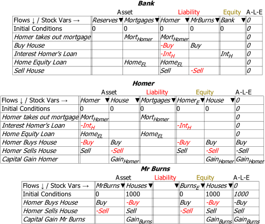
As this example is set up, there is no aggregate capital gain: Homer’s gain, should he be so lucky, will be Burn’s loss. This illustrates that the source of collective capital gain over time—the sort of increase in the aggregate valuation of houses and share (and cryptocurrencies) during asset price bubbles—must lie elsewhere. In the case of housing, it is in the rising aggregate level of mortgage debt, as both the correlations shown in Figure 55, and the logical argument made in the Appendix illustrate. There would, I expect, be an interesting PhD thesis in taking this financial-nonfinancial asset valuation issue further.
Many other monetary questions can be answered simply by posing them in Minsky‘s unique Godley Table structure. However, to fully exploit Minsky‘s capabilities, you need to understand how to use the program to build dynamic simulation models. That is the topic of the next and subsequent chapters.
Note: This feature is still under development, and there are some issues we’re still not sure of. For example, looking at the sale of the house to Homer by Mr Burns, Burns’s equity changes form from a house valued at $X, to $X in the bank. So, in aggregate form, the sum is zero. But in terms of Mr Burns’s stock of houses to sell, the operation results in a fall of dollars in terms of the valuation of his stock of houses—and this is shown both in the specific Equity column Houses, and in the sum for that row.
The Equity columns show the correct dynamics: the rate of change of Burns’s financial equity from the transaction equals dollars per year, and the rate of change of his nonfinancial equity is dollars per year. As to what the A-L-E column should show? We’re still not sure.
This feature will develop, and questions it raises solved, as we release new betas. This is another reason to support Minsky’s development via its Patreon page https://www.patreon.com/hpcoder.
-
The User Interface
Figure 58 shows how Minsky appears when you first run the program.
Figure 58: Minsky’s interface

Minsky‘s user interface has five main components:
-
The menu bar, with options File/Edit/Bookmarks/Insert/Options/Simulation/Help;

-
The simulation control toolbar with tools to reset a simulation, run it, stop it, step through it, change the speed of the simulation, reverse its direction (simulate backwards in time rather than forwards), zoom out/in/reset/full scale, record the construction of a model, and replay its construction;

-
Tabs for various aspects of the user interface. The main tab is Wiring, where you lay out your model using the visual design elements in Minsky; Equations shows the equations generated by your model; Parameters shows the names and values for model parameters; Variables lists the definition of the variables in a model; Plots shows selected graphs from a simulation on a separate canvas; and Godleys shows the double-entry bookkeeping tables used to build the financial aspects of any model you construct;

-
The Toolbar for designing a model. From left to right, the tools: import data; attach data to a Ravel (a commercial extension to Minsky); insert a plot; insert a spreadsheet; from a drop-down menu, insert either a variable, a parameter, or a constant; lock an operation (so that the locked variable doesn’t change when the model is altered); insert a text note; and insert a time widget. The next six icons activate a series of drop-down menus to insert mathematical operators on the canvas. Finally, there is a logical switch operator, the Godley Table icon, integral block icon, and differential operator;

-
And finally, the design canvas, where the contents depend on which Tab is active—see Figure 59. The main Wiring tab presents you with a design surface that is 100,000 by 100,000 pixels large—in terms of modern computer screens, that’s equivalent to an array of 4K monitors 25 monitors wide and 50 monitors deep—each with 4,000 pixels horizontally and 2,000 pixels vertically. You are unlikely to design a model that uses even 1% of that design space, but the room is there if needed to build truly gargantuan models.
Figure 59: Minsky’s interface, open on the “Wiring” Tab.
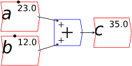
You will spend most of your time on the Wiring Tab when designing a Minsky model. As is standard in system dynamics programs, you create equations using wires that connect one or more entities to each other. A simple equation like, for example,  , looks like this in Minsky:
Figure 60: A simple equation in Minsky
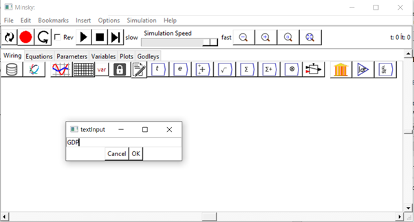
We have endeavoured to make entering equations as easy as possible, so you can just type anywhere on the canvas to add a variable to your model. For example, if you wish to define GDP, you can simply start typing “GDP” on the canvas. When you hit the “G” key, the “textInput” dialog box will pop up, where you can complete typing the expression: see Figure 61.
Figure 61
When you press the Enter key, or click on “OK”, the variable GDP will be entered on the canvas, and the Edit dialog box will pop up where, if you wish, you can give it an initial value, specify its units, give it a short description, etc.—see Figure 62.
Figure 62
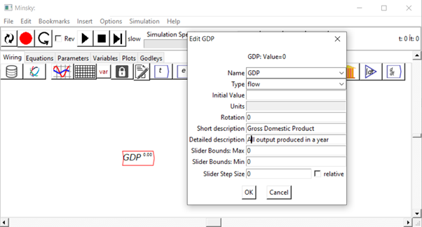
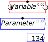
You can also change its type, from “flow” to “parameter”, “constant”, “integral” or “stock” (we’ll meet the latter two types in the next chapter). Parameters differ from flow variables by (a) having a different colour (blue rather than red) and (b) having only an output, whereas flow variables have both an input and an output.
You can see the input and output ports if you put your mouse pointer above an object on the canvas. These are circles on the right and left ends of a Variable, and the right end only of Parameters and Constants—see Figure 63, where my mouse pointer was hovering over Variable, so that both its input and output ports are visible.
Figure 63: Variables, parameters, and constants
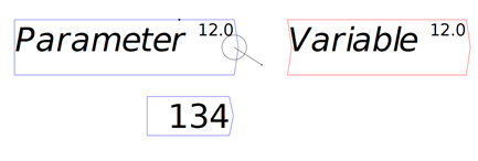
If you click anywhere apart from inside one of these circles, then you can drag the entity to somewhere else on the canvas. If you click inside one of the output circles—those on the right-hand side—then a “wire” will come out of it, which will attach to the nearest input port (you don’t have to click on an input port precisely)—see Figure 64, where I’ve started dragging a wire out of the output port from Parameter towards the input port for Variable.
Figure 64: Wire being drawn out of output port
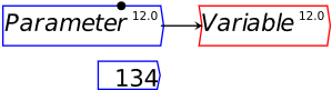
When you release the mouse button, the wire “snaps” to the nearest input port, which is that for Variable—see Figure 65. From now on, Variable‘s value will be whatever Parameter‘s value is.
Figure 65: Parameter output wired to Variable input
Of course, you’ll want to use mathematical operators to create more complicated definitions, and in Minsky you can simply type simple mathematical operators—addition, multiplication, division and subtraction—directly onto the canvas: you don’t have to use the drop-down menus on the icon bar.
Let’s see what the equation for GDP looks like in Minsky, using the standard symbols economists use:
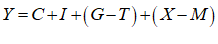
In Minsky, this looks like Figure 66:
Figure 66
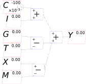
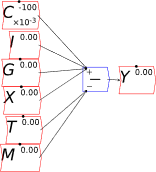
You will notice one unusual thing about Figure 66: there are two inputs to the bottom input port of the “+” key that defines Y. This is a common theme in Minsky, called “overloading”: if an operator can sensibly accept more than one input, then it does. The reason we do this is that system dynamics diagrams—which are effectively flowcharts that map across to equations—can get very messy, with lots of wires which can ultimately produce a “spaghetti diagram” effect. We aim to minimize clutter on the canvas, so you can replace the four addition and subtraction operators in Figure 66 with just one, as shown in Figure 67.
Figure 67
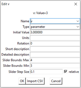
You may also have noticed the black dot on top of the Variable and Parameter blocks. This enables you to change the values of a parameter during a simulation. There are two ways to do this: by using the mouse to drag the dot to the left to reduce the value, and to the right to increase it; and by pressing the up key to increase the value, or the down key to reduce it, while the mouse cursor is hovering over the parameter. The maximum, minimum and step size are all set on the Edit dialog box—see Figure 68.
Figure 68: The edit dialog box for v, showing the slider Max, Min and Step Size
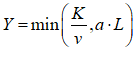
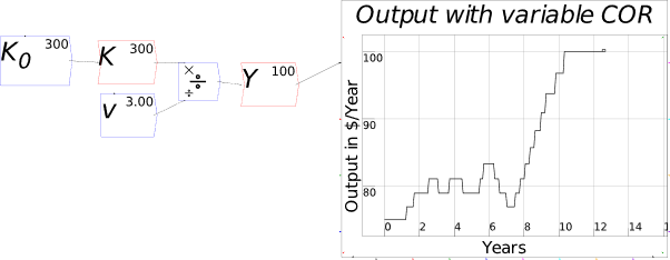
For example, you might use a “Leontief” production function, where output Y is defined as minimum of the capital stock K divided by a capital-output ratio , and an output—to-labour ratio times labor L:
Post-Keynesian models generally treat the capital-output ratio as a constant with a value of between 2 and 4. However, economic data implies that this is a variable with a decreasing trend over time (within a very small range), and that it rises during recessions—see Figure 69.
Figure 69: Capital stock at 2017 prices divided by GDP at 2012 prices (www.myf.red/g/DhPF)
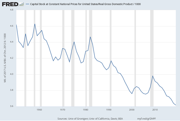
I’ll explain what the capital-output ratio (COR) actually is, and give an explanation for this trend, in the Energy chapter. For now, this implies that the practice of treating the ratio as a constant is generally defensible—the range is small, and the measurement of capital stock is compromised anyway (Sraffa 1960; Pasinetti 1969; Harcourt 1972)—but it would be wise to be able to vary the parameter and see what happens. Figure 70 shows the effect of varying the value of v from 4 to 3 during a simulation.
Figure 70: Output with varying capital-output ratio
-
Text Formatting
Minsky supports text formatting, including Subscripts, Superscripts, and Greek letters , etc., using the LaTeX mathematical formatting conventions. The basic formatting codes are:
-
Underscore _, which subscripts the next character;
-
Caret ^, which superscripts the next character;
-
Brackets , which apply the underscore and caret to a string of characters; and
-
Backslash \, which initiates a Greek character, using the English-language expression for the Greek letter. So typing \lambda into the text input dialog box and pressing Enter will generate the Greek letter .
For example, if you wish to distinguish Real GDP from Nominal GDP, you can create variables GDPReal and GDPNominal using these conventions. This improves the readability of the model, compared to standard text-only systems, which to my knowledge are all that are provided by the other system dynamics programs. Figure 71 shows some examples of LaTeX formatting in Minsky.
Figure 71: Some examples of LaTeX formatting in Minsky
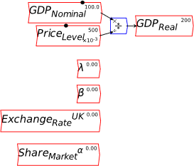
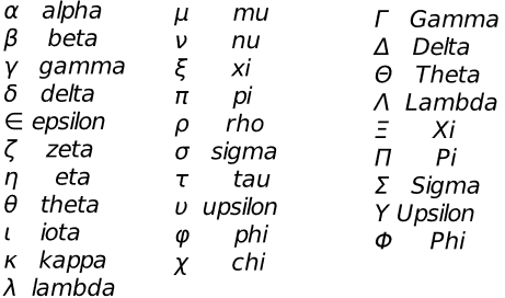
Figure 72 shows the most commonly used Greek characters supported by Minsky, and the English word that LaTeX displays as a Greek letter if you precede it by a backslash key (\).
Figure 72: A partial list of Greek characters supported by Minsky & the English word used for it
-
Multiple copies of variables and parameters
Once you’ve defined a variable or parameter, you can copy it and use it anywhere else on a diagram. So, for example, if you use the Greek letter lambda to indicate the employment rate, then you can make a copy of and use it elsewhere in your model as an input to a wage determination model—a so-called “Phillips Curve”.
-
A Keen Rant: Rehabilitating Bill Phillips
Before I illustrate building a Phillips Curve in Minsky, it’s important to rehabilitate the reputation of the man behind the name of the curve, the New Zealand engineer-turned-economist Bill Phillips.
Few people have been as badly misrepresented by Neoclassical economists as Bill Phillips: a courageous and innovative man has been reduced to a caricature of the empirical study he undertook over one weekend, to validate a hypothesis he made about a nonlinear relationship between the intensity of economic activity and the rate of change of input prices (Phillips 1958). Frankly, the Neoclassical caricature of Phillips is probably worse than their caricature of Keynes (Hicks 1937).
At least with Keynes, Neoclassicals couldn’t completely ignore his outstanding contributions to the politics and economics of his time. As a leading civil servant, Keynes attended the Treaty of Versailles, witnessed its distortion by France into a means to destroy its long-standing enemy Germany, and raised the alarm that the Treaty’s onerous terms would almost certainly lead to another war in The Economic Consequences of the Peace (Keynes 1920). He was a scion of English society, and while Hicks’s IS-LM model eviscerated Keynes’s General Theory (Keynes 1936), it didn’t eviscerate the man himself.
Phillips, on the other hand, had a unremarkable birth as the son of a New Zealand farmer, trained as an engineer, and spent most of WWII in a Japanese prisoner-of-war camp. But in that camp, among many other outstanding deeds, he risked his life to fashion a radio out of parts he stole from the commandant’s office, so that his fellow prisoners could hear British and American news reports on the progress of the War, rather than merely being force fed Japanese propaganda (Leeson 1994, pp. 606-608).
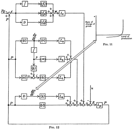
On his release, Phillips decided to use his engineering training to bring economics out of its Dark Ages of equilibrium thinking—using precisely the same modelling techniques that are now used in system dynamics programs like Minsky. The paper from which the model in Figure 73 is taken, “Stabilisation Policy in a Closed Economy” (Phillips 1954), pre-dates Forrester’s initial proposal of system dynamics by 2 years (Forrester 2003 [1956]), and the practical development of system dynamics software by about six years. Phillips was well ahead of his time, and, of course, his innovative work was ignored by mainstream economists.
Phillips’s hypothesized relationship between the level of economic activity and the rate of change of money wages (not prices!) was supposed to fit into the dynamic model shown in Figure 73, where there would not be a simple “trade-off” between inflation and unemployment, as his statistical work was bowdlerized down to, but a dynamic feedback process that would be difficult, though not necessarily impossible, to stabilize.
Figure 73: Phillips’s engineering diagram layout of an economic model with his hypothesized Phillips curve relationship inset (Phillips 1954, p. 309)
-
Plots in Minsky
To illustrate the Phillips Curve in Minsky, we need to plot the input (for which I’ll use the employment rate, rather than the unemployment rate) and the output (the rate of change of wages). That requires adding a plot widget to the canvas, and there are two ways to do this: click on the  icon on the toolbar; or press the @ key while on the canvas. We borrow a trick from Mathcad here: the @ symbol “looks like” a plot (use your imagination!; it’s not as obvious as using * for “multiply”, but it will do), so we use that as a keyboard shortcut.
Figure 74 shows the default shape of the plot widget after you’ve either clicked on the plot icon, or typed the @ key on the canvas. Also shown, in left to right order from the toolbox, are: the spreadsheet widget; the other toolbox icons that generate a single object (lock, note, and time at the left hand end of the toolbox; switch, Godley Table, integral and differential at the right hand end), plus all the drop-down menus shown as “tear-offs”. Notice the dotted line at the top of the fundamental constants drop-down menu? There’s one for each, you “tear off” the menu, so that it remains permanently available while you work on a model, and it can be located anywhere on your screen.
Figure 74: The “fundamental constants” menu on the toolbar, with the other menus as tear-offs
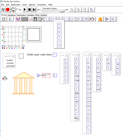
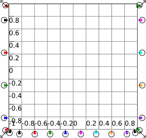
Figure 75 shows a plot with its resize arrows visible: these are four arrows, one on each corner. If you click and drag on one of them, you can resize the plot (a similar feature exists on all objects in a Minsky model: look for a mini-arrow when your mouse hovers over any element on the canvas).
The coloured input ports are also highlighted (you can see this yourself by hovering your mouse over a plot). These are used to determine the upper and lower bounds for each axis (the angled inputs) and to attach variables for plotting (the horizontally aligned port on the two Y-axes, and the vertical one on the X-axis).
Figure 75: A plot with its resize handles visible
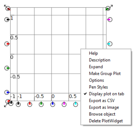
Plots are labelled using the “Options” element on the right-click mouse menu—see Figure 76. Minsky makes very heavy use of the right mouse button: right-click while hovering over a plot, and this menu will appear.
Figure 76: The right-click menu for Plots
“Options” and “Pen Styles” control the appearance of the Plot—see Figure 77.
Figure 77: Options and Pen style dialog boxes
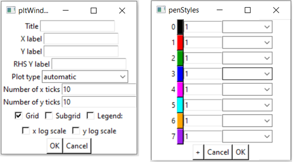
Figure 78 uses the inputs of time  , and the two functions sine
  and cosine
  from the functions drop-down menu. Wire the output from t to the inputs to sine and cosine as shown, then attach them to the plots. As illustrated, more than one output wire can be dragged from an output port and attached to input ports elsewhere in a model.
The top plot in Figure 78 illustrates the default behaviour of a plot: if a variable is wired up to one of the four input ports on the left hand side of a plot, but nothing is wired to one of the eight input ports on the bottom, then “time” is treated as the input on the x-axis and the behaviour of the variable over time is plotted. The bottom plot shows that if you attach an input to the black input on the x-axis, and another to the black input on the y-axis, Minsky plots x against y, as shown in Figure 80. You can create xy plots of different colours by using matching colour inputs on the horizontal and vertical axes.
Notice also that several of the connecting lines in Figure 78 are curved. Lines can be turned into curves by clicking and dragging the blue dot that will appear when your mouse hovers over a line. Multiple points of curvature can be added to create any curve shape, by clicking and dragging somewhere on the line away from the existing blue dot(s).
Figure 78: Using Minsky’s Plot widget
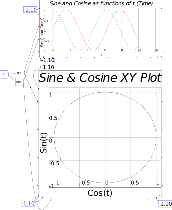
-
Building a “Phillips Curve” in Minsky
Now back to the “Phillips Curve”. Phillips insisted that the function relating the rate of change of money wages to the level of unemployment would be nonlinear, and that it would have three causal factors—the level of unemployment, the rate of change of unemployment, and “the rate of change of retail prices, operating through cost of living adjustments in wage rates” (Phillips 1958, p. 283). The model in Figure 80 is a linear model with only one input, but these limitations are easily overcome later. For now, I’m just using a linear model here to keep it simple early on. You should build this model yourself in Minsky before continuing.
The model introduces one more feature of Minsky, the percent operator: this takes an input and multiplies it by 100. It’s the last entry on the “fundamental constants” toolbar dropdown, which is headed by the operator e for the value of the transcendental number e. Click on e and the drop-down menu shown in Figure 74 will appear; click on  and that will be attached to the mouse pointer; move to where you want to place it on the canvas and click the mouse, and it will be inserted there.
Then wire the model up as shown in Figure 80, using the parameter values shown in Figure 79.
Figure 79: Parameter values in the model in Figure 80 (this Figure was generated by choosing Export Canvas while on the Parameters Tab)
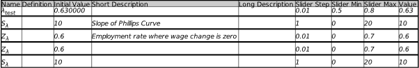
Table 1 shows what you have to type to get the elements shown on the canvas in Figure 80
Table 1: Variable and parameter names and how to type them
| What is displayed on the canvas |
What you type to get it |
|
|
\lambda
|
|
|

|
|
|
|
|
|
|
|
|
\Delta_w
|
To simulate this equation, vary the value of the parameter using the arrow keys or the mouse. As you do, the line shown in the plot in Figure 80 will be drawn.
Figure 80: A linear “Phillips Curve” in Minsky
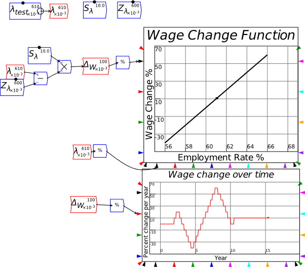
Minsky generates the equations of its models in LaTeX. You can export these from the program via the File menu option “Export Canvas”, which has six options: SVG (a generic vector graphics format that I’m using to produce the Figures in this book); PDF; EPS (Postscript); EMH (Enhanced Metafile, a Windows vector graphics format); LaTeX; and Matlab. Choose LaTeX and you’ll save a file with a *.tex suffix, which you can load into a LaTeX-aware mathematics formatting application (which includes Word itself as of 2017). The equations behind Figure 80 are shown in Equation :
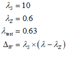
This takes us about as far as we can go without discussing how to handle time in dynamic modeling.
-
System Dynamics Basics
The Wikipedia defines system dynamics as “an approach to understanding the nonlinear behavior of complex systems over time using stocks, flows, internal feedback loops, table functions and time delays”, and “a methodology and mathematical modeling technique to frame, understand, and discuss complex issues and problems” . That’s correct, but it also assumes a fair bit of prior knowledge about how to build dynamic models. I prefer to strip this back to its basics, and describe system dynamics as a method to build systems of ordinary differential equations using a graphical user interface.
An Ordinary Differential Equation (ODEs) describes the rate of change of some variable as a function of itself and/or other variables. The fundamental variable in an ODE is time. In this sense, differential equations are calculus applied to processes in time, which is the essence of dynamics.
A simple Differential Equation is the statement that the rate of change of a variable is a constant—for example, if you’re walking at the speed of metres per second, then the rate of change of your location is metres per second. If we call your location “x”, then this equation is:

To model this in a system dynamics program, you first have to convert this into an integral equation. This is because when most system dynamics programs simulate a model, they do so numerically, and integration is a much more stable numerical process than differentiation. This is because differentiation gives you the slope of a curve, which can change very radically, while integration gives you the area beneath a curve, which changes more slowly than its slope.
Expressed as an integral equation, this is:
is the initial position before starting to walk. Figure 81 is this equation in Minsky with .
Figure 81: A simple differential equation in Minsky
An Ordinary Differential Equation is the statement that the rate of change of a variable is a function of its value. Population growth (and radioactive decay) is the simplest such model. A fish population (with an effectively unlimited food supply) can be modelled as having a constant annual rate of growth per year. The percentage rate of growth of a variable is its rate of change divided by its current level , so the statement that “F grows at a% per year” is in mathematical form:

As an ODE, this is:

Expressed as an integral equation, this is:
In Minsky, with (or 10% per year), this generates the characteristic outcome of exponential growth shown in Figure 82.
Figure 82: A simple population growth model
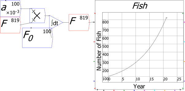
At a growth rate of 10% per annum, the number of fish doubles every 7 years—illustrating the so called “Rule of 70”: a growth rate of x% per year means that the population will double every years. After 21 years, the population has risen 8-fold.
This, in a nutshell, is why there must be dynamic systems: though hypothetically a given population can rise exponentially, in practice it can’t, because the world—even the Universe—isn’t infinite (Murphy 2021). Something else must limit this process—whether that’s the exhaustion of the falsely assumed infinite supply of fish food, or the existence of a predator that eats the fish.
Here entereth our first true system dynamics model, the “predator-prey” model of a pair of interacting species, which keep limits on the numbers of both species. As I explain in Manifesto (Keen 2021, pp. 76-78), it was initially developed by the Italians Lotka and Volterra in the early 1900s—long before the technology of system dynamics was developed by Forrester in the 1950s.
I’ll use this example to illustrate many of Minsky‘s user interface features.
-
Predator-Prey model
Lotka’s predator-prey model (Lotka 1920) was the first mathematical model to demonstrate the hallmarks of complexity: nonlinear interactions in a system leading to sustained non-equilibrium behavior. Its foundations are extremely simple: two population models, a prey species with an assumed limitless supply of food, as in the previous section, coupled to a predator population whose survival depends on the availability of prey.
We can start from the equation for population growth—or rather population change. I’ll stick with Fish for the prey species and introduce Sharks as the predator species S (for Sharks). Then we start from the same percentage change logic, where Fish numbers grow exponentially at the rate per year, and Shark numbers fall at the rate per year (I’m reserving and for the interaction terms). The “hat” notation is a mathematician’s shorthand for :
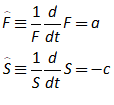
Expanding this out into differential equation form gives us:
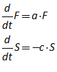
In integral equation form, this is:
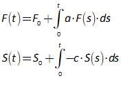
This is precisely how Minsky models it in Figure 83, where the equation
can be seen by reading Minsky‘s symbols from right to left:
Figure 83: Predator and Prey without interaction
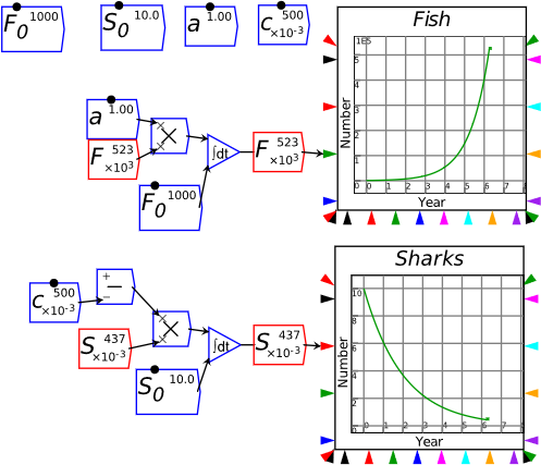
The model in Figure 83 also demonstrates one of Minsky‘s shortcuts: to negate a number, simply feed it into the bottom port of a minus operator  . With no input to the top port, Minsky interprets this as .
Now we need to include the interaction between the species: predation by sharks reducing fish numbers, and increasing shark numbers. Lotka made the simplest possible assumption, that sharks reduce the growth rate of fish by a constant, and decrease the death rate of sharks by another constant. This is most easily shown using the hat notation used in equation :

In integral form, this is
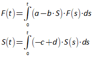
This can be put into Minsky by adding the widgets shown in grey in Figure 84, and the characteristic cycles of the predator-prey model emerge.
Figure 84: Predator and Prey with interaction
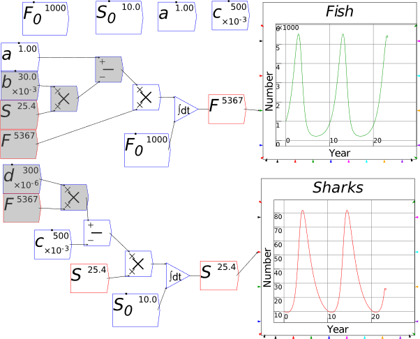
I was actually lucky here: I simply used “suck it and see” values for the parameters and initial conditions, and they worked out OK: the ranges for the numbers of fish and sharks were reasonable. But if you do the same, you may well get “crazy” cycles, because the combination of your initial values and your parameters may have numbers of both species cycling wildly. This is because, in one of the neatest illustrations of how complex systems behave, the equilibrium value for the number of fish depends on the parameters for sharks, and the equilibrium for the number of sharks depends on the parameter for fish.
This is easiest to see by setting the equations in to zero—since this shows you the point at which the rates of change of the number of fish and the number of sharks are both zero:
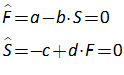
This is only true for specific—equilibrium—values of F and S, which I denote by and respectively:
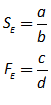
Figure 85 adds the equilibrium calculations with the greyed widgets, as well as a phase diagram showing the repeating cycles over time, the equilibrium here (the other equilibrium—which is unstable—zero sharks and zero fish), and the initial values on the phase plot.
Figure 85: Predator and Prey with phase diagram and equilibria
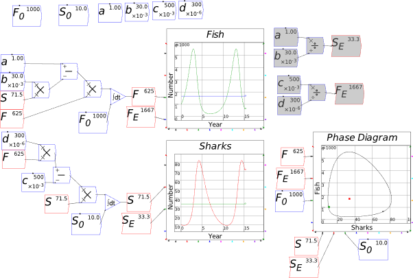
I was lucky that my choice for the initial number of fish and sharks—1000 and 10 respectively—weren’t too far from the equilibrium values for fish and sharks—1667 and 33.3 respectively—given the values I used for the parameters. But if you give initial conditions that differ substantially from the equilibrium determined by the parameters, you will get wild cycles where each species “almost disappears” before spiking up dramatically and then collapsing once more—as illustrated by Figure 86.
Your best bet, when designing a model, is to either (a) check the equilibrium conditions of your model, and choose initial conditions that aren’t too far removed from (one of) the equilibria; (b) if you’re working from data for the initial conditions, choose parameter values that generate equilibria that aren’t radically different; or (c) if you’re working on a large-scale empirically based model, follow the parameter estimation techniques outlined in Chapter 11.
Figure 86: The same model with badly chosen initial conditions
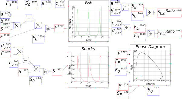
The final things needed to reproduce the figure in Manifesto is to replace the androgynous parameters with more meaningful labels, and to put in the plot with the two Y-axes. We can do the former quickly using the right-mouse button menu item “Rename all instances”—see Figure 87.
Figure 87: Using “Rename all instances”
Figure 88 shows the final model including two plots with 2 y-axes—one showing the numbers of Sharks and Fish, and the other showing the rates of change of the two populations. This is partly to show off Minsky‘s rate of change operator  —which, unlike similar operators in most other system dynamics programs, actually performs a symbolic differentiation rather than a numerical one—and partly to make the point that, no matter how often you “first/second/third difference” these variables, they will always be out of phase. This is despite the complete lack of time lags in this model: the instantaneous value of (the rate of change of) Fish depends on the instantaneous value of Sharks, but in a nonlinear way. So no matter how often they are “differenced”, they will remain “not cointegrated” in the jargon of econometrics.
Figure 88: The final model with rates of change shown as well
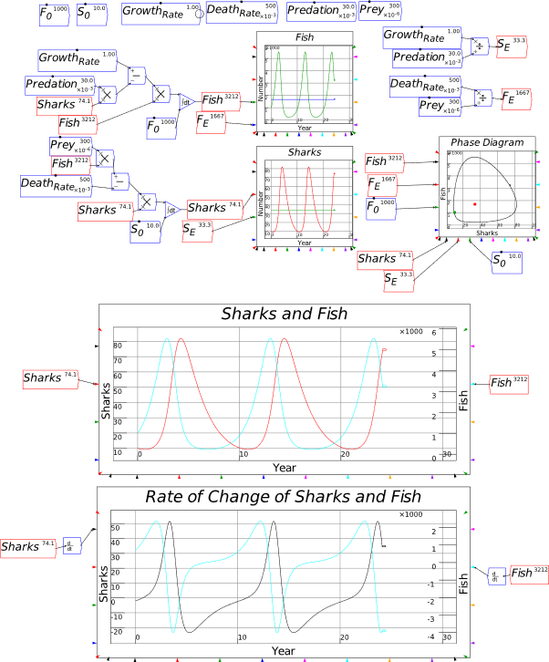
-
Organizing a model
This model is essentially very simple, but with the layout I’ve used, it won’t fit completely on a computer monitor running at 1920×1080 pixels—see Figure 89
Figure 89: The model in Figure 88 on a 1920×1080 resolution monitor
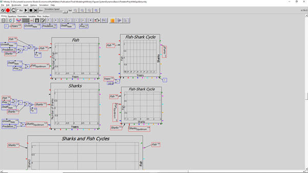
This can be simply fixed by clicking on the “fit to window” magnifying glass—the last one of the four on the control panel bar. But with a large model, that will reduce the variables, parameters etc., to an illegible size. So, you need to organize the model.
There are two ways to do this, and one of them—the standard method used by all other system dynamics programs—I recommend that you don’t use, yet. This is grouping.
The reason I don’t recommend using it, yet, is that in the early days of developing Minsky, we consulted a professional interface designer and he made the novel recommendation of making our groups transparent: at a preset level of magnification, the contents of a group become visible, and you can edit the group while still working at the scale of the overall model.
It was a clever idea, and it will work one day, but it generated a plethora of issues in terms of linear transformations that, unfortunately, we found too late and haven’t yet had the time to debug. This is one of the problems of lack of funding: we are torn between adding new features and bug killing. A team of 3 full-time programmers is really needed as a minimum to balance both objectives, and the best we’ve been able to manage, and even then for only a year with the funding from Friends Provident Foundation, was two.
So we developed a workaround that works as well, and exploits Minsky’s uniquely huge 100,000×100,000 pixel design space: Bookmarks.
-
Bookmarks
There are three ways to insert a bookmark:
In the current release of Minsky (2.35.0), these methods work somewhat inconsistently, and the best one to use is the first. We’ll make them consistent in the first release of Minsky with a Javascript front end, sometime in early 2022.
The first method bring up the “Note” dialog box—see Figure 90. If you don’t click the Bookmark? Box, this command will insert a text string at the cursor, where the string will be whatever you type to replace the “Enter your note here”. This can be quite extensive—paragraphs of text rather than just lines—and some LaTeX formatting is supported, so you can have Greek letters, superscripts and subscripts in what you type. If you type anything in the “Short Description” window, that will appear as a tool tip when the mouse hovers over the Note on the canvas.
Figure 90: The Note Widget
However, if you click the “Bookmark?” box, then the note functions as a bookmark as well: the text you type in “Enter your note here” still appears on the canvas, the Short description still appears as a tool tip; and as well, the location of the Note on screen is recorded as a Bookmark, with the Short Description turning up on the Bookmarks menu.
To navigate to the Bookmark, simply click on it on the Bookmarks menu. The screen view of the canvas will then be reset so that the Note occupies the top-left-hand-corner of the screen.
In Figure 91, I have inserted several bookmarks; in Figure 92, I have chosen the “Equilibrium Calculations” bookmark from the Bookmarks menu, and the screen has been reset so that that Note is in the upper left-hand corner of the screen.
Figure 91: The model with several bookmarks inserted.
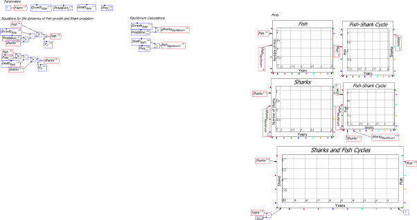
Figure 92: The view of the canvas when you click on the “Equilibrium Calculations” Bookmark
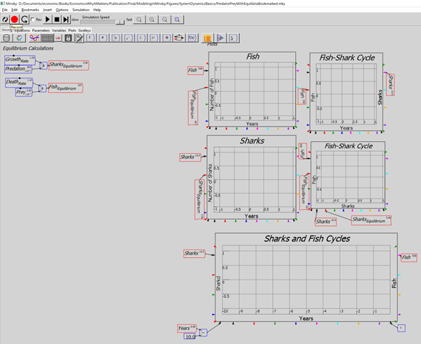
Once a Bookmark is defined, you can move it, and the elements of the model you use it to bookmark, by selecting them and then moving or cut-and-pasting them to a new location. In Figure 93, I have moved the bookmark “Plots” and the plots themselves to a new location on the canvas. Clicking on the bookmark “Plots” from the Bookmark menu will relocate the visible canvas so that the word “Plots” is in the top left hand position.
Figure 93: Figure 92 with the Bookmark “Plots” and the model elements associated with it moved to a new location
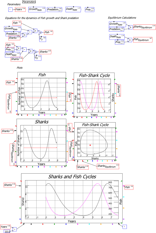
-
Using intermediate variables
Another way to group components of a model in Minsky is to use intermediate variables, which can then be deployed anywhere else on the model. For example, we can reduce the two equations for Fish and Sharks to the simple form of:
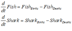
This can be done by defining the positive component of the original equations as “Births” and the negative as “Deaths”—see Figure 94. This approach doesn’t do much to reduce the complexity of this model, since it is quite simple already, but it is very helpful in much more complicated models.
Figure 94: The Fish-Sharks model with simplified system equations
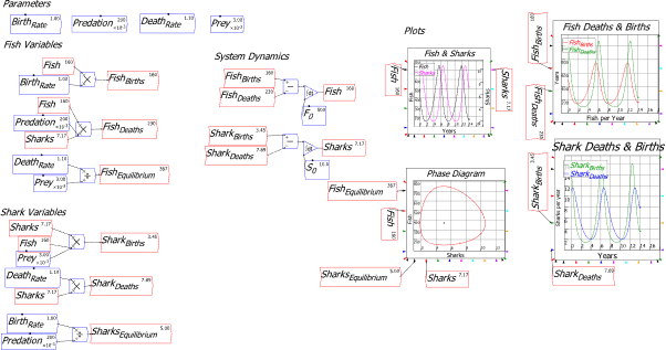
-
Documenting a model
Future versions of Minsky, starting with the first Javascript version that we’ll release in early 2022, will have a “Publication” Tab, where selected elements of a model can be placed to create an explanation of the model. This will include text notes, Godley Tables, Plots, selections of flowchart elements, etc.
The current version, which is the final version to be released with a Tcl/Tk frontend, lets you export the various Tabs in a range of formats, with the most useful—in terms of producing documentation of a model—being the vector graphic format SVG (“Scalable Vector Graphic”). Most writing and presentation programs accept this format, and these graphics files can be inserted into them easily. Figure 95 and Figure 96 show exports of the Parameters and Plots Tabs respectively.
Figure 95: The Parameters Tab of this model, exported as an SVG file
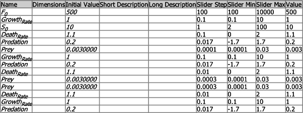
Figure 96: The Plots Tab of the model exported as an SVG file
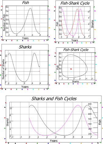
As (pardon me!) noted above, Notes have some capacity for text formatting that makes them useful to document a model as well—though they can take up a fair bit of screen real estate as a result. The Publication Tab will ultimately enable in-situ documentation of a model without taking up canvas space, but at the moment, the Notes widget is the best we can offer.
That said, it has some flexibility since it partially supports the LATEX document formatting language that is also used by Minsky to enable the equations of a model to be exported and then imported into word processor equation editors (including MathType, which I’ve used in this book). The next quote shows the text typed into a Note, and Figure 97 shows how this appears on screen.
Notes can contain
more than one line of text,
and the text can contain elements formatted using the L_A^TE_X
formatting language too, including _{subscripts} and ^{superscripts},
Greek letters like \lambda, and so on.
You have to get a bit creative with using spaces and
carriage returns to lay text out, but overall it’s more flexible than the text documentation features of our rivals, so hey…
With additional funding, we’ll make this a decent little \LaTeX formatter one day.
Figure 97: How Note formats the text in the quote above.

-
The Equations, Parameters, Variables, Plots and Godleys Tabs
As you develop a model, these additional Tabs to the “Wiring” tab where you design the model are auto-populated. They are not editable themselves in this version of Minsky—except for the Godleys and Plots Tabs, where you can relocate each Godley Table and Plot as you wish on the Tab—but they will be in future versions. You can also control which Plots appear on the Plots Tab, using the right-click menu on each plot on the design canvas.
In terms of designing a model, probably the most useful Tab is for Equations. This transforms the flowchart and Godley Table elements of a model into the actual differential equations that are used to simulate it. This gives you a second way to check whether the model actually expresses what you want to express—if a model doesn’t work as it should, you might find you’ve forgotten a minus sign, or used a multiplication symbol rather than a division, etc.—these things happen. You can often work this out by reading just the flowcharts and Godley Tables on the Wiring Tab, but sometimes the different—but entirely consistent—view provided by the Equations Tab can help you identify problems in a model more rapidly.
-
Exporting and importing a model
Minsky’s files use the structured-text language XML. Here, for example, are the first few lines of the actual MKY file for the predator-prey model developed in this section:
<Minsky xmlns=”http://minsky.sf.net/minsky”>
<schemaVersion>3</schemaVersion>
<minskyVersion>2.35.0</minskyVersion>
<wires>
<Wire>
<id>261</id>
<from>6</from>
<to>2</to>
</Wire>
<Wire>
<id>262</id>
<from>17</from>
<to>20</to>
</Wire>
<Wire>
<id>263</id>
<from>28</from>
<to>24</to>
</Wire>
This file format makes it relatively easy for Minsky to interface with other file formats, and we currently support exporting to SVG, PDF, Postscript, PNG, EMF, LaTeX and Matlab—see Figure 98. This feature is accessed through the “Export Canvas” option on the File menu, and what is exported is based upon the Tab which you currently have open (except for the last two formats, LaTeX and Matlab, which are independent of the Tab you have open).
Figure 98: The choices in the Export Canvas menu
We also support importing models from one of the two market leaders in the System Dynamics marketplace, Vensim; this is an option on the File menu. Because the layout philosophy of Vensim is so different to Minsky‘s, there are often SNAFUs in how an imported model is laid out, and some models will fail to import at all. We will repair these over time—and the more people who use this feature and report bugs back to us, the better.
That’s enough on the interface: now to the crucial issue of why would you want to use Minsky rather than the more conventional modelling tools—spreadsheets, Eviews, etc.—that economists currently use. It’s all about time, and economists, as a rule, handle time very badly.
-
A Keen Rant: How not to handle time
The vast majority of economic models, whether Neoclassical (Sargent and Stachurski 2020b, 2020a) or Post Keynesian (Godley and Lavoie 2007b), use what economists term “periods”. A recent example is the debate in Post Keynesian macroeconomics between Claudio Sardoni (Sardoni 2019) and Marc Lavoie and Gennaro Zezza (Lavoie and Zezza 2020), where both sides advocate what they term a “sequential” approach, in preference to “equilibrium” analysis. Sardoni states, quite correctly, that
sequential analysis represents a clearer conceptual framework to cope with processes that occur in time. The analysis of the multiplier effects of investment is one of the cases in which the occurring of events in time should not be ignored. (Sardoni 2019, p. 243)
But he also comments, immediately before this, and also quite correctly, that:
Keynes may have been right to underline the difficulties of sequential analysis and, in particular, the difficulty to provide a precise definition of the length of periods. (Sardoni 2019, p. 243)
The resolution to this paradox is itself paradoxical: there is no “period“. There are instead, economic processes which, at a “micro” level, are discrete acts—each individual act of consumption, investment, borrowing, etc. Each of them takes a different amount of time to complete, and each recurs at a different frequency: no one individual act of consumption is timed precisely with others, nor each act of investment: they are asynchronous. All these individual “periods”, when viewed from the perspective of an aggregate economic system, overlap, and a macro-level period cannot be defined.
While it would be feasible to model these as discrete processes in a multi-agent model, at the level of aggregate macroeconomic modelling, asynchronous microeconomic processes are best treated as happening in what mathematicians call “continuous” time, as opposed to “discrete” time. This in turn means that the proper mathematical technology for dynamic economic modelling is not the “difference equation”, but the “differential equation”.
Therefore, equations like the “discrete-time” Equation , from the seminal Godley and Lavoie paper “Fiscal policy in a stock-flow consistent (SFC) model” (Godley and Lavoie 2007a, p. 84, Equation 19), which defines government debt as a difference equation:
should instead be written as a differential equation in “continuous time”:
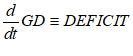
While “sequential analysis” is indeed preferable to equilibrium analysis, continuous time modelling is preferable to both. There are, of course, rejoinders to this, which I have heard many, many times from my Post Keynesian colleagues (especially from Marc Lavoie: we are good friends, and, when our schedules and geography permit, tennis rivals/buddies, as well as intellectual collaborators).
The commonest defense of “sequential analysis” is that economic data is periodic, and therefore economic models should use equivalent periods. This is a fallacy, as stated bluntly by the father of System Dynamics, the engineer Jay Forrester, when he first reported on his study of economic models to his Faculty Seminar at MIT in 1956:
The incremental time intervals for which the variables of a model are solved step-by-step in time must be much shorter than often supposed… This solution interval is unrelated to the interval at which national statistics and economic indicators are measured… (Forrester 2003, pp. 337-345)
Forrester backgrounded this didactic statement in his textbook Industrial Dynamics:
A discontinuous model, which is evaluated at infrequent intervals, such as an economic model solved for a new set of values annually, should never be justified by the fact that data in the real system have been collected at such infrequent intervals. The model should represent the continuously interacting forces in the system being studied. The frequency with which measurements on the real system may happen to have been taken is not relevant to the frequency with which internal dynamic performance must be calculated. (Forrester 2013, p. 65)
Another frequently made rejoinder is that economic decisions, such as investment, are based on lagged data, rather than current data, and therefore period analysis is needed to capture these lags. For example, Godley & Lavoie 2007 assume:
that governments react to lagged inflation rates, rather than to actual or expected inflation rates, on the realistic grounds that fiscal policy may have a reaction time somewhat longer than monetary policy. (Godley and Lavoie 2007a, p. 92)
Therefore, they use the two equations shown in Equation to represent “real pure government expenditures” g, and the “growth rate of real pure government expenditures”, , where the rate of growth of government expenditure is a function of “the growth rate of potential output” gr, the change in the lagged inflation rate , and the deviation of the lagged inflation rate from the target inflation rate :
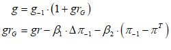
In fact, lags are easily represented in differential equations, using what is known as a “first-order time lag”, to relate the delayed perception of the rate of inflation to the actual, instantaneous rate of inflation . I’ll use rather than for the time-lagged inflation rate, since a time lag can be any length, not merely “one period”. The time-lagged inflation rate is defined by its rate of convergence to the actual inflation rate, which is given by the “time constant” (which, in an elaborate model, can be a variable if desired) which measures the length of time, in years, that it takes for the perceived rate of inflation to converge to the actual rate of inflation . If , this is a 6-month lag; if , a year, and so on. This rate of convergence is given by the differential equation shown in Equation :
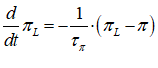
Similarly, the growth rate of government expenditure is expressed as a differential equation:
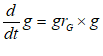
The variable growth rate can now defined as something like Equation , or it could be replaced with its own differential equation.
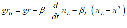
This approach is vastly superior to the discrete approach to time lags (which is more correctly called a time-delay, rather than a time-lag), for many reasons.
Time-lags are flexible. Your lag can be a fraction of a year, or multiple years, or even an irrational number if you wish: it doesn’t have to be 1,2, 3 “time periods”, as in conventional economic modeling. And of course, I’m being generous in saying that! Economic models use a time delay of “1 period” for almost everything. In Lavoie and Godley 2007, interest payments have a lag of -1 (equation 1); spending is negatively related to the interest rate with a lag of -1 (equation 2); taxes on wealth are lagged -1 (equation 7). This is typical. Factors which in the real world occur at vastly different frequencies—consumption, for example, has a much higher frequency than investment—are all corralled into the same arbitrary frequency.
Therefore, the time-delays (not time-lags) in discrete time economic models—which is to say, the majority of economic models—are spurious. They have nothing to do with the actual characteristics of time-dependent actions in the real economy. Time lags, on the other hand, can be derived from empirical data. They are also easy to edit: a time lag is a simple scalar, and if you find that you’re using the wrong value—say, data shows that the time lag in investment is actually 1.5 years when your model uses 3 years—then all you have to alter is that number. On the other hand, if discrete-time economic models did time delays properly, they would have different delays for consumption (short) versus investment (long). This simply isn’t done. If it were, and then empirical data indicated that the delay was different to what the model used, a wholesale re-writing of the model is necessary.
The final objection made to using continuous time is, how then do we derive the values for parameters in such models, and test them, when the economic data we have is in discrete time format (quarterly or yearly)? This is in fact a valid issue, since it does take care to do this properly. A common method is to interpolate intermediate (continuous-time) data points from yearly, quarterly or monthly data using cubic-spline interpolation. This procedure derives a set of third order polynomials that join each pair of points in a series, producing a smooth series that approximates what would have been found by statisticians as the sum of the underlying asynchronous processes, if they had used a higher sampling rate. The model can then be fitted to the interpolated time series.
The bottom line is, stop using difference equations for economic models! They are simply the wrong technology for the macro modelling of asynchronous micro processes in general, let alone economics in particular. Difference equations are really only appropriate for macro-level modelling when the micro-level processes that generate it are synchronized. This is the case for, for example, the birth dynamics of Christmas Island Red Crabs. These crabs give birth on the same day, coordinated by the full moon, so that the sheer number born on that day overwhelms predators, and enables the survival of the species (Adamczewska and Morris 2001). So, if you’re modelling the life cycle of Christmas Island Red Crabs, go right ahead and use difference equations. But if you’re modelling anything else…, then don’t use them.
Given how inappropriate difference-equation models are for modelling the economy, and yet how much they are used by economists, Minsky
deliberately does not support time-delays: “friends don’t let friends use periods“. We may need to introduce time-delays at some point, to enable the importing of models from other system dynamics programs, but if so, they will exist solely for that purpose.
-
Mathematics and Minsky
One of the reasons that economists have used difference equations is because they’re easy to write down: anyone can define a simple equation in terms of time differences, and it can easily be modelled with conventional software like a spreadsheet. You need specialist software (including mathematics programs like R and Matlab, in addition to system dynamics programs like Minsky) to simulate differential equations, and it is also much harder to think in terms of differential equations initially. For this reason, I recommend undertaking some study of differential equations, even though you can use Minsky without that training.
If you do study them, do a course given by mathematicians rather than economists, and make sure the tuition extends to third order nonlinear differential equations (or at least their qualitative features compared to 2nd order equations), since, as I explain in Manifesto, 3-dimensional models are the foundation of complex systems modelling: as Li and Yorke put it, “Period Three Implies Chaos” (Li and Yorke 1975). Alternately, get a good textbook: my favourite, because it is so well written, and because it covers stability analysis, qualitative analysis, and the basics of the linear algebra needed for differential equations as well, is Braun’s Ordinary Differential Equations and their Applications (Braun 1993).
-
Integrals versus differentials
Since system dynamics programs simulate systems that change over time, differential equations are fundamental to them. However, differentiation (working out the slope of a curve) is a much more volatile operation than integration (working out the area under a curve): the slope of a curve can vary dramatically over a short interval, but the area beneath it will change less dramatically. Approximating the slope of a curve numerically can result in large errors, so for this reason (and a few others), system dynamics programs work with integration rather than differentiation.
Therefore, if you start with a differential equation for population growth, like Equation :
Where births and deaths are proportional to the existing population:
Then, in a system dynamics program, you would express Equation in integral form by integrating both sides:
In Minsky, this looks like Figure 99:
Figure 99: A simple equation for population, with the parameters being varied during the simulation
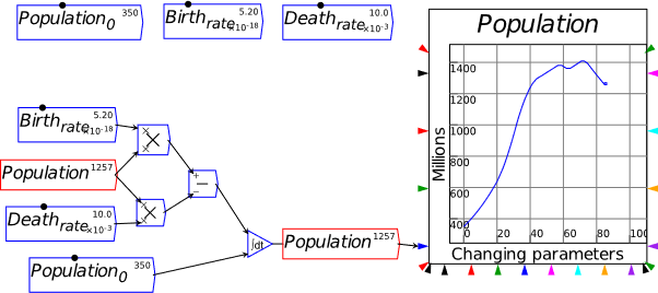
-
A first model, done two ways
Now let’s build a first serious model using Minsky: Goodwin’s growth cycle model (Goodwin 1967). Normally, a system dynamics model is designed by considering causal relationships between elements of a model, and then connecting them all into a causal loop. We’ll do that in a moment, and also follow up with a second method, of deriving the model directly from macroeconomic definitions. This is to emphasize the point I made in Manifesto that Goodwin’s model—and my extension of it to model Minsky’s Financial Instability Hypothesis (Keen 1995, 2020b)—are foundational models for a modern, complex systems approach to macroeconomics.
Figure 100 shows the opening paragraphs of Goodwin’s paper, where he sets out the assumptions underlying his model (Goodwin 1967, p. 54). I’ll follow this structure in deriving the model in a system dynamics way, though Goodwin’s own derivation was closer to the second approach we’ll use later. I should note that I found Goodwin’s explanation of his model interesting but inscrutable when I first read it, and only properly understood the model—and its potential—when I read Blatt’s masterful exposition of it in Dynamic economic systems: a post-Keynesian approach (Blatt 1983). If you’re reading this book with serious intent—in that you plan to become proficient at system dynamics modelling in economics—then I strongly suggest that you buy a copy of Blatt’s recently republished masterpiece.
Figure 100: Goodwin’s statement of the assumptions from which his model is derived
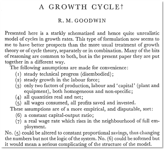
Working from Goodwin’s exposition here—and using slightly different notation—his first two assumptions are constant exogenous growth of the output to labour ratio and of population . Using for the rate of growth of the output to labour ratio and for the rate of growth of population, that gives us these two equations:
In Minsky, these equations are entered as shown in Figure 101:
Figure 101: Exogenous growth rates of technology and population in Minsky
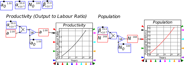
Goodwin’s assumption 6 gives us a constant ratio between capital K and output Y, while assumption 5 means that the level of gross investment equals profits , which in this simple two-class (workers and capitalists) model equals output minus wages . Goodwin neglected to include depreciation of capital, so I include that as well, defining net investment to be equal to gross investment minus depreciation, which is a constant times K:
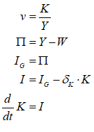
These equations can be used to commence building the model, as shown in Figure 102.
Figure 102: Partial Goodwin model, from the definition of profit to the determination of employment
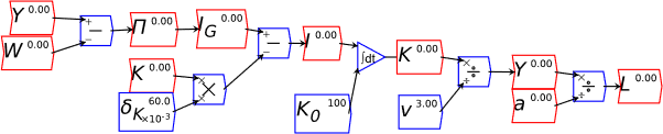
Reading from left to right in Figure 102:
-
Output minus Wages determines profit: ;
-
all profit is invested: ;
-
net investment is gross investment minus depreciation : ;
-
net investment, integrated and added to the initial level of capital stock , is the current capital stock: ;
-
Capital stock divided by the capital output ratio is output: ; and
-
Output divided by the output to labour ratio is Labour: .
This leaves just his assumption 7: “a real wage that rises somewhere in the neighbourhood of full employment” (Goodwin 1967, p. 54). I’ll use for the employment rate, but I’ll relate this to the total population N, and not just the proportion of the total population that is employable, which is what Goodwin and Blatt used. In generic mathematical notation, the Phillips Curve relationship is as stated two equivalent ways in Equation :
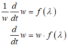
We’ve already built a linear version of this, in Figure 80 and Equation . So all we need to do is add the equation defining as , and then to define as :

This adds the terms in white in the causal diagram part of Figure 103.
Figure 103: The completed model, with the original terms in grey and the new ones in white
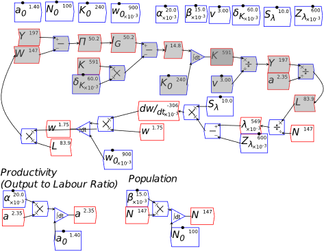
Reading right to left in this section—since I have “flipped” the model components to close the causal loop:
-
Labour divided by population determines the employment rate ;
-
The employment rate fed into the “Phillips Curve” function determines the rate of change of wages ;
-
Multiplied by the current wage, integrated and added to the initial wage , this determines the wage rate ;
-
From this point on, it’s what one of my undergraduate maths lecturers described as “money for old rope”:
With this completed, we can now see the dynamics of the Goodwin model. A few plots inserted and wired up to Y, and generate Figure 104.
Figure 104: Goodwin model with plots
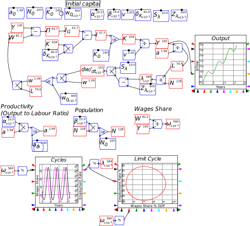
There are many interesting features to this model that we’ll explore later, but I want to address a criticism that I’ve frequently heard of this model, that it is in some way contrived or “ad hoc”. In fact, as I noted in Manifesto, this model—and my “Minskian” extension of it to include private debt—can be derived directly from incontrovertible macroeconomic definitions. For this reason, I regard these two models as not “ad hoc”, but as foundational models for a complex systems approach to macroeconomics. I’ll explain why here as I redo the derivation of the model directly from macroeconomic definitions.
In English, the definitions behind the Goodwin model are:
Using the symbols we’ve already employed in building the flowchart version of Goodwin’s model, these are:
I’ll derive the dynamic model using the differentiation shortcuts that I noted in Manifesto:
-
The percentage rate of change of a variable, say , (expressed as a ratio rather than percentage) is ;
-
The notation mathematicians use for this expression is
-
The percentage rate of change of a ratio is equal to the percentage rate of change of the numerator, minus the percentage rate of change of the denominator, so that ; and
-
The percentage rate of change of a product is the sum of the percentage rates of change of the two parts of the product so that .
Putting the definitions in into percentage rate of change format, and using the differentiation shortcuts, yields:
In words, Equation is saying that:
At the moment, these are still true-by-definition statements. To get from here to a model, we need to introduce one more definition—the output to labour ratio —and the assumption of a uniform wage rate . This lets us make the following substitutions:

Substituting these definitions into the expression for in yields the following for :
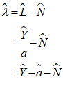
And for :
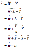
As did Goodwin, we’ll assume a constant rate of technological growth and a constant rate of population growth. This lets us make the substitutions:

Our almost completed model is now:

Now we need to expand and . To do this, we need two more of Goodwin’s simplifying assumptions:
-
A constant capital to output ratio (which I discuss further in Chapter 10 on page 193 et seq.); and
-
An investment function (with depreciation, which Goodwin omitted). Goodwin assumed that all profits were invested.
Because is assumed to be a constant, the percentage rate of change of is identical to the percentage rate of change of :
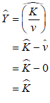
Therefore, once we work out , we can substitute this for , otherwise known as the rate of economic growth. We also insert Goodwin’s assumption that all profits are invested, so that .
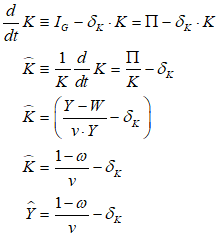
That leaves just the rate of change of wages , which is the “Phillips Curve”. Using the same linear function as in Figure 80 give us:
Substituting and into yields the reduced-form version of Goodwin’s model:
Expressed in differential equation form, this is:
This model, using the same parameter values as the previous model (plus initial conditions similar to the initial values for and ) yields the same dynamics as Figure 104:
Figure 105: The Goodwin model in reduced form
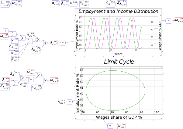
This is a foundational model for macroeconomics, firstly, because it can be derived directly from incontestable macroeconomic definitions and a set of reasonable simplifying assumptions, and secondly, because the simplifying assumptions themselves suggest ways in which the model can be generalized and extended.
The assumption that all profits are invested, for example, is defensible as a first-order approximation (in the Taylor series sense) in that investment is ultimately a function of profit; but the obvious extension is that capitalists invest more than profits during a boom, and less than profits during a slump. This generates a “finance … demand for money”, the omission of which from The General Theory (Keynes 1936) Keynes
later realized was a significant error:
Investment finance in this sense is, of course, only a special case of the finance required by any productive process; but since it is subject to special fluctuations of its own, I should (I now think) have done well to have emphasised it when I analysed the various sources of the demand for money. It may be regarded as lying half-way, so to speak, between the active and the inactive balances. If investment is proceeding at a steady rate, the finance (or the commitments to finance) required can be supplied from a revolving fund of a more or less constant amount, one entrepreneur having his finance replenished for the purpose of a projected investment as another exhausts his on paying for his completed investment. But if decisions to invest are (e.g.) increasing, the extra finance involved will constitute an additional demand for money. (Keynes 1937, p. 247. Emphasis added)
In an “endogenous money” world in which bank loans create money, this adds to aggregate demand and income when the change in debt is positive, and subtracts from it when it is negative (Keen 2020b). As I explain in Chapter 9.2 on page 183, replacing “capitalist invest all their profits” with this more realistic assumption is how I started the development of my model of Minsky’s Financial Instability Hypothesis (Keen 1995).
There are therefore at least two methods to go about designing dynamic, complex-systems models of the economy: the conventional flowchart method, and deriving a model from definitions using calculus. Both approaches have their strengths: the flowchart method is easier, while the definitional approach gives you some insights into how a model might be extended—by, for another example, replacing the single-commodity definitions of and with multiple commodities and input-output dynamics. The closed form solution is also more appropriate for stability analysis. Personally, I find myself using the two approaches symbiotically as I build models.
But there’s one thing I could never model properly with flowcharts: the dynamics of the monetary system. My first successful attempts to model monetary dynamics used systems of equations in the mathematics program Mathcad, with a matrix keeping track of relationships between accounts (Chapman and Keen 2006). But this only generated “static” plots of the models, when I wanted to also show the system changing through time, as I could do with the system dynamics program Vissim. However, every time I tried to put one of my models into Vissim, I’d make a mistake—by changing one equation (say for debt) but not a related one (for money), or putting the wrong sign in one equation, and so on. In 2008, I realized that I could generate the equations directly from the matrix (which I originally did in the program Mathcad). This became the inspiration for creating Godley Tables, and funding from INET in 2012 finally turned that into reality.
I’ve learnt a lot about money from building Minsky, and extending the capabilities of its Godley Tables—so much so that I now know that some of what I wrote about money in Debunking Economics (Keen 2011a) was wrong. I will start work on a 3rd (and final!) edition after completing this book. And now to Minsky’s raison d’etre, Godley Tables.
-
Godley Tables
Minsky‘s double-entry bookkeeping tables are named after Wynne Godley, for three reasons:
-
Godley, in collaboration with Francis Cripps, was the originator of the concept of using double-entry bookkeeping tables to ensure stock-flow consistent modelling;
-
I spent six very pleasant months at the Levy Institute in 2000, writing the first edition of Debunking Economics while on sabbatical leave, and I learnt a great deal from interacting with Wynne at that time, including the crucial role of double-entry bookkeeping in ensuring stock-flow consistency; and
-
Because non-Neoclassical economics needs to preserve the names of its heroes. If we leave history to the victors—which, in the sad case of economics, means leaving it to Neoclassical economists—then the names of our heroes will be forgotten. Hence the name of Minsky itself, Godley Tables for our double-entry bookkeeping tool, and—if I can raise further development funding after our £200,000 grant from Friends Provident Foundation runs out—Moore Tables to show the macroeconomics of inter-sectoral flows, to honour Basil Moore (Moore 1979, 1988b).
Godley Tables in Minsky differ from the flow matrix tables in Godley’s own work. Whereas both the rows and columns in his tables summed to zero “on the principle that every flow comes from somewhere and goes somewhere” (Godley 1999, p. 394), the rows in a Godley Table sum to zero, but the sum of the columns adds up all the flows into and out of a given account, and therefore tells you the rate of change of the account the column represents.
Therefore, when you fill out the rows in a Godley Table, you are actually building a set of differential equations with which to model an integrated financial system. The rule enforced by the Godley Table, that each row must sum to zero, ensure that these differential equations are stock-flow consistent.
-
Creating a Godley Table
There are 2 ways to insert a Godley Table onto the canvas: click on the Godley Table icon on the toolbar, and then click on the canvas where you wish to place it; or choose “Godley Table” from the main menu item “Insert”.
When you first create a Godley Table, you get a bank icon on the canvas—see Figure 106.
Figure 106: A blank Godley Table icon

Double-click on the icon, or click the right-mouse button and choose “Open Godley Table”, and Figure 107 will appear, inside a new Window.
Figure 107: A blank Godley Table opened in an editing window
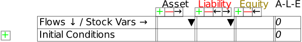
The top row labels each account as either an Asset, a Liability, or Equity—the difference between Assets and Liabilities. The final column, labelled applies the “golden rule of accounting”, that Assets minus Liabilities minus Equity equals zero, to each row in the table.
Immediately below this line has buttons to add or delete columns. There is one set of buttons for each of Asset, Liability and also the Equity columns, if you enable multiple equity columns from the Options menu (if you don’t, there are no buttons for the Equity column). The key adds a new column to the right, the key deletes the current column, and the arrow keys move the selected column one position to the left or right .
 The third line starts with the top left cell in the table, which notes that the columns are “Stock variables”, while the rows are flows between these stock variables. The columns to the right are where you type the names of the accounts (the down-triangle icon is discussed later).
The row below this shows the initial conditions for the accounts—the amount of money in each account when a simulation commences—which must also follow the rule that the numerical sum of these conditions must be zero. At the left-hand end of this line is a plus key, which creates the first row. Once you have done this, plus, minus, up and down symbols appear to allow you to add and delete rows, and move them up and down.
While there can be numerous entries in a row, the norm is two, which must sum to zero according to the rule , which is checked by the column. The entries are symbolic: words, not numbers. These words can include the formatting tricks discussed in the first chapter—subscripts, superscripts, grouped text and Greek letters—and if you can have in one column and in another.
Now let’s use Minsky to build the simplest possible models of a monetary economy, starting with a model of a pure credit economy in which all money is created by bank loans.
-
The simplest possible monetary model of a pure credit economy
Figure 108 shows a simple model with credit (bank-created) money only, with six flows: lending to firms, interest payments, debt repayment, wages, workers’ consumption, and bank purchases from firms.
Figure 108: A simple Godley Table
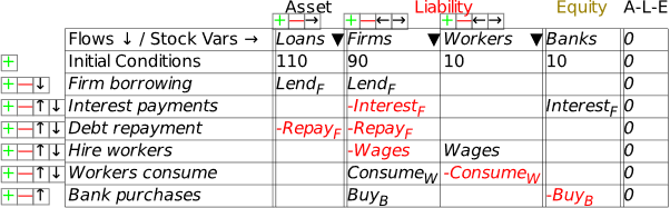
Minsky takes these entries and creates a set of ordinary differential equations, which you can see either by clicking on the Equations Tab, or by choosing “Export Canvas” from the File menu, and then choosing the file type to be LaTeX (*.tex). Equation shows the differential equations for Figure 108.
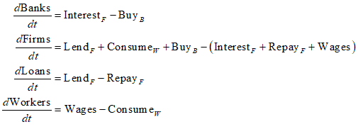
Though this is quite a simple “toy” model, the same process enables huge, detailed models of the financial system to be built, with complete confidence that these equations are stock-flow consistent.
Once you have made entries in a Godley Table, the Godley icon on the canvas changes to show the flows as inputs on the left-hand side, and the stocks as outputs on the bottom:
Figure 109: A Godley Table after stocks and flows have been defined
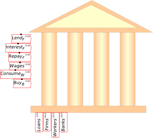
You can also alter the view so that you see the actual Godley Table on the canvas. Choose “Editor Mode” from the right-click menu, and the table will display as shown in Figure 110.
Figure 110: The Godley Table in Editor Mode
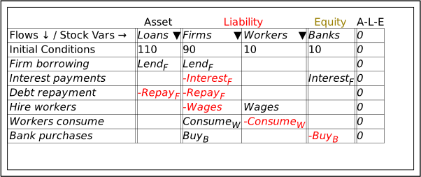
As the name of this display mode implies, you can edit the table here rather than in a separate window, but you have to activate the row and column buttons that are shown automatically in the separate window. You can also turn on showing the stocks and flows attached to the table via the “Display Variables” option on the right-click menu—see Figure 111 (I have also added a title to the Table, using the right-click menu option “Title”).
Figure 111: The Table showing editing buttons and the Stock and Flow widgets
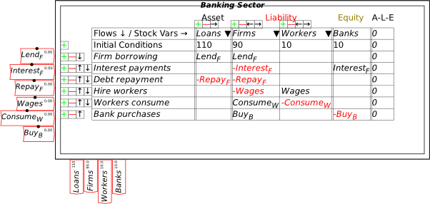
One thing Russell Standish and I have focused upon in designing Minsky is enabling quality documentation of a model by Minsky itself. This includes the capacity to export a Table in either CSV or LaTeX format, via the “Export to File” option on the right-click menu (and also on the file menu from within a Godley Table window). Figure 112 shows the LaTeX output for the Table in Figure 111.
Figure 112: A screenshot of the LaTeX rendition of a Godley Table
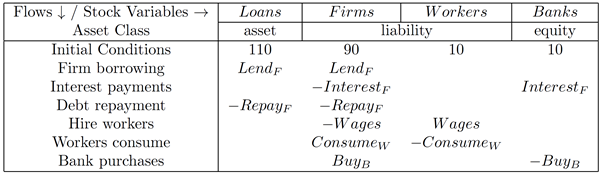
-
Defining the flow elements of a Godley Table
The Godley Table itself clarifies issues in monetary economics, even without a simulation—especially when it is linked to other Godley Tables in an integrated model. But it also makes the modelling of monetary dynamics so much easier than with flowchart programs, as noted above.
To turn a Godley Table into a model, the flows in it have to be defined on the canvas itself, using the same flowchart logic as in the previous section. There are two ways to get the stock and flow variables in a Godley Table onto the canvas: individually, by right-clicking on the flow or stock variables attached to either the icon (Figure 109) or the table (Figure 111); or by right-clicking on the table and choosing “Copy Flow Variables” and “Copy Stock Variables” commands which copies all the relevant variables at once. Figure 113 shows the canvas after they have all been copied.
Figure 113: All the stock and flow variables from a Godley Table copied to the canvas
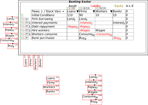
How you define a model is up to you, but you can only define it using the variables and stocks you currently have, or transformations of them—so if you want to define investment flows in a model as a function of capacity utilization, for example, or the wage level as a function of the level of employment, then you need to add those variables to your system. Here I’ll just demonstrate defining a model from the elements of the Godley Table itself.
The simplest flow to define is InterestF, which is the rate of interest on loans multiplied by the current level of Loans. In Figure 114 I add a new parameter, rLoansF, for the rate of interest on loans to firms, multiply that by the stock variable Loans, and this defines InterestF (I have also shrunk the Godley Table using its bounding box arrows).
Figure 114: Defining interest payments (without hitting the “Recalc” button before exporting the figure)
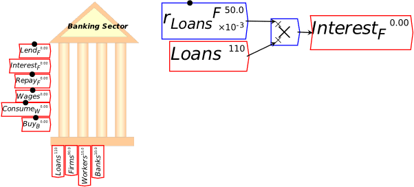
To define the other flows, I use the mechanism I explained earlier in these models—the first-order time lag. As well as being useful to define a lagged variable, such as lagged inflation as a function of the actual rate of inflation, it can be used to explain a flow as a time-based response to a stock. For example, the level of repayment of existing debt will be roughly proportional to the current level of loans—it can be a large proportion or a small one, but there will be some proportionality. This could be done using a simple scalar—say, for example 10%, so that 10% of loans are repaid every year, as in Figure 115.
Figure 115: Repayment modelled using a repayment rate (after hitting the “Recalc” button)
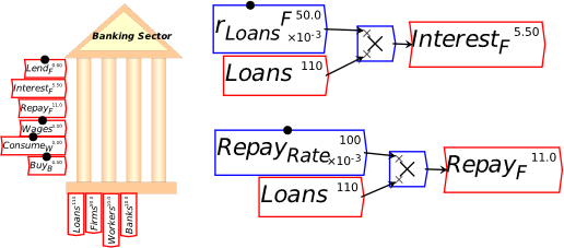
I prefer to use a time constant instead, because then the value of the time constant is easily understood in terms of the time dimension of the model. If I give that time constant a value of 10, as in Figure 116, then I get the same numerical result as in Figure 115, but the number 10 stands for the number of years it would take to reduce the debt to zero if this rate of repayment were sustained.
Figure 116: Using a time constant instead for the rate of debt repayment
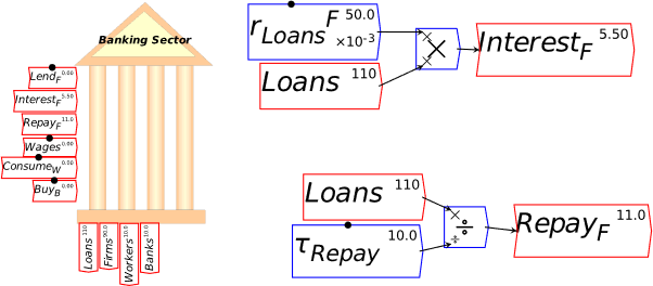
A similar definition for the rate of new lending tells you how long this rate of lending would take to double the debt—see Figure 117, where I’ve also copied the model’s parameters to the top of the canvas, where they can be varied easily during a simulation.
Figure 117: Lending also with a time constant, plus copying parameters into a “control panel”
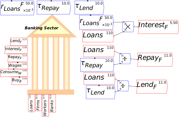
This simple model, without any physical output or price component, needs a definition of GDP as well in terms of financial flows only. We can’t just add up consumption and investment using this model, because the only non-financial flows in it are Wages as the income of workers, and consumption by workers (ConsumeW) and bankers (BuyB): there’s no definition of profit as the income of capitalists, nor is there any definition of investment—which involves capitalists buying from other capitalists, and is therefore subsumed within the single column for the Firm sector. So, given how this simple model is constructed, investment—as well as profit, and consumption by capitalists—doesn’t appear at all, and it therefore has to be inferred as a residual.
My approach in these simple models (without an integrated model of the physical economy as well) has been to take a leaf out of Das Kapital—specifically, Volume II, Chapter 7, “The Turnover Time and the Number of Turnovers”:
We have seen that the entire time of turnover of a given capital is equal to the sum of its time of circulation and its time of production. It is the period of time from the moment of the advance of capital-value in a definite form to the return of the functioning capital-value in the same form. (Marx and Engels 1885)
In this model, GDP is derived from the amount of money in the Firm sector, and its turnover rate:
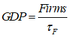
This equation, in flowchart form, is highlighted in grey in Figure 118.
Figure 118: GDP as the turnover of money per year in the firm sector
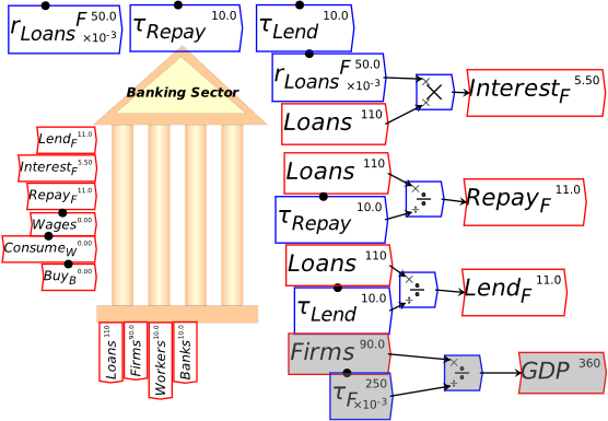
With GDP defined this way, inter-firm spending (which in this simple model, includes investment and consumption by capitalists, since I haven’t separated out capitalists as a different financial entity to Firms in this model) is the residual between GDP and wages. This residual includes profits, dividends, etc.—again, aspects of a capitalist system that you could explicitly model in a more elaborate model.
I also use a very simple assumption to determine wages: I make the distribution of income a parameter, so that of GDP goes to workers and goes to capitalists as gross profit, with this minus interest payments being net profit (in an integrated physical-monetary economy model, wage determination would be driven by bargaining power, as in the Goodwin model).
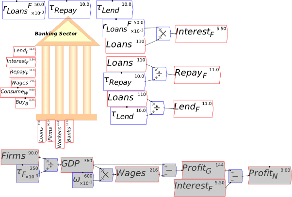
This leaves consumption by workers and bankers to be defined. You could, of course, make a “Kaleckian” assumption that workers simply consume their wages, and equivalently, that bankers spend their interest income. For the sake of illustration, I’ll do that first (in Figure 119), and compare the results to a model with time constants, based on the amount of money in the workers’ and bankers’ accounts.
Figure 119: “Kaleckian” assumptions on consumption by workers and bankers
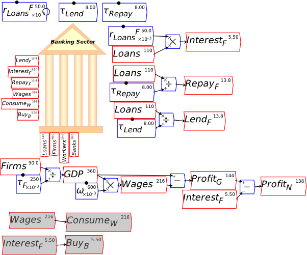
This Kaleckian assumption effectively making workers and bankers passive parts of the system, rather than active parts: whatever they receive as Wages ($216/Year) or Interest ($5.50/Year) goes out as consumption. On the other hand, if you base spending upon the amounts in their bank accounts, divided by time constants that reflect the fact that workers are living close to “hand to mouth” whereas bankers have large buffers compared to their spending, then you have a small time constant for Workers and a large time constant for Bankers. Changing the distribution of income between workers and bankers will therefore change the amount turning up in the Firms account, thus changing GDP.
Figure 120: Consumption based on time constants
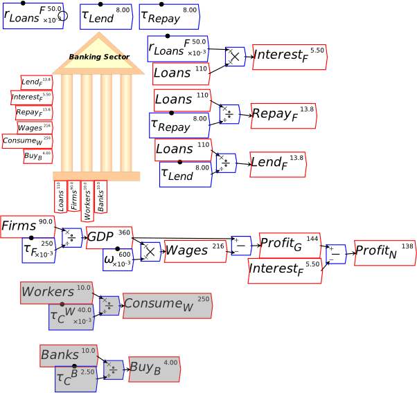
Figure 120 also shows the advantages of dividing by a time constant to define a flow, rather than multiplying by an equivalent constant. The value for the time constant tells you how long, in fractions of a year, that the social class could consume before running out of money: 1/25th of a year for Workers (otherwise known as a fortnight), 2.5 years for Bankers. The size of the time constant is readily interpreted as an indicator of the relative income and wealth of the two social classes.
Figure 121 illustrates the impact of varying the time constants in the model. If the time constant for lending is smaller than that for repayment, then there is net debt and money creation by the banking sector, and GDP rises. If repayment is faster than new lending, then there is net money destruction and GDP falls. Changes in the workers’ time constant have more impact than changing that for bankers—workers spend their accounts much more quickly than bankers, because they have to. So though their bank accounts are the same size in Figure 121, workers generate far more spending than do bankers ($250/Year versus $4/Year).
Figure 121: Varying time constants for lending, repayment, worker & banker consumption
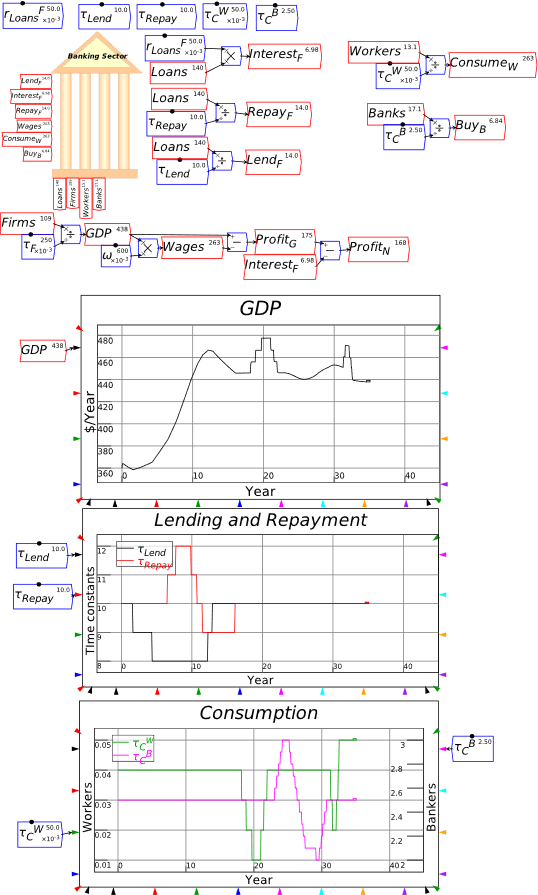
By using the “Editor Mode” display of the Godley Table, and choosing “Godley Table Show Values” from the Preferences form of the Options main menu (see Figure 122), you can see the amounts passing between the accounts in this model in the Godley Table itself—see Figure 123.
Figure 122: The Preferences form from the Options menu
Figure 123: Editor Mode display with numerical values shown in the Godley Table
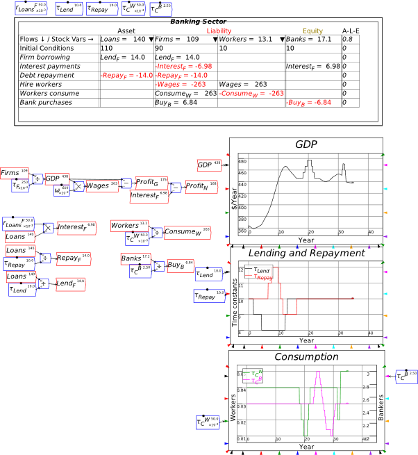
The last step in putting together a comprehensive model is to show the financial system from the point of view of Firms and Workers, as well as from the Banking sector. To do this, insert two more Godley Tables on the canvas, label one Firms and the other Workers, and then use the down-arrow on the columns (
 ) to search for Liabilities that haven’t yet been defined as Assets, and vice versa. The Firm sector has one Asset—its deposit account Firms—and one Liability—Loans. When these are added to its Godley Table, Minsky automatically fills in the rows where there are already operations on both accounts (LendF and RepayF), while leaving those where there is an operation on one but not the other unbalanced: the sum of shows the flow that hasn’t yet been allocated to an account—see Figure 124.
Figure 124: The Firm sector’s Godley Table with Assets & Liabilities added
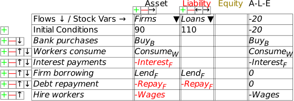
To fully specify the model, you need to define an Equity column for the Table. I used FirmE as the name for “Firm Equity” and made the matching entry needed so that on every row—see Figure 125. In this simple model, all those entries go in the Equity column, but that isn’t necessarily the case in a more complex model. You might, for example, have CashW as an asset of the Workers, so that withdrawing money from the Banking sector reduced the Workers’ deposit account (Workers) and increased their cash account CashW, without altering their Equity.
Figure 125: The model from the Firm sector’s point of view
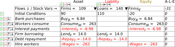
Figure 126 shows the complete model, with all accounts recorded in the respective Godley Tables.
Figure 126: The complete model, which is still very simple, with financial dynamics only
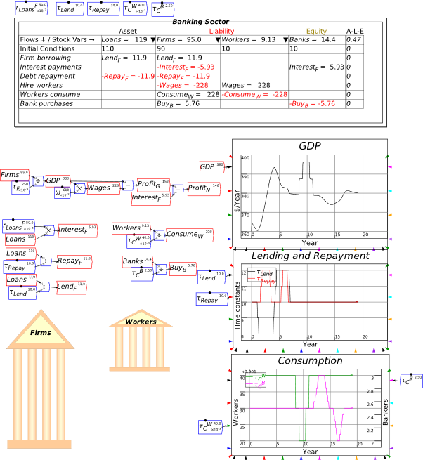
-
Getting creative with Godley: Modelling the pandemic
Godley Tables were developed to enable monetary modelling, but that’s not all they can do. The basic idea that Wynne Godley himself based his modelling on—that “all financial flows start somewhere and end somewhere”—makes it feasible to use Godley Tables to model processes where there is an exclusive transfer from one location to another.
One highly relevant instance of this is the Covid-19 pandemic. You either have Covid or you don’t; you’re either in hospital, or you aren’t: the various positions someone can be in with respect to the disease are mutually exclusive categories, and if you enter one category, you leave another.
I used this to build a simple model of a pandemic—known as a SIR model, where the acronym stands for SusceptibleàInfectedàRecovered—which I’ll explain in a moment. Subsequently, a supporter of mine on Patreon, Tyrone Keynes, developed an incredibly sophisticated model of the pandemic, which really shows the power of Minsky and its Godley Tables in system dynamics modelling. I’ll showcase Tyrone’s model after I’ve explained the simplest possible model.
In the simplest possible model, you’re either Susceptible but not Infected, Infected, or Recovered; in a slightly more complicated but highly relevant model, there’s a 4th option—Dead.
This basic pattern is easily implemented in a Godley Table. Create a Table with 5 columns: N for the population—which is assumed to be constant, since the human population grows much more slowly than the disease spreads, and make this the Table’s sole Asset. Record as Liabilities, S for susceptible—which initially is almost everyone in the population; I for Infected—which is equal to the population minus those susceptible; and D for Dead—which starts at zero. Show R for Recovered as the model’s Equity—which also starts at zero.
Then define flows between each of the possibilities: Catch for getting the disease; Recover for Recovering; and Die for dying. Put in initial conditions—which, as in any monetary model, must sum to zero using the A-L-E rule—and you have the structure for a basic model.
Figure 127: A basic SIRD model in Minsky
 Minsky automatically generates the differential equations for this model:
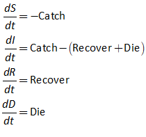
The next stage is to define each of the flows: , , and .
The key logical assumption in a simple pandemic model is that the percentage of the population that will catch the disease at any point in time is a function of the percentage of the population that is susceptible to it at that point in time . The simplest function is a parameter times that fraction. So the initial equation for the growth of the pandemic is:
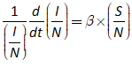
Because the pandemic grows so much faster than the population, can be treated as a constant. That enables the N on the left hand side of the equation to be cancelled:
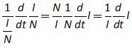
The equation for the percentage rate of growth of infections is then:

The equation for is therefore:
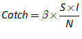
The equations for recovery and death are defined using simple constants, but to take advantage of the system dynamics framework, I’m using a “time constant” for the duration of the disease. In Figure 128 I have set the infectious parameter to 0.5, to 14 days, and the fatality rate to 5%. The characteristic “pandemic wave” with which we have become all too familiar since 2020 shows up in the plots.
Figure 128: A simple SIRD model of a pandemic in Minsky
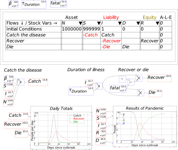
This simple model is more representative of a disease in an animal population where there is no coordinated response to the pandemic itself. Of course, in our human civilization, a huge diversity of responses were tried, to varying degrees of both success and compliance: “social distancing”, mask mandates, lockdowns, travel restrictions, etc. This is where Tyrone Keynes’s model comes in.
It has not a mere 5 system states, as in the model in Figure 128, but 25 states, and numerous policy settings that can be varied dynamically as the model runs. The imposition and premature release of these controls generates the characteristic multiple waves that we have seen in our real world Covid experience, strongly suggesting that it was this very on-again, off-again public policy process that generated the waves. As the pandemic and complex systems control expert Yaneer Bar-Yam argues on https://www.endcoronavirus.org/, the only way to successfully fight a pandemic is to react too soon, to over-react, and to not remove controls until cases have fallen to zero.
A major motivation in designing Minsky was to produce a tool by which policymakers could learn lessons like these “in silicon” before confronting them in the real world. Tyrone’s model is a superb example of how models like this could be constructed in Minsky, so that the policymakers could learn how to manage real world crises before they occur in the real world.
Figure 129: Tyrone Keynes’s pandemic model with varying policy controls over time
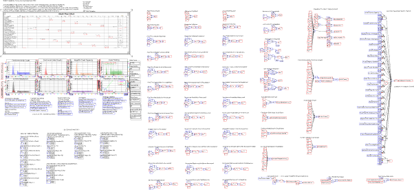
I hope that’s enough background to enable you to use Godley Tables in your own modelling. Now let’s use Minsky to show why, when it comes to money, Paul Krugman doesn’t know what he’s talking about.
-
A Keen Rant: Using Minsky to Revisit the Keen-Krugman Debate
Almost a decade ago now, Paul Krugman gave me a birthday present, by citing me in his New York Times column on March 27th, 2012.
Entitled “Minsky and Methodology (Wonkish)”, the post began as any birthday present should—it was very nicely wrapped:
Figure 130: The opening to Krugman’s first post
Unfortunately, once I opened the present, it was all downhill. He wrote a series of seven posts, ending with “Oh My, Steve Keen Edition”, whose final line was “Nick [Rowe] uses a four-letter word to describe this; I can’t, because this is the Times.”
In between the nice introduction and the derogatory denouement, there was something that is far too rare in economics today, a “debate” between opposing schools of thought in economics over a fundamental issue. I put “debate” in inverted commas because we never spoke, and while I read his posts, he didn’t read mine. But the juxtaposition of opposing views was something that rarely happens in economics, so in that sense, it qualifies as a debate.
The topic of the debate was “Do banks, debt and money matter in macroeconomics?” Krugman’s position was “No” back then, and it’s still “No” today: in the 2021 promotional video for his Masterclass on economics, he says “It’s about people. It’s not about money”.
Figure 131: Screenshots from Krugman’s promotional video
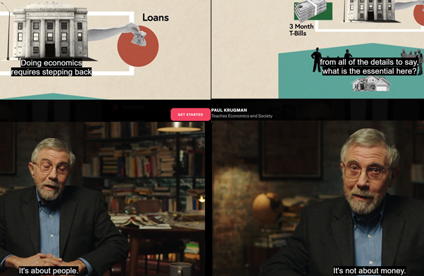
Yes it is (also) about money, as I’ll now explain using Minsky. Firstly, here are the substantive parts of Krugman’s first post in 2012, where he set out very well the basic assumptions of the “Loanable Funds” model of banking. I’ve highlighted the key passages in italics:
I always try to find the simplest representation I can of whatever story I’m trying to tell about the economy. The goal, in particular, is to identify which assumptions are really crucial — and in so doing to catch yourself when you’re making implicit assumptions that can’t stand clear scrutiny.
Keen doesn’t seem to be doing that. His paper contains a number of assertions about what is crucial, without much explanation of why these things are crucial. And I guess I just don’t see it.
In particular, he asserts that putting banks in the story is essential. Now, I’m all for including the banking sector in stories where it’s relevant; but why is it so crucial to a story about debt and leverage?
Keen says that it’s because once you include banks, lending increases the money supply. OK, but why does that matter? He seems to assume that aggregate demand can’t increase unless the money supply rises, but that’s only true if the velocity of money is fixed; so have we suddenly become strict monetarists while I wasn’t looking? In the kind of model Gauti and I use, lending very much can and does increase aggregate demand, so what is the problem?
Keen then goes on to assert that lending is, by definition (at least as I understand it), an addition to aggregate demand. I guess I don’t get that at all. If I decide to cut back on my spending and stash the funds in a bank, which lends them out to someone else, this doesn’t have to represent a net increase in demand. Yes, in some (many) cases lending is associated with higher demand, because resources are being transferred to people with a higher propensity to spend; but Keen seems to be saying something else, and I’m not sure what. I think it has something to do with the notion that creating money = creating demand, but again that isn’t right in any model I understand. (Krugman 2012b. Emphasis added)
The key technical issue here is what do banks do? According to Krugman, banks take in deposits from some customers, and lend them out to others:
If I decide to cut back on my spending and stash the funds in a bank, which lends them out to someone else, this doesn’t have to represent a net increase in demand…
This is not, of course, what banks actually do, as we now can state with the authority of the Bank of England:
This article explains how the majority of money in the modern economy is created by commercial banks making loans. Money creation in practice differs from some popular misconceptions — banks do not act simply as intermediaries, lending out deposits that savers place with them, and nor do they ‘multiply up’ central bank money to create new loans and deposits. (McLeay, Radia, and Thomas 2014. Emphasis added)
But it’s worth putting Krugman’s misconception into Minsky to show that, if Neoclassicals were right about what banks do, then they would also be right to ignore banks in their macroeconomic models.
Fundamentally, as the Bank of England notes, Neoclassicals believe that banks act “simply as intermediaries”. I call it the “Ashley Madison theory of banking”—see Figure 132 if you haven’t heard of Ashley Madison before.
Figure 132: Ashley-Madison as an intermediary

Ashley Madison doesn’t actually provide sex: instead, it lets men who want sex find women who want sex, and charges a fee for the introduction service. Similarly, in the Neoclassical mind, banks don’t actually provide money: instead, they let people with more money than they need at the moment (savers) meet people with less money than they need (borrowers). The savers lend money to the borrowers, and the bank charges a fee for the introduction. No money is created because of the new debt—just ask Paul Krugman:
Think of it this way: when debt is rising, it’s not the economy as a whole borrowing more money. It is, rather, a case of less patient people—people who for whatever reason want to spend sooner rather than later—borrowing from more patient people. (Krugman 2012a, pp. 146-147. Emphasis added)
The easiest way to model what Krugman—and all Neoclassicals, with almost the sole exception of the Bank of England economist Michael Kumhof—think banks do, is to model the literal case of savers lending money directly to borrowers, through the deposit facilities provided by banks. Figure 133 shows the banking sector’s view of that person-to-person case, where the “less patient people” are factories, and the “more patient people” are rentiers who both invest in and lend to factories. The bank has only one asset—Reserves, which match the sum of the deposits of Impatient people, Patient people and Workers, plus the Banking sector’s Equity. The first four rows show financial operations—lending, paying interest, repaying debt, and paying the bank’s “intermediation” fee. Then we have paying wages to workers, which enables production; dividend payments to shareholders (those “patient people” again), and finally consumption of the output of the factories managed by the “impatient people” by “patient people”, workers and bankers.
Figure 133: Patient lends to impatient via the banking system
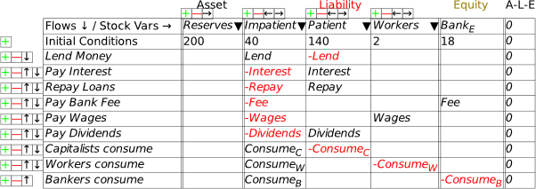
Notice that while lending shows up in the banking sector’s Godley Table, the actual debt owed doesn’t, because in this model, the debt is not an asset of the banking sector: instead, it’s an asset for the “Patient” people and a liability for the “Impatient” people. So to see the debt itself (which I labelled as “Loans” in this model), you have to create additional tables for Patient, Impatient and Workers. Figure 134 shows all the Godley Tables in this model—as noted in the chapter on Godley Tables, all you have to do is create a new table and then use the down-arrow on the columns (
 ) to search for Liabilities that haven’t yet been defined as Assets, and vice versa.
Figure 134: All the Godley Tables for “Patient to Impatient” lending
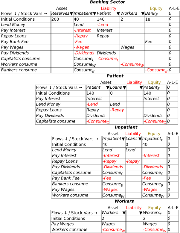
To complete the model, I made very similar definitions to the model developed in Figure 126—see Figure 135. The main differences are that Krugman’s silly “Impatient” term takes the place of the Firm sector there.
Figure 135: The definitions of flows in the Loanable Funds model
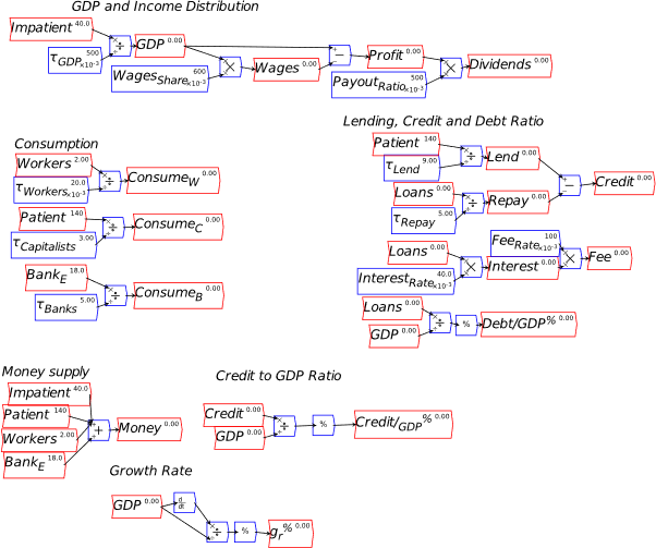
With those definitions made, the model can be run, and the parameters that control lending and repayment varied while the model runs, to see the impact of higher and lower levels of credit and debt on this toy economy. While there clearly is some impact, some things don’t change: as Krugman put it himself, “when debt is rising, it’s not the economy as a whole borrowing more money”: changes in debt have no impact on the money supply. There are variations in GDP and incomes as a result of the variations in the time constants for lending and repayment, but they are both minor and transient. If this model described the real world accurately, then it would make sense to leave banks, debt and money out of macroeconomics. To cite Krugman once more:
“I’m all for including the banking sector in stories where it’s relevant; but why is it so crucial to a story about debt and leverage?” (Krugman 2012b)
Take a minute to savor this statement. If anyone scoffs at the assertion that mainstream economists don’t understand banks, debt and money, just show them this gem.
Anyway, to answer his question, we have to take account of the real-world situation that banks lend to non-banks, so that Loans are an asset of the Banking Sector, and not of “Patient People”. Before I show how to do this, note one aspect of Figure 136: given the parameters in the model, a higher debt to GDP ratio is associated with a lower GDP—see the Income and Debt/GDP plots on the right hand side of Figure 136.
Figure 136: Dramatic changes in Debt/GDP, minor transient changes in GDP
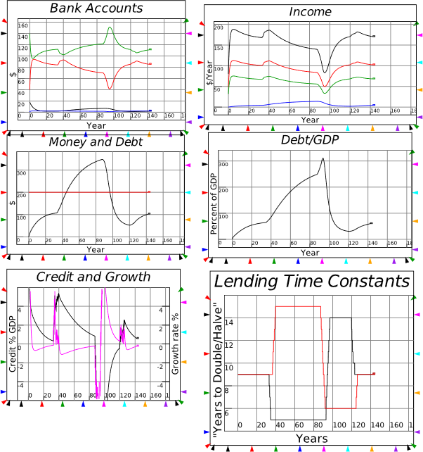
To change this model so that Banks, rather than “Patient People”, lend to “Impatient People”, you have to:
-
Shift the Loans column from Patient’s Godley Table to the Bank’s;
-
Delete the financial operations on the Patient Godley Table: the first three rows for Interest payments, lending and repayment all go, leaving just two rows—receiving Dividends and consuming;
-
Make room for a new Asset on the Banking Sector Godley Table by clicking on the green plus icon below the Asset label;
-
Click on the


, which will show Loans as a Liability that hasn’t yet been classified as an Asset (when you delete the Loans column from Patient’s Godley Table, Loans remains in the model as a Liability of Impatient), and select Loans;
-
Minsky then brings across the two operations that affect Loans, Lend and Repay;
-
The Banking sector Godley Table will still show Interest as a transfer out of Impatient’s account, but it doesn’t go anywhere; Type “Interest” into the BankE column, to show that interest payments increase the (at-call) equity of the banking sector.
That’s it: strictly speaking we should also change how lending is determined, since the Loanable Funds model shows lending as being based on amount of money in Patient’s deposit account, but this is enough to see if this simply structural change to the model—as opposed to a behavioural change—has any impact on the dynamics.
Figure 137: Altering the Godley Tables of Loanable Funds to fit the real world
You bet it does: see Figure 138. Debt creates money, so the money supply rises when debt rises, and falls when it falls; a rising debt to GDP ratio is associated with a rising GDP (and the obverse for falling debt); credit growth, which was out of synch with GDP growth in the Loanable Funds model, now parallels—and in fact causes—the growth of GDP. We are in a completely different world to the Neoclassical model of loanable funds—and it happens to be the real world we actually inhabit. Loanable Funds is a misleading fantasy.
Figure 138: Dramatic changes in Debt/GDP, dramatic changes in GDP
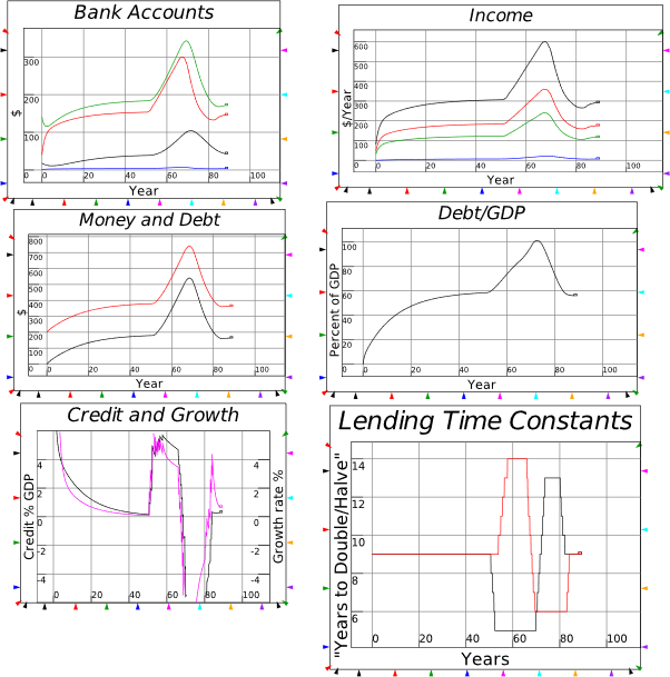
So too are all the models that go with it—especially the model of “Fractional Reserve Banking”. Here Mankiw’s Macroeconomics textbook gives a good outline of the fantasy. It starts with banks as just warehouses for deposits:
We begin by imagining a world without banks. In such a world, all money takes the form of currency, and the quantity of money is simply the amount of currency that the public holds. For this discussion, suppose that there is $1,000 of currency in the economy.
Now introduce banks. At first, suppose that banks accept deposits but do not make loans. The only purpose of the banks is to provide a safe place for depositors to keep their money.
The deposits that banks have received but have not lent out are called reserves. Some reserves are held in the vaults of local banks throughout the country, but most are held at a central bank, such as the Federal Reserve. In our hypothetical economy, all deposits are held as reserves: banks simply accept deposits, place the money in reserve, and leave the money there until the depositor makes a withdrawal or writes a check against the balance. This system is called 100–percent–reserve banking. (Mankiw 2016, p. 89. Emphasis added)
Mankiw displays this using a T-Account:
Figure 139: Mankiw’s model of Full Reserve Banking
| Firstbank’s Balance Sheet |
| Assets |
Liabilities |
| Reserves |
$1,000 |
Deposits |
$1,000 |
When Mankiw introduces lending, it is lending from reserves:
Now imagine that banks start to use some of their deposits to make loans… The banks must keep some reserves on hand so that reserves are available whenever depositors want to make withdrawals. But as long as the amount of new deposits approximately equals the amount of withdrawals, a bank need not keep all its deposits in reserve. Thus, bankers have an incentive to make loans. When they do so, we have fractional–reserve banking, a system under which banks keep only a fraction of their deposits in reserve. (Mankiw 2016, pp. 89-90)
Mankiw then shows the bank as lending out 80% of its reserves:
Figure 140: Mankiw’s model of Fractional Reserve Lending
| Firstbank’s Balance Sheet |
| Assets |
Liabilities |
| Reserves |
$200 |
Deposits |
$1,000 |
| Loans |
$800 |
|
|
Let’s compare this model of banks to what banks actually do, in Minsky—see Figure 141.
Figure 141: Comparing actual banking with the Fractional Reserve Banking Model
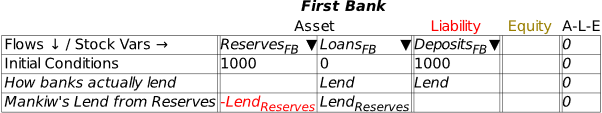
The first line shows what banks actually do to make a loan: they add an amount to the borrower’s deposit account, and simultaneously record a debt by the borrower to the bank for precisely the same amount. Lending creates deposits directly, which is creating money directly—there’s no need for the iterative process alleged in the Fractional Reserve Banking model.
The second line shows the first stage of Fractional Reserve Banking model, but it is clearly incomplete: it shows a transfer of Assets from Reserves to Loans, but where is the money for the borrower?
The only way to show the loan actually giving money to the borrower is if the loan is in cash: the borrower walks out of the bank with a debt to the bank as shown in Figure 141, and an equivalent amount of cash, as shown in Figure 142.
Figure 142: Completing the first round of Fractional Reserve Banking
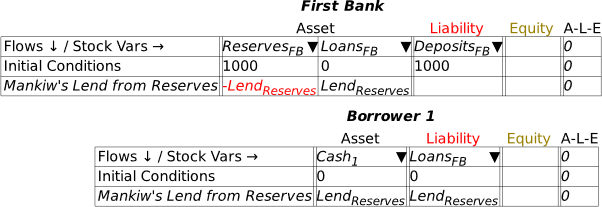
This alone is enough reason to reject the model: it’s very easy to say “use some of their deposits to make loans” as Mankiw does, but when one models what that means in strict double-entry format, lending from reserves only works if all loans are in cash. In the real world, almost all loans are made by crediting a deposit account.
So why do Neoclassicals stick with an unrealistic and complicated model, in place of a realistic and simpler one? Because with the more complicated model, they can ignore banks and money and debt in their macroeconomics, and claim that the money supply is controlled by government policy—government reserve creation times the “money multiplier”—rather than determined by bank lending. In part, this is ideology disguised as science, but it’s also the standard reaction of a discipline to a discovery that contradicts a core belief. As the physicist who discovered quantum mechanics put it:
“a new scientific truth does not triumph by convincing its opponents and making them see the light, but rather because its opponents eventually die, and a new generation grows up that is familiar with it.” (Planck 1949, pp. 33-34)
Krugman’s reaction to the Bank of England report that rejected these textbook models is par for the course here. The Bank of England paper said nothing that hadn’t been said by many non-mainstream economists in the previous five decades (Moore 1979, 1988a; Graziani 1989; Holmes 1969), but it said it with the authority of a body that Neoclassical economists could not ignore:
The reality of how money is created today differs from the description found in some economics textbooks:
- Rather than banks receiving deposits when households save and then lending them out, bank lending creates deposits.
- In normal times, the central bank does not fix the amount of money in circulation, nor is central bank money ‘multiplied up’ into more loans and deposits. (McLeay et al. 2014a, p. 1. Emphasis added)
Pretty definitive, right? So how did Krugman react to it? See Figure 143:
Figure 143: Krugman’s reaction to the Bank of England paper
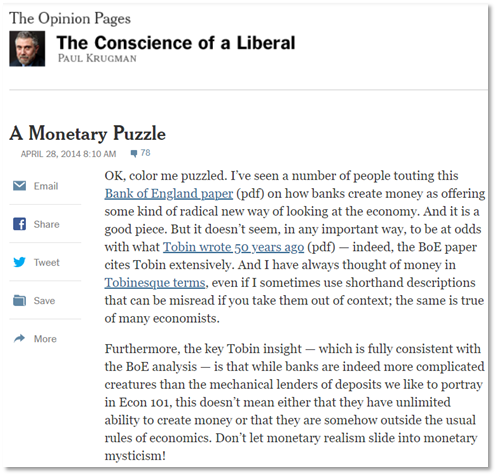
That reaction can be summarized as “I’ve read it. So what?”. He did not even consider that he should model what this meant for money creation, let alone macroeconomics as a whole. The same applies to Mankiw, whose textbook post-dates the Bank of England paper, and yet repeats the myths that the Bank of England debunked.
In a moment, we’ll leave these barter mystics behind, and consider the actual macroeconomics of money. But beforehand, I want to cover one important point: though all the Minsky models I’ve shown to date have been either pure “Godley Table” models, or pure flowchart models, it’s quite easy to mix the two—thus letting Godley Tables handle the monetary dynamics of a model economy, and the flowchart cover the physical dynamics.
-
A Mixed Godley Table-Flowchart model
In all the models to date, I’ve either used the Godley Tables to lay out the system’s dynamics, as in Figure 134, or a flowchart, as in Figure 104. In every Figure between Figure 121 and Figure 138, the flowchart components were used to define variables in the Godley Table itself, while the Godley Table generated all the differential equations that power the model.
But this is done just for convenience. It’s quite easy to combine a model of mixed monetary and physical dynamics. I’ll illustrate this starting from a simple Godley-Table-only model, as illustrated in Figure 144.
I’ve copped a fair bit of criticism (on YouTube and social media) for the part of this model highlighted in Figure 144: the determination of GDP by turnover of money in the Firm sector’s bank account, and then also profits and wages.
Figure 144: A pure Godley Table model with money turnover assumptions determining GDP, Profits and Wages
For the record, I don’t think this is how capitalism actually works: this is just a genuine simplifying assumption to allow me to ignore the physical economy and concentrate on monetary dynamics, which—thanks to the ignorance of Neoclassical economists and the fervency of other ideologues—remains an area of great contention in economics today. Of course, Neoclassical economists get the physical economy wrong as well, with their fetish for equilibrium, and an unrealistic “production function” (the “Cobb-Douglas”) that is both tautological where it’s right, and delusional where it’s wrong. In practice, I want to encourage economists to build mixed monetary-physical economy models (with ecological linkages as well—see Chapter 10, starting on page 193). So let’s see how, using my model of Minsky’s Financial Instability Hypothesis.
Figure 145 shows this model. The physical output part of the model—the flowchart components directly below the Godley Table—reproduce Goodwin’s model. The monetary components—borrowing and debt repayment, interest, wages and consumption—are added via the Godley Table for the banking sector. The key factors I added to Goodwin’s model to reproduce Minsky’s Hypothesis were an investment function in place of Goodwin’s assumption that all profits were invested, and debt financing investment in excess of profits. This was easily modelled by the combined actions of the Godley Table, where the Debt column has entries and :
And some of the flowchart elements highlighted in the Figure which equate borrowing to gross investment and profits to debt repayment:

Done in this way, the crucial role of the endogeneity of money in Minsky’s Hypothesis is obvious: since loans create deposits, the act of borrowing to finance investment expands both the money supply and aggregate demand.
Figure 145: Using a Godley Table in the Keen-Minsky model
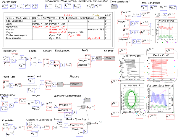
I’ve added one tiny feature to the model as well, using a switch to make it an option in running the model. In the original model, the role of consumption is effectively ignored, with workers’ consumption equalling wages and bank spending equalling interest. That is the default shown in Figure 145, but if the parameter Is set to 1, consumption is instead based on the money in Workers and Banks, divided by a time-constant:
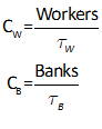
This is to address one criticism I’ve also heard of the model, and which is surely reproduced in some academic papers somewhere, that it is a “supply driven” model, rather than a demand driven one.
Hello? The driving force in the model is the investment function, and since when was investment not a component of aggregate demand? The element that is missing from the original model (Keen 1995) was any model for consumption, so that consumption was the residual variable—since the model determined both investment and output.
The capacity to base consumption on a time constant in this model is a simple step towards modelling both investment and consumption. This necessarily means that the residual variable is now something not modelled here: unsold stocks, since with investment, consumption and output determined, the free variable will be unsold stocks. Price dynamics are also absent—though they can easily be added.
Now let’s turn to the key issue for which Minsky was designed: to allow the easy analysis of monetary dynamics in a capitalist economy.
-
Money
My main motivation for inventing Minsky was to enable proper modelling of money. Since then, Modern Monetary Theory (MMT) has risen to prominence, and Minsky is ideally suited to analyzing the claims and counter-claims made about MMT. The core claim is that government spending precedes taxation: that rather than having to tax to be able to spend, governments create money first by spending, and tax it back later.
One of the best ways to illustrate this is to take a situation where there was no monetary system, and have money introduced. As Graeber (Graeber 2011) emphasized, this was not what normally happened in history—the assumption first enunciated by Smith that barter was the rule before money was introduced is a myth. But there are instances where one political system has collapsed, and the monetary system with it, followed later by the development of a new monetary system in the context of forging a new political system. The legal scholar Christine Desan identified instances of this in England after the collapse of the Roman Empire:
The new narrative explains how each of the capacities associated with money—its function as a unit of account, mode of payment, and medium of exchange—is, at base, a mode of governing. The unit of account, first, arises when a stakeholder takes something that is not fungible—the in-kind service owed by individuals or families—and marks it with a token. Accounts that rely on the “convergence story” of money’s creation often simply assume the existence of a unit of account because it is so difficult to understand how people who are engaged only in bipolar exchanges can create a term for value that is shared among them all. But establishing a unit of account is a critical accomplishment that demands an explanation. The capacity of an object to furnish homogeneous comparative terms—a unit of account—to evaluate other objects supplies the terms for “counting” value, i.e., price. That unit is used both as the basis of accounting systems and as the metric into which circulating coin or currency can be converted. Once we admit the agency of a stakeholder common to those engaged in bipolar exchanges, the accomplishment becomes intelligible.
In early medieval England, rulers chose to make the basic unit of account—the penny—out of silver. That choice gave silver a price. For example, a weighed pound of silver of specified fineness might be exchanged for 230 pennies at the mint—the “mint price” received when an individual took that amount of bullion in to be coined. The mint made perhaps 242 pennies out of the bullion, kept 12 for the moneyer and the king, and returned the remainder. The “price” of silver was tied, by definition, to the value of the tribute or tax obligation: pennies made by the mint were the tokens used by the king to pay for resources advanced to him. At the time the tax was due, each penny carried value towards extinguishing the tax obligation.
Note that without violence to that reality, observers could assume that coin expressed the value of the silver it contained: at tax time, the arrangement itself identified the value that a penny held for extinguishing the fiscal obligation with the value of silver. In fact, we might say that the silver coin had become a material proxy for the tax obligation. (Money therefore also furnished a “store of value,” another function often attributed to money.) It was not, however, the content of coin that gave it a priced value, but the system that made coin into money. (Desan 2015, p. 58)
Desan singled out the example of the 8th century King of Mercia, Offa, whose coinage was particularly well designed—see Figure 146.
Figure 146: A silver penny from Offa’s reign

The main aspect to the design wasn’t the art on the coin itself, but the role of the coin in defining the Kingdom itself: what once were payments-in-kind to the King became payments in coin, while the coin came to be used in person-to-person trade in the Kingdom as well:
in-kind payment of rents began to be converted in part into cash payments during the 8th century, a trend that would continue in later centuries, and the late 8th century Mercian king Offa extended tribute obligations to virtually “everyone” in his territory… tokens clearly acted as a “mode of payment” to the government when they were returned in lieu of tribute or other obligation. As we saw above, the tokens invited use as a mode of payment in private deals as well. (Desan 2015, pp. 57-59)
The first fully-fledged Minsky model in Manifesto simulates this “ab initio” creation of a monetary system.
-
Modelling the Origins of Fiat Money in Minsky: pp. 33-39 of Manifesto
File: http://www.profstevekeen.com/wp-content/uploads/2021/05/Figure03DesanOffaCoins-1.mky
To create a monetary system based on coins, firstly you have to create the coins. Assuming that the King starts with enough silver to make the initial coins, the most sensible entity to start with is the authority he directs to make the coins, The Mint.
The steps in this process are:
-
The Mint creates the coins;
-
The Mint gives the coins to the Treasury;
-
The Treasury spends the coins to procure goods from lords and peasants, where the purchase replaced the pre-monetary practice of compulsory acquisition at the point of a sword (the in-kind payment of rents noted by Desan above);
-
The coins are then used by lords to pay peasants to produce output, which is sold to both lords and peasants, and the government (this is a bit of a fiction: back in the 700s, peasants were indentured to their feudal lords, but it’s for the purposes of illustration); and
-
Finally, coins are taxed from the lords and peasants by the Treasury.
Figure 147 shows these steps in The Mint’s Godley Table.
Figure 147: The Mint’s view of King Offa’s establishment of a monetary economy
As I note in Manifesto, Godley Tables don’t show actual coins, but are an accountant’s record of where the coins are at some point in time (the stocks called CoinsMint, CoinsTreasury, etc. in Figure 147), and the rate at which they’re moving from one account to another per year (the flows called MintCoins, SpendPeasants, etc., in Figure 147):
Think of the entries as records in a spreadsheet file, rather than the things themselves, whether these be grams of gold in a vault, penny coins in your pocket, or electronic dollars stored in a bank database. (Keen 2021, p. 27)
This “spreadsheet” shows the distribution of coins from the Mint’s point of view. Once you have defined it, it also tells you how many more tables you need to complete the model: three, one each for the Liabilities of the Mint. Figure 148 shows the model after those three tables have been created, but before they are populated with stocks and flows by using the 
 tool in each table to identify Liabilities that haven’t yet been defined as Assets.
Figure 148: Introducing Godley Tables for the other 3 entities in the model
The Treasury has both the Asset of CoinsTreasury, and the Liability of CoinsMint (the Mint’s Asset has to be a Liability for another entity in the model). If you open the Treasury Godley Table, and use the 
 tool on both the Asset and Liability side of its ledger, you will generate the table you see in Figure 149:
Figure 149: The Treasury’s Godley Table after allocating the Mint’s assets and liabilities

The next step is matching the flows with changes to the Equity of the Treasury—which I define as TreasuryE—see Figure 150
Figure 150: Treasury Godley Table finalised. Peasants and Lords to go
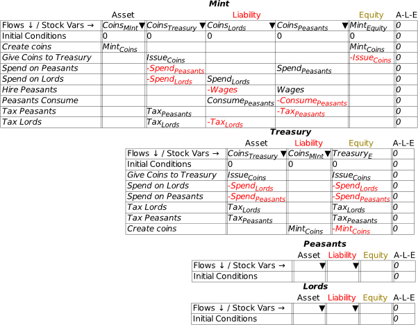
All that is left to complete the structure of coin accounts in this model is to repeat this process for the Peasants and Lords—see Figure 151.
Figure 151: The complete set of Godley Tables for the King Offa model
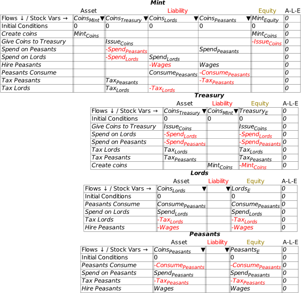
I find this structure alone, in any model, to be very informative. We’ll see a better example with the next model, of modern-day fiat money. But for now, it is obvious that act of minting the coins sends the Treasury into negative equity, while the issuance of those coins to it by the Mint puts it back into zero equity—if the coins just remained in the Treasury. But of course, the Mint and the Treasury are two wings of the government, so the sum of their two operations is zero. In effect, the fact that the government can do this—create liabilities and assets within itself, and then have those liabilities accepted by other entities in the society (“Would you prefer a coin in your hand, or a sword at your throat, in exchange for those chickens?”)—is the essence of what gives the government’s balance sheet a unique status in a monetary economy.
To complete the model, we need to define the flows, and the initial flow here is the minting of coins. I’m using 1000 coins to match Milton Friedman’s mythical “Optimum Quantity of Money” model, in which
(12) All money consists of strict fiat money, i.e., pieces of paper, each labelled “This is one dollar.” (Friedman 1969, p. 3)
The first stage of modelling the flows is to take the stocks and flows from the Godley Tables themselves and place them on the canvas. This is done using the right-mouse menu—see Figure 152.
Figure 152: Copy stock and flow variables from Godley Tables to the canvas
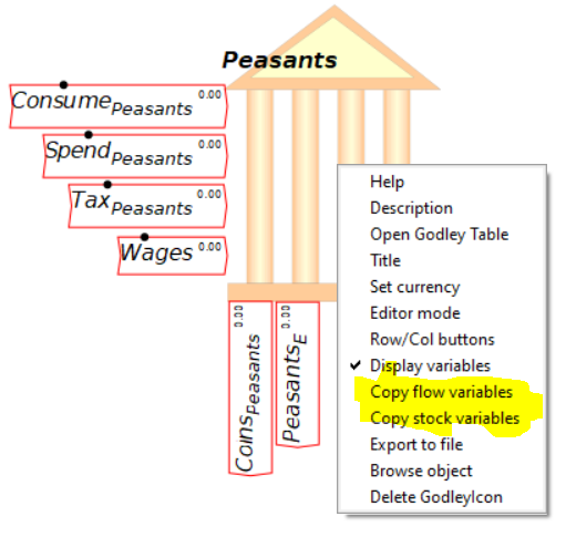
In Figure 153, I’ve copied the stocks and flows from the Mint’s Godley Table, placed them on the canvas, put the Mint’s table back in icon rather than Edit view, and turned off display of variables on each Godley Table to save space. This is feasible now that Minsky has a “Godleys” tab that lets you see all the Godley Tables at once. The stocks and flows overlap onscreen somewhat because when I resized the Mint’s icon, it rescaled the layout of the variables as well. This is technically a bug—it would be better if the symbols didn’t overlap. But it’s not fatal, so we’ll leave this bug in place until we’re rolling in development funding.
Figure 153: Stocks and flows extracted from the Mint’s Godley Table
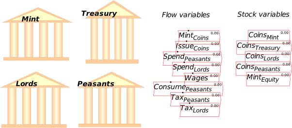
The first activity to define is the minting of coins, and here I use a simple but very useful feature of Minsky, the switch. This takes a logical operator in at the top, and has two options on the left hand side: what happens if the logical operator is false, and what happens if it is true. The operation shown in Figure 154 compares the system simulation time to 1, and so long as , it outputs 1000 per year. Once then the output drops to zero. Therefore, over the first year of the simulation, 1000 coins are created. You could add a time lag between minting and issuing if you wish, but for simplicity I’ve simply linked minting to issuing.
Figure 154: Using the switch to produce 1000 coins while t< 1 year
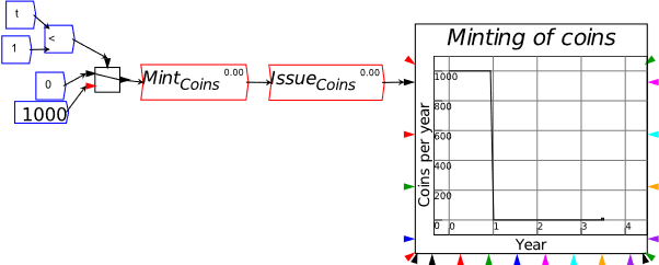
So long as the coins remain in the hands of the government, nothing of interest happens: the Equity of the Treasury, Mint and the government as a whole remain at zero: the minting of coins (which increases the Mint’s equity and reduces the Treasury’s) is offset by the issuing of those coins to Treasury (which increases the Treasury’s equity and reduces the Mint’s)—see Figure 155.
Figure 155
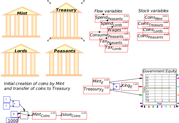
The action commences—as MMT argues—when the Treasury spends its newly created currency into circulation. As Desan emphasises, this practice replaced forced appropriation in these post-Roman and pre-Norman Kingdoms. In this simple model, I assume that the rate of spending is a function of how many coins are in the Treasury, using a time lag. One by-product of the spending is that the Treasury’s equity turns negative: it still “owes” the Mint 1000 coins, but it has spent them all into the economy, where they are now in the hands of the Lords and Peasants—see Figure 156.
Figure 156: Treasury spends coins into circulation
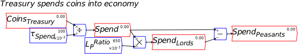
For the Treasury, this means that it goes into negative equity: it “owes” 1000 coins to the Mint, but it has spent them into the economy, so that, with no subsequent usage of the coins, and no taxation, it has no coins to meet its “debt” to the Mint, and no coins to continue purchasing goods from the Lords and Peasants—see Figure 157.
Figure 157
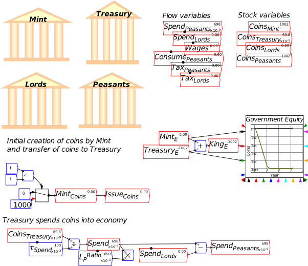
To continue purchasing goods from the private sector, it either has to produce more coins (which would undermine the value of those in existence), or tax back some of those in circulation. The latter makes far more sense, and also sets up the antagonistic relationship between the private sector, where everyone wants to hang on to the tokens they already have, given their value in exchange, and the state, which wants the tokens back, not because it needs them—it could, after all, just print more—but because taxation maintains the value of those in circulation.
As Desan emphasises, the most important impact of going from paying taxes in kind, to paying in coin, was that the first way of levying taxes simply takes resources out of the “private sector”, leaving nothing behind. Paying in coin achieves the same physical outcome—resources produced in the private sector are transferred to the public—but leaves the private sector with an exchangeable token, the coins. This enables trade to expand in the private sector, if these coins are made valuable by being a means to pay taxes in future. Therefore, the expansion in trade that Neoclassicals attribute to using a “money commodity” in place of barter, actually occurred when an otherwise valueless token—King Offa’s coin—was made valuable as a way to pay taxes in future. Taxes, which mainstream and Austrian economists rail against, are essential to maintaining the value of that commerce-enabling fiat currency.
This creates a symbiotic relationship between the public sector and the private sector, rather than the parasitic one emphasised by Austrian economists. Yes, the government is taking resources from the private sector; but its manner of doing it by coins rather than payment in kind creates a token which can be—and was, as Desan explains—used to dramatically expand private sector trade.
These aspects are introduced by the flows shown in Figure 158—which does a bit of historical violence by imagining that peasants are paid a wage rather than being indentured:
Figure 158: Coins are now used for private sector commerce
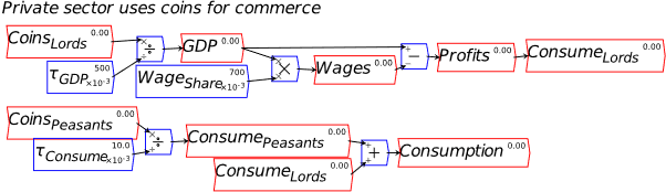
Finally, taxation is imposed to both get the coins back to the Treasury to finance future spending, and to give the coins a value to the public: it’s worth collecting them in the course of business to be able to pay taxes when they are levied. For reasons of historical accuracy, I show the Peasants paying a higher rate of tax than the Lords. That taxation revenue, when subtracted from government spending, determines the deficit—see Figure 159.
Figure 159: Taxation and the deficit
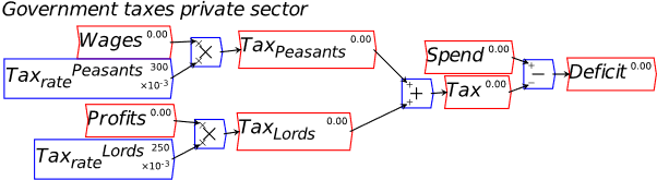
Finally, we have the full model shown in Manifesto—see Figure 160.
Figure 160: The model that produced Figures 2-3 and 2-4 in Manifesto
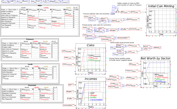
The Godleys Tab, with display of values turned on via the Options/Preferences menu, provides a nice overview of the flows in the model—see Figure 161. Notice that the Mint has zero equity, while the Treasury has negative equity of 952 coins—and this is precisely equal to the positive equity of the private sector, which is 11 for the Peasants and 941 for the Lords.
Figure 161: The Godley Tables in the Offa example, with display of values turned on
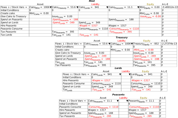
-
Check the equations
One thing Minsky does which is almost unique in the system dynamics space is generate the equations of the model in mathematical format—I’m pretty certain Mathematica’s System Modeler does the same, but Vensim, Stella, etc., do not. It’s an option under “Export Canvas”—see Figure 162, where LaTeX is the relevant option).
Figure 162: The options under “Export Canvas”)
One of the advantages of this capacity is that things you might have missed in the flowchart model can be more obvious in the equations (if reading equations is “your thing”, as it is mine). The clear flaw, in stock-flow consistency terms, in this model is that I have the Lords consuming their “Profits”, but also paying taxes on their profits. I missed that in laying out the flowchart, but it was obvious when I checked the equations—see Equation , where I’ve highlighted the inconsistent equations in red.
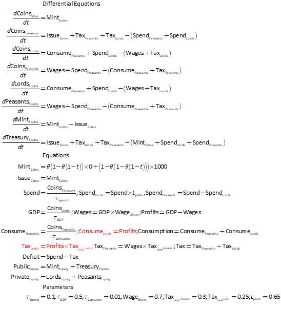
This error was easily edited—see Figure 163—and it didn’t have any impact on the model anyway, but it shows what can go wrong when you use the flowchart logic for monetary flows rather than the Godley Tables, since the flowchart paradigm doesn’t automatically enforce stock-flow consistency, whereas the Godley Tables do.
Figure 163: Lords consumption now shown net of taxes
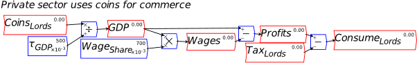
A Godley Table would have captured this error, but since I was assuming that, to consume, the Lords were buying from other Lords (there was plenty of inter-estate trade in the feudal epoch: some fiefs were almost entirely devoted to one industry, such as ship-making), this intra-class trade couldn’t be entered into a Godley Table (yet).
One critical insight into the role of government spending in any economy—or rather, any economy where the government issues its own currency—can be garnered by adding together the equity of the Mint and the Treasury to define the equity of the government sector in this model, and the equity of the Lords and Peasants to define the change in equity of the private sector. The insight, as shown in Equation , is that an increase in equity for one sector is necessarily a decrease in equity of the other. I’ve colour-coded transactions that net out within different sectors: minting of coins increases the Mint’s equity and reduces the Treasury’s; issuing of coins does the opposite, leaving taxation and spending the only actions that alter aggregate government equity. Conversely, Wages and consumption by peasants net out in the private sector, leaving taxation and spending the only actions that alter aggregate private equity. A deficit for the government sector (spending exceeding taxation) causes a surplus for the private sector:
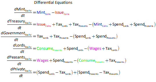
This is the basic insight of MMT: the government deficit is the private sector surplus.
We can also integrate these rates of change to derive the result that the equity of one sector is the negative of the equity of the other:
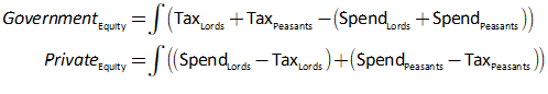
There’s no debt of any sort in this model, so I can’t yet derive the other fundamental insight of MMT, that the outstanding government debt is simply the record of government money creation. But that’s an obvious deduction from the next model.
-
Modelling Modern Fiat Money in Minsky: pp. 39-50 of Manifesto
Notice that all the accounting in the King Offa model is shown on the Mint’s Godley Table (see Figure 147 on page 131), because what is circulating in the economy is its combination asset-and-liability, the coin, which was created by Offa’s Mint. The Mint doesn’t actually facilitate the exchange of coin between Peasant and Lord, or Lord and Treasury; but because the Peasants and Lords tables record these transactions—where they are exchanging assets—the exchange turns up on the Mint’s Godley Table as well, as a record of the movement of its liabilities (this is a feature of Minsky).
When we move on to a modern monetary economy, the private banks and their liabilities of deposit accounts enter the picture as well, because private banks do facilitate the transfer (when the transaction is a transfer from one deposit account to another), and what is being transferred are liabilities of the private banking system, not of the Central Bank itself. They are also the conduit for government spending and tax payments
This necessitates a much more convoluted path for government spending: to actually get money to the public, it has to turn up in people’s deposit accounts, which are liabilities of the private banks. So the assets of the private banks have to be increased as well, which means that net government spending creates both deposits and reserves.
Therefore, net government spending creates both assets and liabilities at the level of the private banking system: the assets and liabilities of the banking sector rise because of a government deficit, leaving its net position unchanged: its aggregate equity position remains at zero (in this model, at this stage of its development).
For the private sector non-bank public however (where did we develop this contradictory usage of the words “private” and “public”?), the deficit increases their assets—the Deposit accounts—without changing their liabilities. This is the key MMT point that government deficits create “net financial assets” for the public.
At the next level of the financial system, the Central Bank, there is no creation of net financial assets: instead, there is a transfer of Central Bank liabilities from one account to another. The reserves, as well as being an asset of the private banks, are a liability of the central bank. Reserves are increased by government spending and reduced by taxation. Simultaneously, government spending reduces the Treasury’s deposit account and taxation increases it. At this level therefore, the deficit is a liability swap: a transfer from one Central Bank liability account—the Treasury—to another—Reserves. Neither deficits nor surpluses alter the assets of the Central Bank.
At this stage of the development of the model, the Treasury only has the asset of its deposit account at the central bank, and no liabilities, so spending decreases the Treasury’s assets while taxation increases them. Overall, the Treasury’s capacity and willingness to go into negative equity is what drives the creation of money at the level of the private banking sector and the public.
Therefore at the minimum, four Godley Tables are needed to show the overall monetary mechanics: the Treasury, the Central Bank, the Private Banks, and the (confusingly named) Public, or non-bank private sector—see Figure 164.
Figure 164: Government spending and taxation in a modern monetary economy
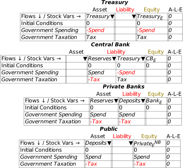
This basic situation for a modern monetary economy confirms the point made by the model of King Offa’s coins, which is the fundamental insight of MMT: the government sector deficit is the private sector surplus, and vice versa. Focusing just on the Treasury, Bank Deposits and Bank Reserves, a government deficit creates both Deposits, which are an asset of the non-Bank private sector, and Reserves, which are an asset of the Banking sector—see Equation .
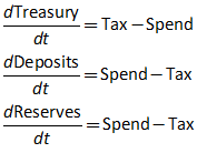
This immediately shows that government surpluses are a bad idea, unless you actually want to reduce the amount of money in the economy; and that whatever they might do to future generations—which we’ll tackle shortly—government deficits enrich the current generation, by creating net equity for it (see Equation ).
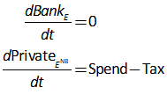
Figure 165 adds the account TBondsB to the model. This records the value of Treasury Bonds that have been sold, so it is an asset for the private banking system and a liability for the Treasury.
You can see that if government spending exceeds taxation, the net equity of the private sector rises, and is identical in magnitude to the negative equity of the government, which at this stage is entirely reflected in a negative value for its account at the Central Bank—effectively, the government’s Treasury runs an overdraft account with the government’s Central Bank.
Also, Reserves and the Treasury’s account at the Central Bank move in opposite directions: if the government runs a deficit, Reserves are created; if it runs a surplus, Reserves are destroyed. The Reserves are identical in value to the negative of the equity of the government sector.
Figure 165: Bond sales enabled but not yet simulated
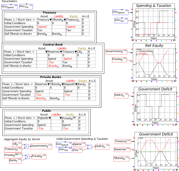
I haven’t defined flows for bond sales as yet however, so the simulation shown in Figure 165 is effectively of the model in Figure 164. Now let’s introduce government debt by having the Treasury issue bonds, which are sold to the private banks—see Figure 166. This could be made much more complicated—bond sales could be modeled as based on forward forecasts of the deficit, extrapolating existing trends—but the simplest case will do here.
Figure 166: Bonds are sold to cover the Deficit
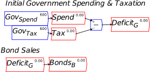
Figure 167 introduces bond sales by Treasury to the private banks. Bond sales are made equal to the deficit. The impact of this change to the model is that bank Reserves remain at zero, the Treasury’s account at the Central Bank also remains at zero—whereas it went negative in the simulation without bond sales in Figure 165—and that the money in the economy is identical to the level of government debt.
It also introduces money as the sum of the amounts in deposit accounts plus (short-term) bank equity. Now we can see that—in this model—the money in existence is identical to the Treasury Bonds in existence. So the sale of bonds has had no role in the creation of money—that was done by the deficit itself—but it has enabled the banking sector to exchange a non-tradeable, non-income-earning asset (Reserves) for a tradeable, income-earning asset (Treasury Bonds).
This confirms the crucial points made by MMT, that the “debt” itself doesn’t create the money, nor does the government need to sell the bonds in order to finance its deficit. If the Treasury didn’t sell the bonds, then it would be in the same situation as the Treasury in the King Offa model: it would be in debt to the Central Bank (as King Offa’s Treasury was to his Mint), with an overdraft taking the place of a deficiency of coins in its possession. The bond sales let the Treasury maintain its account at the Central Bank at zero (in this model—in the real world, a positive level could be maintained as well), because the bond sales bring in revenue equivalent to the deficit.
To illustrate an important feature of this model, I’ve enabled display of numbers on the Godley Tables, via the Options/Preferences dialog box.
Figure 167: Bond sales, but no interest on bonds
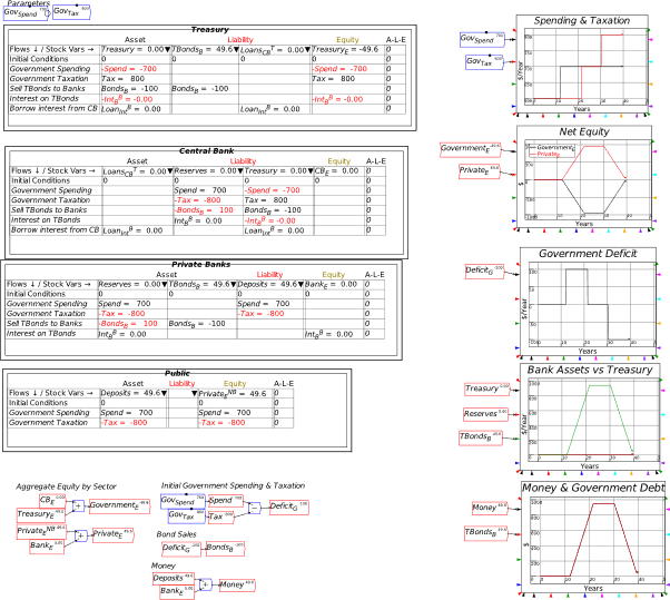
The government does, of course, pay interest on Treasury Bonds. I assume that it then borrows the funds needed to pay the interest from the Central Bank—see Figure 168.
Figure 168: Interest on Bonds
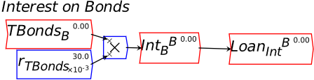
Introducing this fact has a dramatic effect on the model: compare Figure 169 to Figure 167, and you will see that private bank equity, which remained at zero with no interest on bonds, turns positive when interest is paid, because the interest on bonds adds to bank reserves, without also adding to liabilities. So it increases bank equity, which has been zero through all the previous models. Notice also that the amount of money in existence exceeds the amount of bonds—otherwise known as government debt to the private sector. The difference is made up by the Treasury’s debt to the Central Bank, which is equivalent to the total interest paid on Treasury bonds.
Figure 169: Interest on bonds creates positive equity for the banking sector
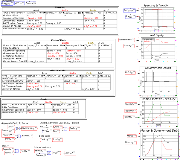
What this shows is that a government deficit can actually “kick-start” a private banking system, by creating positive net equity for the banking sector, which is necessary for real-world lending: a bank with negative equity is bankrupt, while to start operation as a bank, a private corporation needs to raise share capital so that it can start with its activities as a bank with positive equity.
Before writing Manifesto, I had primarily used Minsky to model the dynamics of private credit—largely because that’s the topic that mainstreamers like Krugman get so badly wrong. One puzzle, when working with models of a pure credit economy, was how did banks accumulate the positive equity needed to operate: in a pure credit system, positive equity for the banking sector means identical negative equity for the non-banking sectors.
This model shows that, arguably, interest on government bonds enables the banking sector to have positive equity, without driving the non-banking sector into negative equity, because the bonds create positive equity for the non-banking sector (notice that the equity of the public in Figure 169 is 294, which is identical to the value of bonds on issue), while the interest on those bonds creates positive equity for the banking sector (the positive equity of the banking sector, of 486, is identical to the debt of the Treasury to the Central Bank, which is identical to the sum of interest paid on bonds).
One personal opportunity cost of all the time I waste reading Neoclassical literature is that I am not up to date on the literature of MMT. That said, I am not aware of any MMT authors making this same case—that interest paid on Treasury bonds creates positive equity for the banking sector. If any reader knows of papers making that case, please let me know and I’ll read them and cite them here. That said, this may be a novel discovery—and a good reason for the rate of interest on Treasury Bonds to be positive.
This model can obviously be extended to include private bank lending, and financial transactions between subsectors of the non-bank public.
-
An integrated view of deficits and credit: pp. 59-65 of Manifesto
This section of the Manifesto covers a vital episode in America and the world’s economic history: the boom of the 1920s and the bust of the 1930s. These events should be the focus on economic analysis, but instead, Neoclassical economists prefer to ignore them as “outlier events”. The Great Depression, according to them, shouldn’t have happened; and nor should the Stock Market reach such ridiculous heights and then crashed. But of course they did happen.
Before I use Minsky to explain why this boom and bust happened, I’m going to take the opportunity here to go more deeply into the data than I had space for in Manifesto. The first thing to note is that this was a time of extreme volatility, compared to the relative stability of the post-WWII economy—a point that was fundamental to Hyman Minsky’s analysis of capitalism:
The most significant economic event of the era since World War II is something that has not happened: there has not been a deep and long-lasting depression.
As measured by the record of history, to go more than thirty-five years without a severe and protracted depression is a striking success. Before World War II, serious depressions occurred regularly. The Great Depression of the 1930s was just a “bigger and better” example of the hard times that occurred so frequently. This postwar success indicates that something is right about the institutional structure and the policy interventions that were largely created by the reforms of the 1930s.
Can “It”—a Great Depression—happen again? And if “It” can happen, why didn’t “It” occur in the years since World War II? These are questions that naturally follow from both the historical record and the comparative success of the past thirty-five years. To answer these questions it is necessary to have an economic theory which makes great depressions one of the possible states in which our type of capitalist economy can find itself. We need a theory which will enable us to identify which of the many differences between the economy of 1980 and that of 1930 are responsible for the success of the postwar era. (Minsky 1982, p. xix)
The volatility of the pre-WWII period is striking, which we, embedded in out post-WWII “Baby Boomer”/Gen X/ Gen Y reality, can fail to fully appreciate. Table 2 and Figure 175 show that not only was real growth higher in the pre-WWII period (averaging 3.7% per year versus 2.5% since 1945), it was also much more volatile: the ratio of the standard deviation of growth to the rate of growth was 2.2 for 1850-1945 versus 1.17 for 1945-2021.
Table 2:Growth and Volatility 1850-2030
|
Nominal Growth
|
Real Growth
|
|
Period
|
Mean
|
Standard Deviation
|
Ratio
|
Mean
|
Standard Deviation
|
Ratio
|
|
1850-1945
|
5.3%
|
9.6%
|
1.83
|
3.7%
|
8.2%
|
2.21
|
|
1945-2021
|
6.2%
|
3.2%
|
0.52
|
2.5%
|
3.0%
|
1.17
|
Figure 170: Pre-WWII Volatility & Post-WWII Stability of growth
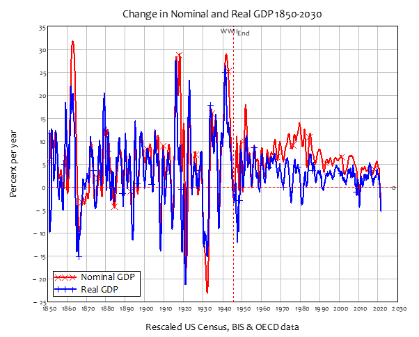
The same applies to the unemployment and inflation rates: both were lower on average before the end of WWII than in the post-War period, but the volatility was far higher in the pre-War period than after
Table 3: Unemployment and Inflation Volatility 1850-2030
|
Unemployment
|
Inflation
|
|
Period
|
Mean
|
Standard Deviation
|
Ratio
|
Mean
|
Standard Deviation
|
Ratio
|
|
1850-1945
|
4.2%
|
6.5%
|
1.5
|
1.0%
|
6.4%
|
6.1
|
|
1945-2021
|
5.7%
|
1.7%
|
0.3
|
3.7%
|
3.3%
|
0.9
|
Figure 171: Unemployment and Inflation Volatility 1850-2030
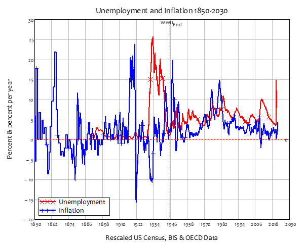
Minsky was obviously right that there was a significant change in the nature of American capitalism after WWII, which he identified as the evolution of “Big Government”:
Whereas in the small government economy of the 1920s profits were well nigh exclusively dependent on the pace of investment, the increase in direct and indirect state employment along with the explosion of transfer payments since World War II means that the dependence of profits on investment has been greatly reduced.
With the rise of big government, the reaction of tax receipts and transfer payments to income changes implies that any decline in income will lead to an explosion of the government deficit. Since it can be shown that profits are equal to investment plus the government’s deficit, profit flows are sustained whenever a fall in investment leads to a rise in the government’s deficit.
A cumulative debt deflation process that depends on a fall of profits for its realization is quickly halted when government is so big that the deficit explodes when income falls. The combination of refinancing by lender-of-last-resort interventions and the stabilizing effect of deficits upon profits explain why we have not had a deep depression since World War II. The downside vulnerability of the economy is significantly reduced by the combination of these types of “interventions.” (Minsky 1982, p. xxviii. Emphasis added)
As Figure 172 shows, the transition from small to Big Government is emphatically a product of the Great Depression and World War II. World War I caused a sharp spike in government spending as a percentage of GDP, but the post-War period saw a rapid return to small government—the pre-WWI period had, from today’s perspective, an unthinkably low level of government spending of just 2% of GDP. World War I saw that rise to almost 25%, but it fell rapidly back to below 5% of GDP in the early 1920s. It then continued to fall during that decade, as Coolidge used the prosperity of the era to reduce government debt by running a surplus that, across much of the decade, was equivalent to 1% of GDP.
Figure 172: From small to Big Government between the Great Depression and the end of WWII
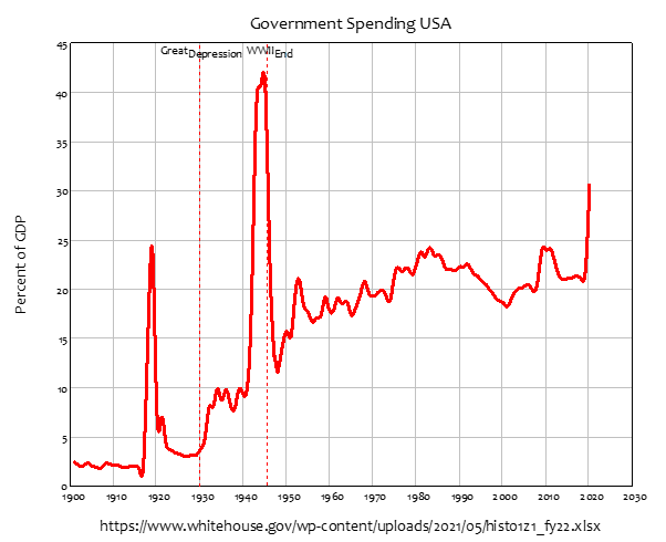
This is what Calvin Coolidge thought was responsible for the apparent prosperity of The Roaring Twenties. To repeat, at much greater length than in Manifesto, the quote from Coolidge’s State of the Union address, he attributed the prosperity of the 1920s to his policy of running a sustained government surplus, and using it to pay down government debt:
No Congress of the United States ever assembled, on surveying the state of the Union, has met with a more pleasing prospect than that which appears at the present time. In the domestic field there is tranquility and contentment, harmonious relations between management and wage earner, freedom from industrial strife, and the highest record of years of prosperity… The country can regard the present with satisfaction and anticipate the future with optimism.
The main source of these unexampled blessings lies in the integrity and character of the American people… Yet these remarkable powers would have been exerted almost in vain without the constant cooperation and careful administration of the Federal Government…
Wastefulness in public business and private enterprise has been displaced by constructive economy… We have substituted for the vicious circle of increasing expenditures, increasing tax rates, and diminishing profits the charmed circle of diminishing expenditures, diminishing tax rates, and increasing profits…
One-third of the national debt has been paid … the national income has increased nearly 50 per cent, until it is estimated to stand well over $90,000,000,000. It has been a method which has performed the seeming miracle of leaving a much greater percentage of earnings in the hands of the taxpayers with scarcely any diminution of the Government revenue. That is constructive economy in the highest degree. It is the corner stone of prosperity. It should not fail to be continued…
Last June the estimates showed a threatened deficit for the current fiscal year of $94,000,000. Under my direction the departments began saving all they could out of their present appropriations… The combination of economy and good times now indicates a surplus of about $37,000,000. This is a margin of less than 1 percent on our expenditures and makes it obvious that the Treasury is in no condition to undertake increases in expenditures to be made before June 30. It is necessary therefore during the present session to refrain from new appropriations for immediate outlay, or if such are absolutely required to provide for them by new revenue; otherwise, we shall reach the end of the year with the unthinkable result of an unbalanced budget. (Coolidge 1928, December 4 1928. Emphasis added)
The June to which Coolidge referred was June, 1929. The “unthinkable result” at the end of that year was not “an unbalanced budget”, but America’s second Great Depression (the first, as I note in Manifesto, was “The Panic of 1837”).
Coolidge was acutely aware of the declining government debt of his time. However, he, like his successors one century later, had no idea of what was happening with private debt. As he applauded halving government debt, from $30 to roughly $15 billion, private debt rose from $45 to $80 billion—see Figure 173. He was, as Clinton and Bush did in the 1990s and early 2000s, conducting an unwitting experiment into how long credit-based money creation could counter the destruction of fiat-based money, without causing a crisis.
Figure 173: GDP, Private and Government Debt 1910-1940
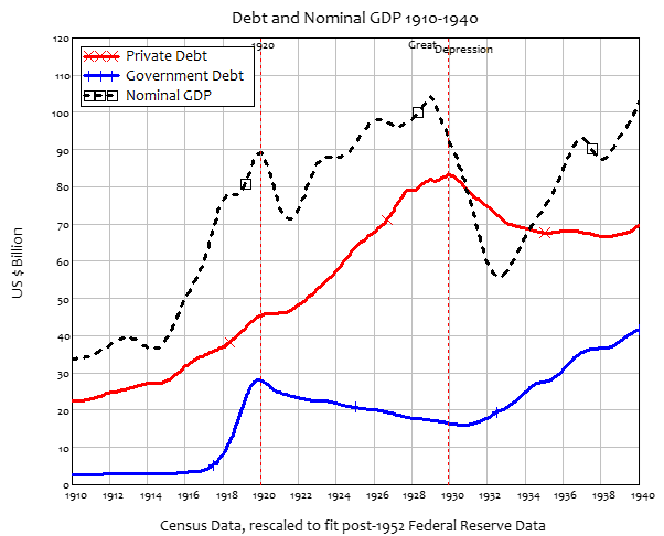
In Coolidge’s time, the answer turned out to be “about 8 years”. Between 1921 and 1929, the government surplus of roughly $1 billion a year was more than counterbalanced by credit of between $1 billion and $8 billion per year—see Figure 174.
Figure 174: Private Credit and the Government Deficit 1910-1940
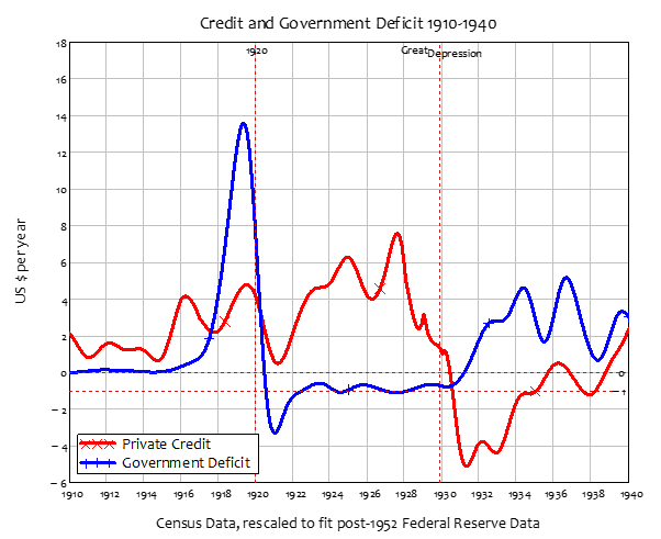
While that situation endured, GDP rose from a low of $71 billion in 1921 to a maximum of $104 billion at the start of 1929—see the dotted plot in Figure 173. It was a volatile performance, as Figure 175 indicates—inflation-adjusted growth ranged from as low as minus 21% in 1921 to a high of 23% in 1922—but the average was still a very high 5.8% real growth per year. Coolidge’s rhetoric extrapolated this rate of growth forward thanks to his good budget management, but that’s not what transpired: the average real growth rate from the high of 1929 till the 1930s low in 1933 was minus 9% per year. Nominal GDP in 1933 was $16 billion lower than in 1921.
Figure 175: Volatile GDP
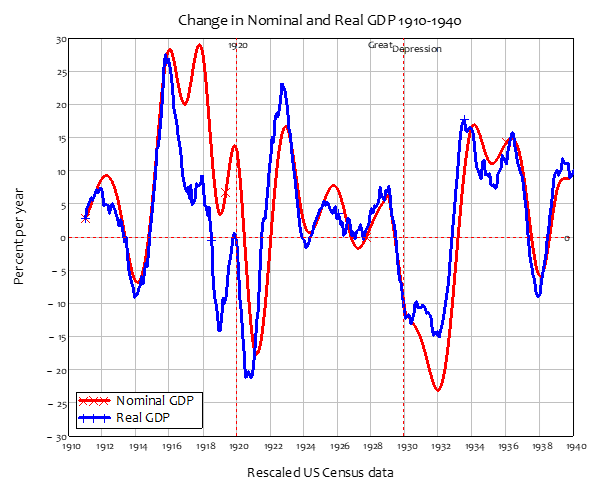
The core feature of the Great Depression that, even today, is seared into people’s minds, is the huge increase and then sustained level of unemployment. Unemployment data wasn’t as systematic back then—much of it was recorded by trade unions—but nor was it as corrupted as is has become in the last fifty years: back then you were recorded as unemployed if you had registered as unemployed, either with your union or an employment office. The boom of the 1920s was so extreme at its end that the percentage rate of unemployment in October 1929 was zero. Three years later, it was an unprecedented 25%, and it remained at elevated levels throughout the 1930s.
Figure 176: Unemployment and Inflation 1910-1940
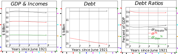
There is much more to the story of the 1920s and 1930s than just government money destruction and private money creation. But since that part of the story has never been properly told—because the mainstream, as well as misunderstanding the role of fiat money creation in a well-functioning capitalist economy, also continues to deny the role of credit in aggregate demand—I’m going to attempt to use Minsky to reproduce the effects of government surpluses and private credit across the boom period of the 1920s. I’ll define this as starting at the nadir for nominal GDP in the 1920s—mid 1921, when the USA’s nominal GDP was US$72.25 billion—and ending at its apogee in 1929, when it peaked at $104.6 billion. Across almost all of that time, the government surplus was 1% of GDP, while credit began at 1% of GDP and peaked at 8% in mid-1927—see Figure 177. I’m showing the deficit rather than the surplus, since a deficit has the same impact on the economy as positive credit. So, for most of the 1920s, the government deficit was minus 1% of GDP. Though it fluctuated much more than the government surplus, the average value of credit between 1921 and 1929 was 5% of GDP.
Figure 177: Government deficits and private credit 1910-1940
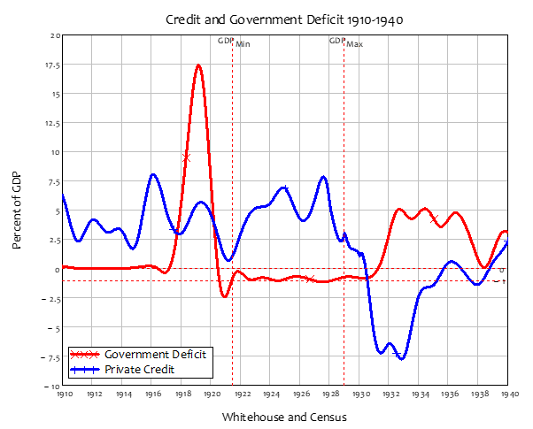
The data that I wish to emulate in a Minsky model are the following:
Table 4: Historical data to emulate in the Minsky model
| Parameters |
% of GDP |
Date |
GDP |
Government Debt |
Private Debt |
| Deficit |
-1% |
1921.5 |
$ 71.26 |
$ 23.87 |
$ 46.66 |
| Credit |
5% |
1929 |
$ 104.60 |
$ 17.20 |
$ 82.07 |
I have created a very simplified model here, because I want as few complications as possible to get in the way of the three basic questions that I want to pose: what would have happened to the economy had the private sector not gone on a borrowing binge; and what would have happened had Coolidge run either a deficit, or a balanced budget during that private sector borrowing binge; and what would have happened had Coolidge run a deficit while the private sector’s debt remained constant?
Table 5: Godley Table for the banking sector in the model
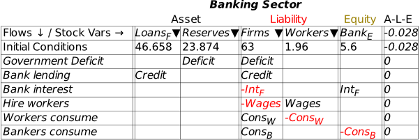
The model came pretty close to fitting the data (see Table 6), even though the time path of credit was much simpler—a constant 5% of GDP throughout, rather than the range from 1 to 7.5%—than the actual data.
Table 6: Simulation results
| Simulation |
% of GDP |
Simulation Years |
GDP |
Government Debt |
Private Debt |
| Deficit |
-1% |
0 |
$ 70.00 |
$ 23.87 |
$ 46.66 |
| Credit |
5% |
7.5 |
$ 100.00 |
$ 17.40 |
$ 79.20 |
The full model is shown in Figure 178. It is, as noted, extremely simple: there are no government bonds for example, all the government debt is owed by the Treasury to the Central Bank. But as the previous model showed, bonds don’t finance government spending: instead, they are a way of creating reserves for the private banks. They could be added here, and quite possibly could improve the accuracy of the simulation; but this is a sufficient structure to disentangle the causal factors behind the boom of the 1920s.
Figure 178: Simulating Coolidge’s Golden Years
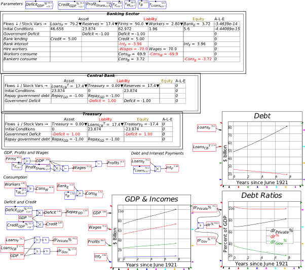
With the model constructed, we can now use it to answer those “what if?” questions:
-
What if the private sector had not increased its debt?;
-
What if Coolidge had run a balanced budget or deficit, while the private sector borrowed?;
-
What if Coolidge had run a deficit while the private sector’s debt remained constant?;
-
What if Coolidge had run a deficit while the private sector borrowed; and
-
How large a deficit would have been needed to reproduce the prosperity of the 1920s without increasing private debt?
All the subsequent plots of this model export the Canvas from the Plots tab.
-
The actual event: Coolidge Surplus and private sector credit binge
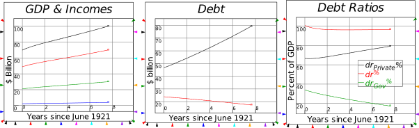
-
Coolidge Surplus with no private sector borrowing
This first simulation indicates that, without the rise in private debt, there would have been no boom—no growth even—during the 1920s.
Figure 179: No credit: the Roaring Twenties loses its Roar

-
Coolidge Balanced Budget with the credit binge
This simulation indicates that the impact of Coolidge’s surplus was to reduce the level of economic growth, compared to what it would have been with the credit binge alone.
Figure 180
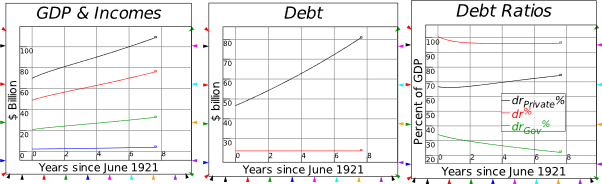
-
Coolidge runs a Deficit with the credit binge
This generates higher growth and a lower private sector debt ratio.
Figure 181
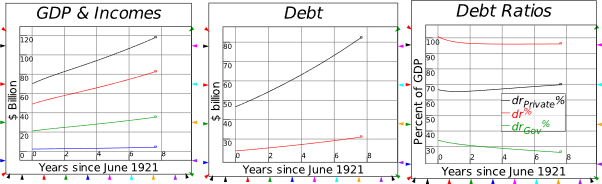
-
Coolidge runs a Deficit with no credit
This is with the 1% of GDP surplus converted into a deficit: the economy grows rather than shrinks.
Figure 182
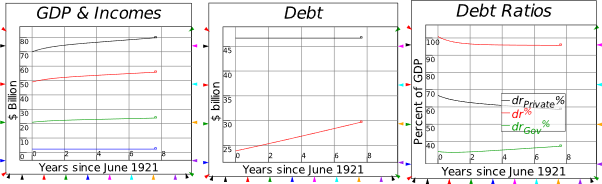
-
Coolidge runs a Deficit to reproduce the 1920s boom without credit
A deficit of 4% of GDP is sufficient to reproduce the boom of the 1920s, without any growth in private debt.
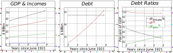
-
Disentangling cause and effect
This simple model shows the advantages of the monetary, system dynamics approach to modelling. But it would be nothing without including the key causal factors, which Neoclassical economics omit by assumption: private debt and credit. In the next chapter I’ll explain my “Keen” model of Minsky’s Financial Instability Hypothesis, which shows that capitalism can be overwhelmed by excessive private debt, and plunged into a deep and lasting downturn as credit turns substantially negative.
This has now happened three times in the history of American capitalism: during “The Panic of 1837”, the Great Depression, and the Great Recession. The unifying factor in each of these crises has been a prolonged period of negative credit, as noted in Table 2.5 in Manifesto (reproduced here as Table 7).
Table 7: Magnitude of Credit and duration of negative credit in the USA’s major economic crises
|
Credit (annual change in private debt)
|
|
Credit as percent of GDP
|
Years
|
| Crisis |
Maximum
|
Minimum
|
Change
|
Negative Duration
|
| Panic of 1837 |
12.2
|
-8.9
|
21.1
|
6.2
|
| Great Depression |
9.1
|
-9.1
|
18.2
|
8.2
|
| Great Recession |
15.4
|
-5.3
|
20.7
|
2.6
|
The next four figures illustrate this, along with the rising level of private debt associated with each boom and bust, and the correlation of credit to the rate of economic growth (nominal in these plots, since I’m focusing here on the impact of credit on the monetary level of output: changes in the price level—but do not eliminate—the impact).
Figure 183: USA Debt and Credit since 1834
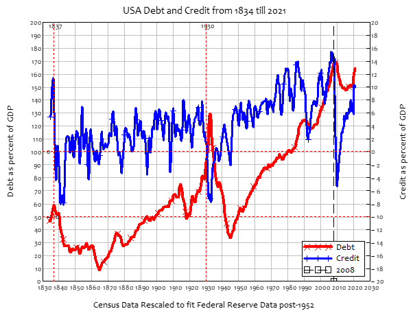
The major crises in America’s economic history were all negative credit events, and Richard Vague’s magisterial survey of global credit crises, A Brief History of Doom (Vague 2019), shows that this rule applies to all of global capitalism’s roughly 150 crises in the last 150 years. The next three charts focus on America and its three major crises: the “Panic of 1837, the Great Depression, and the Great Recession. Though the levels of private debt were substantially different, the scale of the negative credit events were quite similar: as shown by Table 7, each crisis was preceded by a credit boom, with credit-based demand reaching between 9% and 15% of GDP, while the plunge from this peak was roughly 20% of GDP in each case.
Figure 184: The Panic of 1837
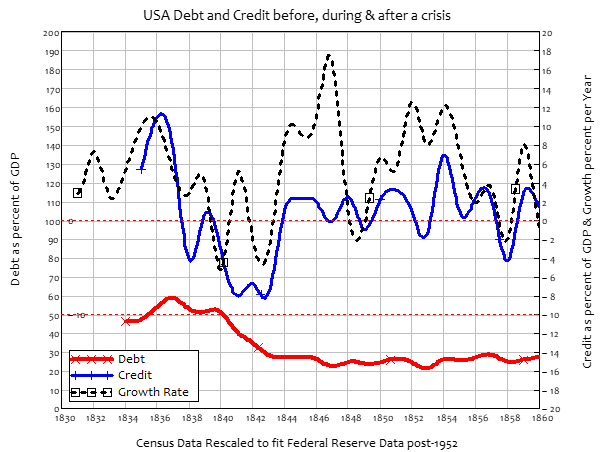
Figure 185: The Great Depression
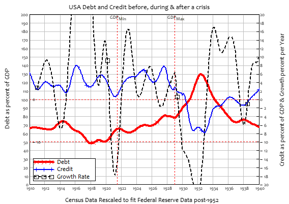
Figure 186: The Great Recession
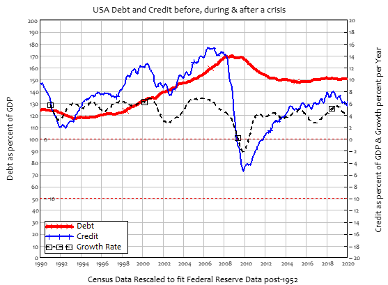
-
A Modern Debt Jubilee: pp. 65-68 of Manifesto
The end result of almost two centuries of widespread misunderstandings about how money is created, developed and maintained by the false beliefs of mainstream economists, is a global economy terminally indebted to the private creators of money. The previous charts show this phenomenon in the home of modern capitalism, America. The next chart–Figure 187—shows that this is a global phenomenon.
Here I have to thank the Bank of International Settlements for assembling an excellent database on debt across over 40 countries. When I started warning that a global financial crisis was imminent back in December 2005, the only data I could get easily was on America from the Federal Reserve Flow of Funds, and Australia from the Reserve Bank of Australia’s statistical tables. Today, thanks to Bill White—who, as Research Director for the Bank of International Settlements, was the only person in an official position to warn that a financial crisis was likely (Borio and White 2004)—the Bank of International Settlements publishes a database with standardized measures of private and public debt from over 40 countries. That data shows unequivocally that the level of private debt, relative to GDP, is the highest it has been in the post-WWII period, which, by reference to long term data series for the USA and UK, is also the highest it has been in the history of capitalism—see Figure 187.
This has numerous deleterious effects on the economy, which I discuss with respect to my model of Minsky’s Financial Instability Hypothesis in the next chapter. Here, I want to model something that I first proposed in 2012 (on January 1st, as it happens): a “Modern Debt Jubilee”, as a means of escaping from this debt trap, by effectively replacing credit-based money with fiat-based money in a way that does not discriminate between those who had joined the 2000s speculative bubble and those who did not.
Figure 187: Record private debt levels afflict almost all economies
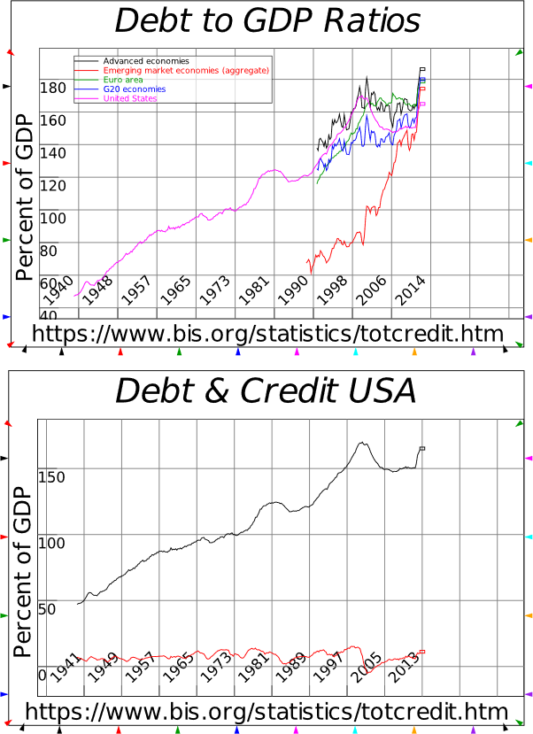
Though I thought of the idea a decade ago, I didn’t subsequently develop it, because I believed that it had a snowflake’s chance in Hell of actually being implemented. And then along came Hell, in the form of Covid. In 2020, private debt in the USA rose faster than it had even done.
Figure 188: Covid and its impact upon private debt and credit
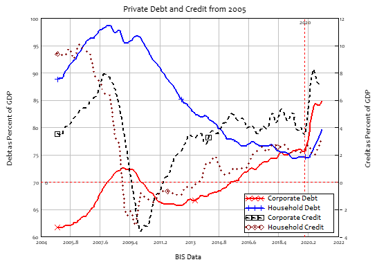
All previous instances of rapidly rising private debt have occurred during a speculative binge. This one is occurring because the corporate sector in particular can’t meet its financial obligations during Covid, and so has rolled over existing debt that would otherwise have been retired, and taken on new debt in order to meet financial commitments that were ordinarily covered from cash flow. So there will not be the typical economic boom from private sector borrowing—but there could well be the typical bust after Covid, if there is ever an after, especially if the welcome if insufficient government supports are removed too quickly.
This meant that it was time to actually model how a Modern Debt Jubilee could be undertaken, and the results surprised even me. The model in Manifesto was extremely simple—I just covered the accounting involved and showed that it was consistent: see Figure 189. I’ll include the simulation model for this at the end of this chapter, just for the sake of completeness, but what I want to do now is develop a much more comprehensive model of a Modern Debt Jubilee, to show how it might be used to reduce America’s private and government debt levels.
Figure 189: The basic mechanics of a Modern Debt Jubilee
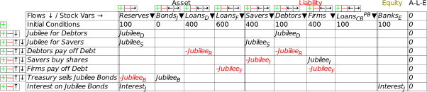
This is the first moderately large Minsky model that I’ve developed here, so it will take quite a while to explain its structure and dynamics. The basic structure of the Jubilee, and outcomes of the model, are as follows:
-
The Jubilee is used to convert Jubilee % of existing private sector debt into government debt, thus converting credit-backed money into fiat-backed. Fiat-money increases, credit-money decreases.
-
The Jubilee is distributed on a per capita basis, so every adult (person over 18) receives the same amount. If the per capita amount exceeds a person’s debt, the excess is used to buy newly-issued corporate debt, which must be used to pay down corporate debt.
-
The Jubilee creates money, but the allocation of it to debt repayment cancels precisely as much, so there is no net creation of money by the Jubilee itself.
-
Treasury issues Jubilee Bonds, which are sold to the Banking sector. The Banking sector gets the funds to buy these bonds from the Jubilee itself, which creates excess Reserves equal in magnitude to the fiat money created by the Jubilee.
-
Interest payments by Treasury on the Jubilee bonds then compensate the Banking sector for the fall in its income from interest on private debt
-
Side-effects of the Jubilee include a fall in inequality and an increase in GDP from dramatic rise in the velocity of money. These occur because the Jubilee increases the money held by workers, whose higher propensity to spend also boosts the economy.
-
If interest is paid on Jubilee Bonds, this creates money over time, thus expanding GDP.
Though the model is the most complicated to date, the monetary model is essentially a combination of the endogenous money model of Figure 126 with the Jubilee components of Figure 189. I have divided the non-bank private sector into three sectors—Firms, where output is produced, Capitalists, who own the Firms, and Workers, who work in the Firms. The first eight rows of Figure 190 are the basic financial operations of the private sector: interest and dividend payments, wages, and consumption. I have omitted bank lending and debt repayment here, just to simplify the model—they could easily be added.
The remaining rows implement the mechanics of the Jubilee:
-
Jubilee payments to workers and capitalists;
-
Debt repayment by workers and capitalists;
-
Share purchases by those workers and capitalists whose debts were less than the value of the per-capita Jubilee payment (set at 60% of aggregate private debt in this simulation, which is roughly equal to 100% of GDP in this simulation, and equal to the debt level of the US private sector);
-
Firms using these share sales to pay down corporate debt;
-
Bond sales by the Treasury, of a value equal to the Jubilee itself—which has created the excess Reserves that banks will use to buy the bonds; and
-
Interest payments on those bonds by Treasury to the Banks.
Figure 190: Banking sector Godley Table for a Modern Debt Jubilee
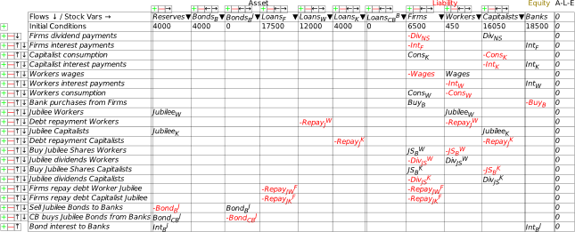
The Jubilee component of the model is shown in Figure 191. The top left-hand corner determines the Jubilee itself. The switch means that the Jubilee doesn’t commence until Start year, after which it lasts for one year. The other logic switches determine that, if debt is paid down to zero, the payments are used to purchase “Jubilee shares” instead—shares newly issued by companies (so that they receive the revenue, rather than a trader), the revenue from which must be used to pay down corporate debt.
Figure 191: Mechanics of the Jubilee
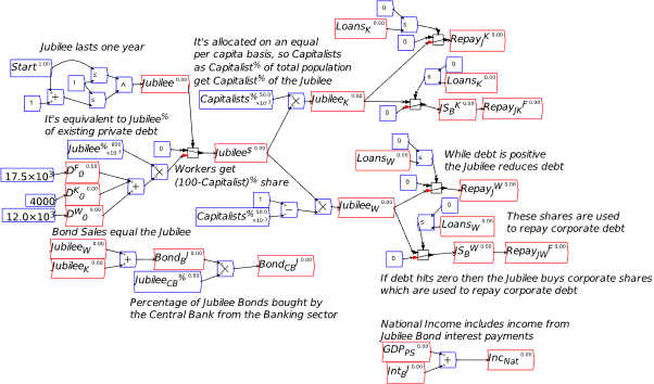
The scale of the Jubilee is based on current US private debt data, which totalled US$29.5 trillion in 2021. This is broken into corporate debt of $17.5 trillion and household debt of $12 trillion. I made an arbitrary division of initial household debt into ¼ as debt of capitalists and ¾ as debt of workers , since the Flow of Funds doesn’t provide that information. The Jubilee equals 60% of this outstanding debt, or $17.7 trillion.
The division of the population into workers and capitalists is somewhat arbitrary as well: I assume that 5% of the population earns its income primarily from ownership, and 95% primarily from wages. Since the Jubilee is on a per capita basis (which works out to US$100,000 per adult American in this simulation), 95% of the Jubilee goes to workers and 5% to capitalists. This is hardly unfair to capitalists as individuals—everyone gets the same amount, regardless of social class—and it goes some way to redressing the impact of Quantitative Easing, which had the express objective of increasing share prices, and therefore overwhelmingly favoured capitalists over workers.
There are some complicated issues as a result of the change in share ownership, which are handled by the component shown in Figure 192: the new shares dilute existing shareholdings, so there has to be a change in where the dividends go.
Figure 192: Share ownership and dividend effects of the Jubilee
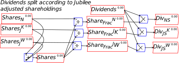
This doesn’t make existing shareholders worse off however, because the fall in interest payments by firms is partly passed on to all shareholders via a rise in dividend payments—see Figure 193, and Equation , which I think is easier to read than the flowchart.
Figure 193: Firms pass on the fall in interest payments in the form of dividends
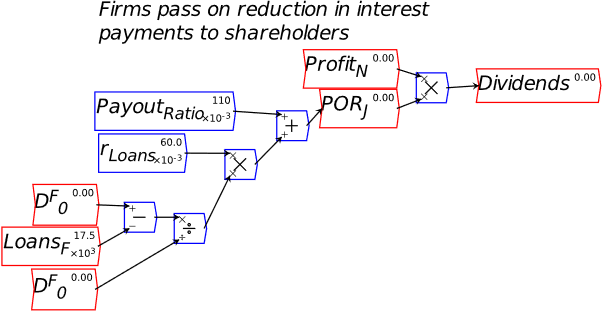
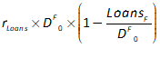
Equation cover the variable part of dividend payments by firms because of the Jubilee. When the simulation starts and before the Jubilee, Equation equals zero, and the dividend payout is 11% of profits, as specified by PayoutRatio. When the debt level of firms LoansF falls because of the Jubilee, this becomes positive, and is added to the dividend payout ratio. In this way, the reduction in firm interest payments is passed back to the owners of shares—who also change in social composition, because, with 95% of the Jubilee going to workers, their debt of $12 trillion is extinguished, and they buy $7 trillion of Jubilee Shares.
In the first simulation shown below in Figure 194, the interest rate on Jubilee Bonds is set to zero, to illustrate what the Jubilee does if the amount of money in the economy remains constant—with interest payments, the amount of money increases. The effects include a large increase in GDP—which surprised even me when I first ran the model.
The reason for this is the impact of the Jubilee on the distribution of money, with initially more of it turning up in workers’ bank accounts, but then—because workers have a much higher rate of spending than capitalists or bankers—most of that money ends up in the firm sector, rather than in the bank accounts of capitalists and bankers. The firm sector’s turnover of money determines private sector GDP (I have omitted normal government spending and taxation from this model), and its rate of turnover is lower than that of workers, but much higher than bankers and capitalists. So the impact of the redistribution of money via the Jubilee is a much higher level of GDP via an increased rate at which money turns over in the economy.
This modelling phenomenon is the obverse of a real-world phenomenon that I have long observed and attributed to the impact of higher private debt levels on people’s willingness to spend: the fall in the velocity of money since the peak inflationary period of the early 1980s—see Figure 195. This explanation still has legs as an inadvertent macro effect of a micro phenomenon: the higher average debt to income ratio today makes people “hoard” money to be able to pay their interest and principal commitments, but at the aggregate level hoarding merely reduces the rate of turnover of money. This leads to lower incomes, defeating the micro objective people have of saving more.
Figure 194: Simulation with no interest on Jubilee Bonds
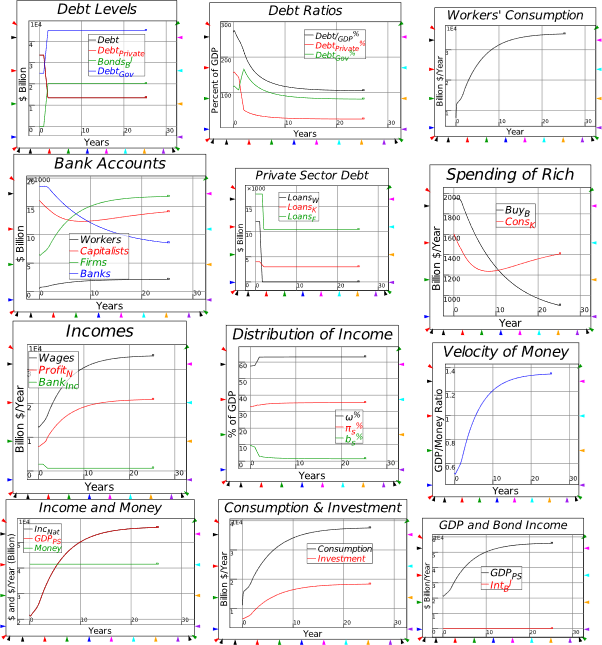
However, this model has constant turnover rates for each social class (workers, capitalists and bankers) and the firm sector, so the rise in velocity it generates comes from the redistribution of existing money (and the fall in indebtedness, which reduces interest payments on existing debt, thus enabling that money to be used for commodity purchases instead).
Figure 195: Velocity of money of zero maturity (https://fred.stlouisfed.org/series/MZMV)
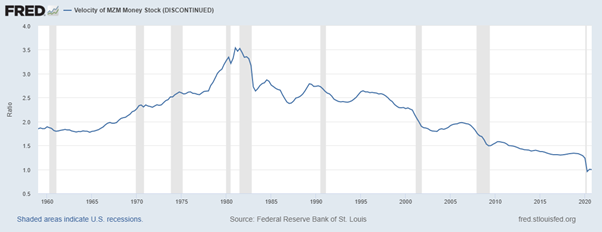
The next simulation has interest paid on Jubilee bonds at the same rate as private debt, of 6% per year. The outcome is that bank income does not fall because of the Jubilee, while the payment of interest also creates new money. The banks don’t lose income out of the Jubilee—the interest they used to receive from private debtors is now provided by the government. As with MMT’s insight in general, the negative equity of the Treasury enables the positive equity of the private sector—see Figure 196.
Figure 196: The Treasury’s Godley Table for the Modern Debt Jubilee
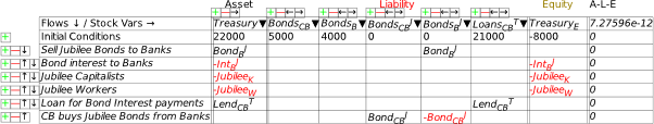
Rather than this leading to an increase in the government’s debt to GDP ratio however, over time, it leads to a fall—see the second plot in Figure 197, which shows the debt to GDP ratios for the private sector, public sector, and the sum of the two. The government debt to GDP ratio rises as a direct consequence of the Jubilee initially, as government debt replaces private debt; but the growth in the economy triggered by the Jubilee means that the government debt ratio falls over time. After a decade, the government debt ratio is lower than it was before the Jubilee. The aggregate debt ratio also falls: the economy transitions from a private sector based on debt to one based on share equity.
This is because the stimulatory effect of the Jubilee on private sector activity more than outweighs the increased debt the government takes on in Jubilee Bonds. Direct attempts to reduce the government debt to GDP ratio by austerity have the opposite effect on the real economy—depressing GDP and counteracting the attempt to reduce the debt ratio by reducing government debt.
Figure 197: A Modern Debt Jubilee with interest on Jubilee Bonds
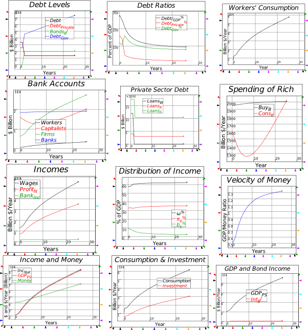
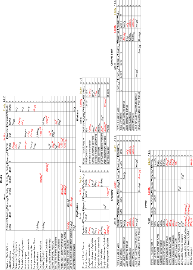 Figure 198: Modern Debt Jubilee Godley Tables
Figure 199: The full Modern Debt Jubilee model
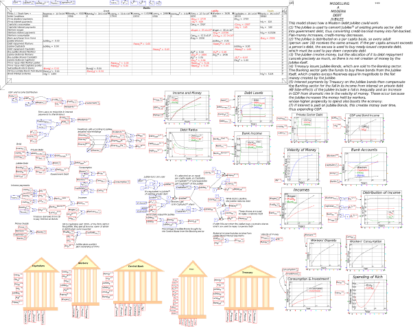
This completes the models showcased in Manifesto. As time goes on, I’ll add new models here, developed by myself and others, to show what Minsky can do.
-
Complexity
Lotka’s model was easily derived, simply by acknowledging that sharks eat fish, and by using the simplest possible mathematical operation to link the two species together. It’s also easily analyzed, since with just two dimensions, its dynamic properties depend on a simple quadratic, as I’ll explain later in Chapter 11. The next model, which is the first simulated model in the history of complex systems analysis, is an entirely different … kettle of fish.
-
Lorenz model
The derivation of Lorenz’s model of turbulent flow required mathematical skills well in advance of those possessed by the vast majority of economists—including me—so don’t let the simplicity of the equations in fool you. Superficially, they are only slightly more complicated than the Lotka predator prey model: rather than 2 variables and 4 parameters (Lotka), there are 3 variables and 3 parameters:
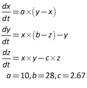
However, the behavior of the model is from another planet: Planet Complexity—see Figure 200. Unfortunately for mainstream economists, this happens to be the planet on which we actually live.
Figure 200: Lorenz’s model with its chaotic behavior and “strange attractors”
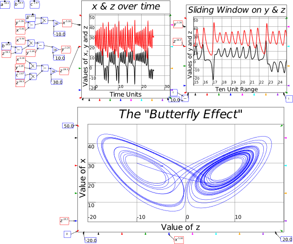
I won’t repeat the step-by-step explanation of deriving this model that I gave for Lokta’s model—there is no simple “step by step” process to explain, and you should be able to pretty rapidly design this model in Minsky yourself by converting the differential equations in equation to integral equations, and then coding them in Minsky. But one feature of this model is worth noting: the “sliding window” plot that shows a ten time-unit slice of the plots for y and z. This uses the “range” inputs for the plots—the angled inputs on each of the X, Y1 and Y2 axes. Normally these are constants, but they can take variable inputs, and the variable inputs for this plot are the input for the system’s simulation time  at the far right of the plot, and on the far left.
What is worth repeating is the exercise of deriving the equilibrium of the model, by setting all the differential equations in to zero:
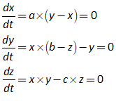
One obvious solution here is where . The non-zero solutions to give us these three conditions for the equilibrium values, which I identify using the subscript E:
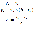
A bit of algebraic manipulation yields:
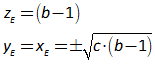
There are thus 3 equilibria for this model:
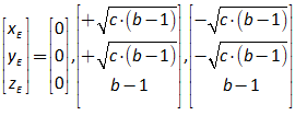
One reason I love this model, as a non-mainstream economist, is that it makes a mockery of the Neoclassical obsession with equilibrium modelling, because it has three equilibria, all of which are unstable. The equilibria are the colored dots on the phase plots of z against x & y, and y against x. The simulation starts at the values , just a slight displacement from the (0,0,0) equilibrium. Because the simulation starts so close to this equilibrium, the system is rapidly pushed away from it: this equilibrium is stable on two of its three eigenvalues, but unstable on one.
The system is then attracted towards one of the other two equilibria, but they are “strange attractors”: they attract the system from a distance but repel it—in a cyclical fashion—when it gets closer to them. We’ll get into the detail of how to analyze this instability in Chapter 11, but for now its primary characteristics are that the system will never converge to any of its equilibria, and yet the system will also never return values that are unrealistic. Its dynamics are therefore necessarily far-from-equilibrium dynamics: the very idea of “equilibrium dynamics”—as ensconced in Neoclassical “Dynamic Stochastic General Equilibrium” modeling—is an oxymoron.
Figure 201: Lorenz model with equilibria. Simulation starting from (0.1,0.1,0.1)
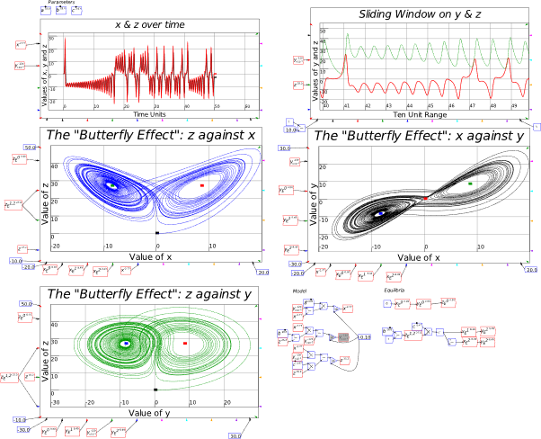
My model of Minsky’s Financial Instability Hypothesis, which we’ll develop in the next section, has related, though not quite so complex, far-from-equilibrium dynamics.
-
A complex systems model of economic instability
On page 80, I introduced Richard Goodwin’s model of cyclical growth, which reduced to the following two equations for the employment rate and the wages share of output .
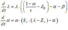
The model generated everlasting cycles, like those generated by Lotka’s Predator-Prey model:
Figure 202: Reduced Form Goodwin Model
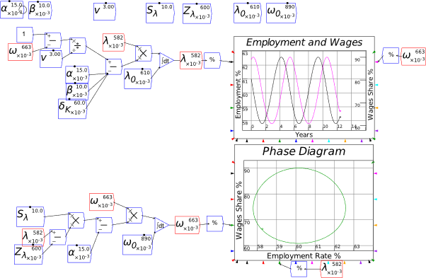
Since that derivation was some time back(!), and I don’t have to worry about my publisher’s constraints on word length, I’ll repeat the derivation here, along with the third factor I introduced when I constructed my model of Minsky’s Financial Instability Hypothesis in 1992 (Keen 1995): the private debt to GDP ratio . I’ll derive the model using the basic rules of calculus that:
The three definitions that we will turn into a simple model that extends Goodwin’s model to include the role of finance in capitalism, are the employment rate, the wages share of GDP, and the private debt to GDP ratio:
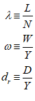
Two ancillary definitions are needed: the output to labor ratio , and the capital to output ratio :
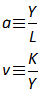
The first step is to apply the rules in to the definitions in —and to save time I’ll use the definitions in to extend the equations as far as possible without introducing any assumptions:
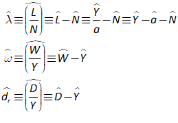
To proceed any further, we need to introduce some simplifying assumptions. Most of the assumptions Goodwin made are shown in Equation : exponential growth of the output to labor ratio and of population, a constant capital to output ratio, and a uniform wage:
When we feed these assumptions into the definitions, we get a final and very simple expression for the rate of change of the workers’ share of output , but we still have further to go with the employment rate and the debt ratio. Both contain an expression for the rate of change of the capital stock , and the debt ratio equation includes the rate of change of private debt :
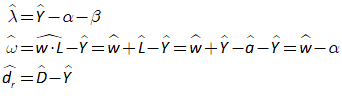
is better known as the rate of economic growth, so let’s use to simplify the appearance of these equations. I’ll also replace with (“Phillips curve”) :
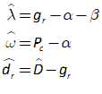
At this point, we have three mathematical statements that are easily interpreted verbally: the employment rate will rise if economic growth exceeds the sum of the growth rates of the output to labor ratio and population; the wages share of GDP will rise if wage demands exceed the growth rate of the output to labor ratio; and the debt ratio will rise if debt rises faster than the rate of economic growth.
We now need to define the rate of economic growth and the rate of growth of private debt to arrive at a final model. Given the assumption that the capital to output ratio is a constant, the rate of economic growth is the same as the rate of change in the capital stock:
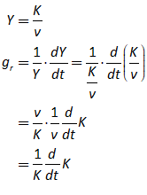
Now we need to define the rate of change of the capital stock. The obvious starting point is that the rate of change of capital equals investment minus depreciation, which is normally assumed to be a linear function of the amount of capital. Using for gross investment , for the depreciation rate, and for the ratio of gross investment to output, this yields:
This leaves just the rate of change of private debt to be defined:
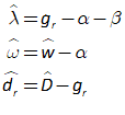
To determine , we need a realistic simplifying assumption. The simplest—which is far too kind to the finance sector, since it omits the modern finance sector’s main business model of Ponzi finance— is that capitalists invest more than profits during a boom, and less than profits during a slump—and that they have to borrow money to enable this. Borrowing thus finances investment, so that the rate of change of private debt was equal to gross investment minus profits:
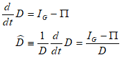
This appears to be an impasse, since the denominator is D, rather than something we can work with like Y. But there’s a handy trick for situations like this, taught to me by the wonderful (if irascible) mathematics lecturer Professor Williams when I was studying first year undergraduate mathematics at Sydney University in 1971. To quote Williams:
There are 3 rules of mathematics: (1) what have you got that you don’t want? Get rid of it; (2) what haven’t you got that you do want? Put it in (3) Keep it balanced.
We can bring in Y by multiplying the right hand side of , and then rearranging terms:
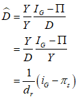
Here stands for the profit share of income: . This now gives us three fairly simple equations:
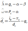
To proceed, we need to add functional forms for the rate of change of wages and the investment share of output . For the former, I use the same linear “Phillips curve” function used by Goodwin. For the latter, though a common practice in Post Keynesian economics is to model investment as driven by a target level of capacity utilisation, I base investment on the rate of profit, using exactly the same form as the wage change function, with the rate of profit taking the place of the employment rate:
Profit in the original Goodwin model was just output minus wages. The introduction of private debt means that profit now equals output minus wages minus interest payments on outstanding debt:
The rate of profit is profit divided by capital . It is easily related to the profit share , where this is now :
This gives us a 3-dimensional model which, as I explain in Manifesto, reproduces the essence of Minsky’s Financial Instability Hypothesis:
Where I’ve used the abbreviations:
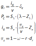
To simulate and analyze this model, we need to express it in terms of differential equations——rather than rates of change—. This just involves multiplying both sides of Equation by the relevant variables :
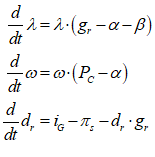
These equations are easily entered into Minsky—see Figure 203.
Figure 203: Reduced form version of Minsky’s Financial Instability model
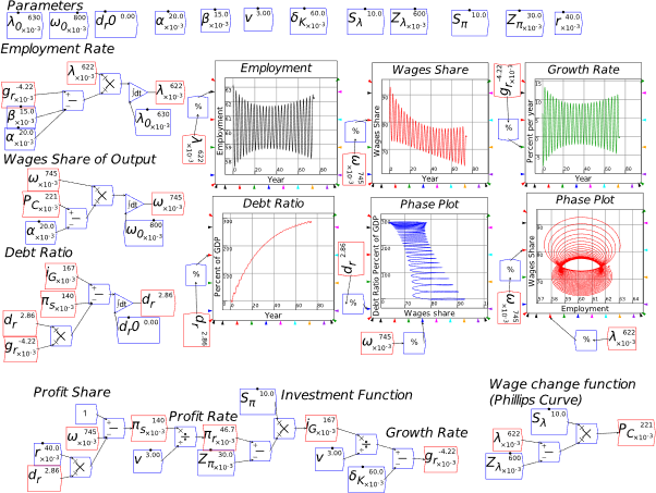
The peculiar dynamics in this model—the initially falling and then rising cycles in the growth rate and employment, the rising private debt to GDP ratio, and the decline in the workers’ share of GDP, even though they do no borrowing in this model—turn out to be a particular subset of the dynamics of the Lorenz model, known as the “Intermittent Route to Chaos” (Pomeau and Manneville 1980).
We’ll check this behavior out analytically in Chapter 11—and the linear form of the model, shown here, is essential to that task. But I’ve also heard comments from Neoclassicals that this model generates unrealistic cycles—look at how large the fluctuations are in wages share, employment, and the growth rate! Therefore, this is a useful point at which to discuss the proper role of nonlinear functions in complex systems models.
-
Nonlinear Functions in Nonlinear Models
Figure 204 adds two nonlinear functions to the previous model, one for the “Phillips Curve” and the other for the investment function. You will note that the cycles in this model are much smaller in scale than for the previous model with linear behavioral functions.
This is because the nonlinear functions themselves curtail a model’s behavior to realistic bounds, in a way that linear functions do not. They do not generate the cycles themselves in the model shown here, since those cycles are intrinsic to the model itself via the nonlinear interaction of system states.
The actual cyclical behavior of the model is due to the several points in it in which one variable (say, the debt ratio) is multiplied by another (say, the wages share of GDP). For example, as the employment rate rises, it increases the rate of growth of the wages share of GDP because the variables are multiplied together in the equation for the rate of growth of the wages share.
With a linear “Phillips Curve” function, this intrinsic nonlinearity is multiplied by a constant slope of the Phillips Curve, whether the model economy is close to an equilibrium or far away from it. This applies whether the employment rate is well below or well above its equilibrium value, and a constant slope means that it shows wages fall with low employment as easily as they rise with high employment.
But with a nonlinear Phillips Curve, the intrinsic nonlinearity is increased much more when it is a significant distance above the equilibrium than it is when closer to it, while an employment rate well below the equilibrium leads to only a small fall in wages, rather than a very large one.
Nonlinear functions also let you use much more subdued assumptions about the magnitude of a system’s response to an imbalance. The functions used here are both exponentials, and are entered using a generalized formula that takes an (x,y) coordinate, the slope at that coordinate, and a minimum value as inputs:
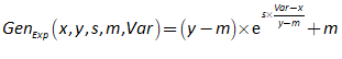
The slope of both these functions at their (x,y) points—the employment level where wage change equals zero for the wages function, the profit level at which all profits are invested for the investment function—is 2, versus a slope of 10 for both of their linear counterparts. An extreme slope is needed for the linear functions because, with a more gradual slope, nonsense values could be returned—such as an employment rate of more than 100%, for example. With a nonlinear function, the slope near the equilibrium can be quite modest, while the nonlinearity of the function itself makes this slope steeper further away from the equilibrium. This is realistic, and serves the purpose of constraining system outcomes to realistic bounds.
Figure 204: Nonlinear behavioral functions generate more realistic cycles
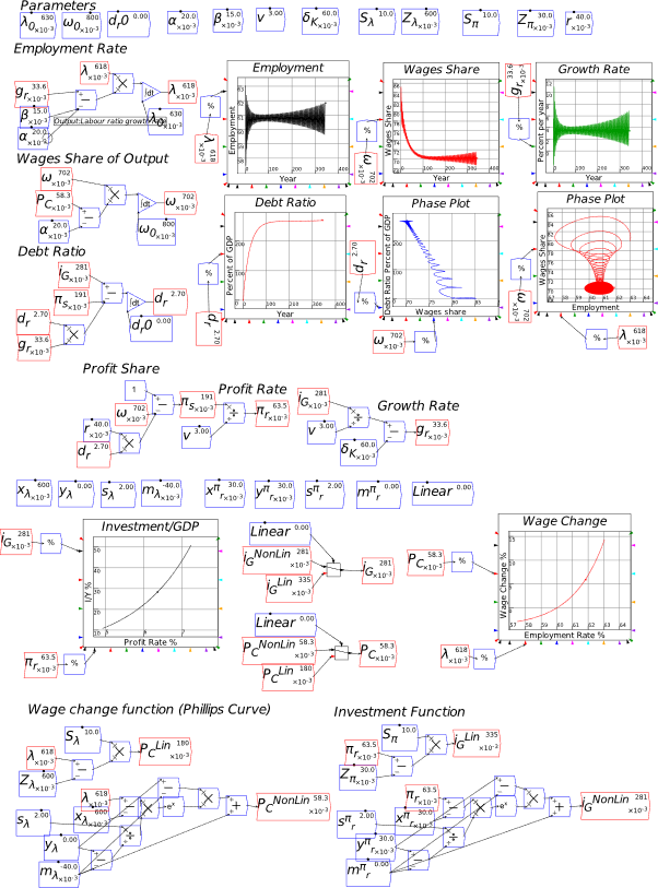
-
The switch function
Figure 204 makes use of Minsky’s switch function to enable the model to switch from using linear to nonlinear functions easily.
Figure 205: The switch functions used in Figure 204
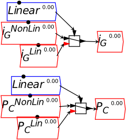
The switch function takes an input which can be zero or non-zero, and returns the first input if its value is zero, or the second if it is non-zero. The parameter has an initial value of 0, a maximum of 1, and a step-size of 1, so it acts as the on-off switch. To make it easier to see what is happening, the indicator wire within the switch block will switch from one input to the other when the input condition is altered.
Now let’s turn our attention to the essential missing ingredient in economic models of production: energy.
-
Energy
The work in this chapter is the most technically demanding in this book, and also the area most needing follow-up work … by people like you! As I note in Manifesto, the fact that economics has persisted for almost a century (Cobb and Douglas 1928; Leontief 1944, 1946b; Leontief 1946a; Leontief 1936) with models of production in which energy plays no role is, arguably, the Original Sin of Economics that has resulted in it being the misleading miasma that it is today. But escaping from that miasma is difficult, as I found as I worked with Matheus Grasselli and Tim Garrett to derive the models outlined here.
The starting point, though, was simple enough. Both Neoclassical and Post Keynesian mathematical models of production functions treated output as a function of inputs of Labor and Capital:

However, nothing can be produced without energy and matter inputs as well. The input-output approach to modelling production, pioneered by Leontief (Leontief 1936), did explicitly include inputs of both energy and raw materials (as well as other commodities) to produce output, but in practice, this method was generally implemented in an equilibrium framework in “Computable General Equilibrium” (CGE) models, when the equilibrium of an input-output matrix is unstable. After the “Rational Expectations Revolution”, Neoclassicals largely abandoned CGE modeling in favour of single commodity modeling, based on the Ramsey growth model (Ramsey 1928). The Cobb-Douglas Production Function (CDPF) ruled supreme in these models, and portrayed output as being produced by combining technology , labour and capital :

Post-Keynesian aggregate production form of the Leontief input-output model, which Goodwin used in his cyclical growth model (Goodwin 1967), and I used in my model of Minsky’s Financial Instability Hypothesis, is:
Here is normally described as the “Capital to Output ratio” (see Figure 69 on page 47), while is called “Labor Productivity”—though I challenge both these labels later.
Neither aggregate production function explicitly include either matter or energy, something which mainstream economists largely ignored until the publication of the Limits to Growth (Meadows, Randers, and Meadows 1972). Then, faced with a rival technology—system dynamics—they tried to develop a Neoclassical riposte. Stiglitz (Stiglitz 1974a; Stiglitz 1974b) and Solow (Solow 1974a) both proposed modified Cobb-Douglas functions of the form (Solow 1974a, p. 35, Equation 6):
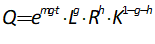
Here R stood for “Resources”, which include energy. It is treated as a third input on equal footing with Labor and Capital.
This didn’t make sense to me, for two reasons. Firstly, it implied that energy could be added to a production process independently of labor and capital—say, by hitting a factory with a bolt of lightning—and thus producing output. But this was more likely to turn the factory into a smouldering ruin. Secondly, it implied that Labor and Capital could both function without energy—which of course they can’t. Figure 206 both portrays and satirizes this approach.
Even far superior attempts to engage with the role of energy in production, like the work of Kümmel and Ayres (Kümmel, Ayres, and Lindenberger 2010; Kummel 2011; Lindenberger and Kümmel 2011; Kümmel, Lindenberger, and Weiser 2015), used a similar formulation where Capital, Labor and Energy were put on an equal footing. One step in the derivation of their LinEx production function was the introduction of a dimensionless specification of a production function, which again put Labor, Capital and Energy on an equal footing. Equation shows equations 39 and 50 from (Kümmel, Ayres, and Lindenberger 2010, pp. 162,166)
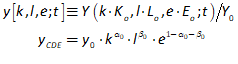
What was needed was a formulation which made energy absolutely essential to the production process, and didn’t pretend that it could be added independently of both labour and machinery.
Figure 206: Treating energy as an equivalent independent input to labour and capital

I was cogitating over this dilemma one evening while walking through Bob Ayres’s apartment in Paris—which was full of statues—when the quip “Capital without energy is a sculpture; labor without energy is a corpse” flashed into my mind. This insight revealed that the correct form for incorporating energy in production wasn’t Equation and Figure 206, but equation and Figure 207. Energy is an input to both machinery and labour, without which they can’t do useful work:
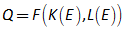
In doing useful work, waste is also necessarily generated—an application, in a very limited sense, of the Second Law of Thermodynamics. So the inputs to Labour and Capital are (different forms of) energy, and the outputs are materials transformed from non-usable inputs to usable commodities, plus waste.
Figure 207: Labour and capital both need energy inputs to produce output (which inevitably produces waste)

The easiest way to develop a mathematical model of production out of this insight was to treat both and as being equal to the product of the units of each ( and ), times the annual energy consumption of each ( and ), times how efficiently those inputs were turned into useful work ( and ):
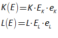
I fed this into the Capital and Labour components of the Cobb-Douglas Production Function (minus what soon transpired to be the superfluous ):
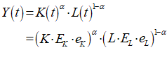
Rearranging this led to the expression in Equation , where the last two components are the standard expressions for capital and labour in the CDPF:
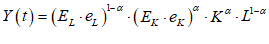
The first component—the energy consumption of the typical worker, times how much of that energy is turned into useful work in production—can be treated as a constant: the capacity for a worker to put energy into useful work hasn’t varied since humans evolved, and is roughly 100 Watts. The second is the energy input to the “representative machine” at a given time, multiplied by how much of that energy is turned into useful work. The energy consumption of the “representative machine” has risen from the tonnes of fuel per day that powered James Watt’s steam engine to the tonnes per second that fuel Elon Musk’s rockets. The efficiency with which machines turn energy into useful work is an unknown scalar bounded by . Treat the product as a constant and reserve the exponents for factors that actually change over time: . Then our energy-modified Cobb-Douglas Production Function is equation :
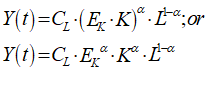
Derived this way, the “total factor productivity” term is actually a constant times the energy input to the “representative machine” of a given time.
This is the form in which I published this work (with Bob Ayres and Russell Standish) in “A Note on the Role of Energy in Production” (Keen, Ayres, and Standish 2019, p. 44). But we only used the Cobb-Douglas Production Function in the probably forlorn hope that some Neoclassicals might therefore read the paper. The real basis for modelling the role of energy in production properly is the “Leontief Production Function” used by Post Keynesians (equation ):
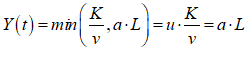
On the other hand, the Cobb-Douglas Production Function belongs in the dustbin of the history of economic thought.
-
Forget the “Cobb-Douglas Production Function” (an optional read)
Neoclassicals take great solace in the fact that their preferred aggregate production function fits the national data so well:
I have always found the high R2 reassuring when I teach the Solow growth model. Surely, a low R2 in this regression would have shaken my faith. (Mankiw 1997, p. 104)
This is doubly so, because the model also encapsulates the Neoclassical belief that the real wage is the marginal productivity of labor, and the rate of profit is the marginal productivity of capital. The fact that the empirically measured Cobb-Douglas exponents are very close to the national income shares of labour and capital played a major role in the acceptance of the Cobb Douglas by Neoclassical economists:
aggregate production functions apparently work nevertheless and do so in a way which is prima facie not easy to explain. It is easy enough to understand why, in economies in which things move more or less together, a relationship giving an aggregate measure of output as dependent on aggregate measures of capital and labor should give a good fit when applied to the data. What is not so easy to explain is the fact that the marginal product of labor in such an estimated relationship ap- pears to give a reasonably good explanation of wages as well. In its simplest form, this puzzle is set by a remark which Solow once made to me that, had Douglas found labor’s share to be 25 per cent and capital’s 75 per cent instead of the other way around, we would not now be discussing aggregate production functions. (Fisher 1971, p. 305)
Tragically, in one of the most insightful and witty papers in the history of economics, “The Humbug Production Function”, Anwar Shaikh (Shaikh 1974) gave the explanation that Fisher craved—and it wasn’t one that Fisher would have enjoyed. The Cobb-Douglas Production Function is just a tautology. It simply restates, in exponential rather than additive form, the identity that “Income equals Wages plus Profits” under conditions of relatively constant income shares:
Shaikh demonstrated that the Cobb–Douglas is simply an (anti-)logarithmic transformation of the income identity under the assumption that relative income shares are constant. (Carter 2011, p. 259)
Therefore, regressing the Cobb-Douglas Production Function against national income data is like regressing Y against Y: of course you’ll get a high correlation. That correlation falls below 100% only to the extent to which its assumptions—such as a uniform wage rate and constancy of income shares—deviate from actual conditions.
I’ll repeat Shaikh’s proof here to explain why the Cobb-Douglas function should be rejected as a basis for economic modelling. Start with the identity that income equals wages plus profits :

Assume a uniform real wage rate and a uniform rate of profit , applied respectively to a labour force and stock of capital :
Differentiate both sides and divide by :
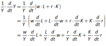
Bring in income shares—the proportion of income going to workers and capitalists respectively—by multiplying each fraction by the “missing ingredient”: multiply the first term by , the second by and so on:
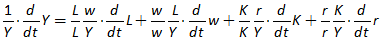
Group the terms so that income shares multiply each differential:
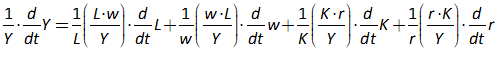
Call the profit share of GDP , and the wages share
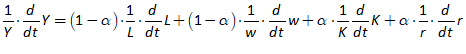
“Percentage” rates of change can be expressed as the differential of the logs, so that
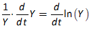
And likewise for the other differentials in
:
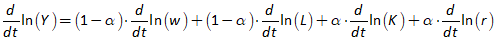
At this point, we assume that income shares and are constant. They do change over time—that was the basis of the Goodwin model—but relatively slowly compared to employment, wages, capital and the rate of return on capital, as codified in Kaldor’s stylized facts:
the share of wages and the share of profits in the national income has shown a remarkable constancy in ” developed ” capitalist economies of the United States and the United Kingdom since the second half of the nineteenth century. (Kaldor 1957, pp. 591-92)
Neoclassical modelers also treat as a constant in their models. So we can do the same, and then integrate both sides, with integration being the inverse of differentiation:
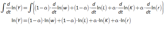
A constant multiplying the logarithm of a variable is the same as the logarithm of the variable raised to the power of that constant: and so on, so that
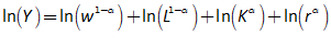
Take exponentials of both sides:
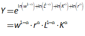
This is almost the “Cobb-Douglas Production Function”: the only difference is that Cobb and Douglas began with a constant in the place of , while later Neoclassicals use a time-varying , which they call “total factor productivity”—and which, as explained previously, is actually the energy consumption level of the “representative machine”:
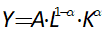
It’s no wonder, therefore, that the “Cobb Douglas Production Function” fits the empirical data on output and income distribution, since it can be derived from that data, under the not entirely false assumption that income shares are relatively constant.
Neoclassicals estimate as a residual from the time series for Labour and Capital—since the vast majority of them are not aware of Shaikh’s proof, and in typical Neoclassical fashion, those that are think that Solow’s rejoinder to Shaikh (Solow 1974b) settled the dispute in their favour. But it didn’t (Shaikh 1980, 2005; Labini 1995).
There is a further weakness, pointed out by Mankiw and noted in Manifesto, that while the CDPF fits national data well with its exponent conforming to national income distribution data, this value for also results in predictions of relative economic performance that are disastrously bad:
Because poor countries have about one-tenth the income of rich countries, they should have returns to capital that are about one hundred times as large. In particular, since the profit rate is about 10 percent per year in rich countries, it should be about 1,000 percent per year in poor countries. (Mankiw, Phelps, and Romer 1995, p. 287)
Another good reason to reject the CDPF is its assumed easy substitution of one input for another. This in itself is a dubious assumption—you can’t easily vary the labour and capital inputs into a production process—but in the context of energy, it is simply false. Energy can be used more or less efficiently, but there is no substituting for it. If you don’t have energy, you don’t have output, period. On this basis, the fixed coefficient formulation of the Leontief is more sensible. And, as the next section shows, it is easy to interpret the capital output ratio in the Leontief function as the efficiency with which energy is turned into useful work. The Leontief function has therefore implicitly contained the role of energy all along.
-
Generalizing the Leontief Production Function
Superficially, the Leontief Production Function has the same weakness as the Cobb-Douglas when it comes to the role of energy of energy in production—there isn’t one. Stating the Leontief in terms of a utilization of capital rate , a capital to output ratio , and an output to labour ratio , it is:
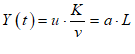
In fact, it’s relatively easy to show that the capital to output ratio v, which has been treated simply as an empirical regularity with a fairly constant value of between 2 and 4 for most economies, is actually the inverse of : the efficiency with which machines turn energy into useful work.
We have to start by defining what aggregate output actually is, mathematically, in a macroeconomic model. Economists treat it as just a number—a scalar—but the real question is “a number of what?”. It is not a pure number, but a dimensioned number: it is a number of identical “things”. These “things” are stylized universal commodities, which in the models can be consumed by workers as consumption items , or used as investment items , which are inputs to make machines, or “Capital” . The term for this (highly unrealistic) universal commodity is a “widget”. So in an aggregate macroeconomic model is the number of widgets produced per year.
In this same sense, we—my collaborators Matheus Grasselli (Grasselli and Costa Lima 2012; Grasselli and Maheshwari 2017; Grasselli and Nguyen-Huu 2018; Giraud and Grasselli 2019) and Tim Garrett (Garrett 2011, 2012a, 2012b, 2014, 2015) and I—introduced as the energy equivalent of : it was the amount of energy (measured in joules) contained in a widget, multiplied by the number of widgets produced per year .

We then equated Q to the energy converted into useful work by machinery, using equation :
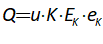
We can now show the relationship between Q and Y, using equation :
If we now equate terms with the same dimensions—energy per year in the cases of and scalars in the cases of , we get, firstly, that is the inverse of :

Secondly, the conversion factor between output in widgets and output in terms of energy (useful work) at any given time in this single-commodity world is the energy consumption level of the typical machine of that time:

The first finding was a surprise, but one that made intuitive sense once we realized it: the empirically-observed rough proportionality between output Y and capital stock K, which is an essential aspect of the Leontief model, actually represents the efficiency with which machines turn their energy inputs into useful work. In this sense, the Leontief model has always included a role for energy—it just wasn’t explicit. This then turns on its head the standard rendition of the capital to output ratio. This has been declining over time, somewhat inexplicably—see Figure 208:
Figure 208: Capital output ratio from https://fred.stlouisfed.org/series/RKNANPUSA666NRUG#0
However, from this energy-based perspective, what this actually shows is a rise over time in the efficiency with which machinery turns energy into useful work—or, also quite feasibly, an increase in the amount of GDP which is virtual or non-physical (neither commodities nor directly consumed energy, though of course virtual products—such as video games—require physical resources, including file servers and electricity). Though there is an increasing trend right from the start of the data, it becomes much stronger and more pronounced in the early 1980s, which coincides with the development of the computer and the “virtual” economy it allows, the financialization of capitalism and the rise in what Marx would call “fictitious output” from “fictitious capital”, and the start of US capital outsourcing production to China.
Figure 209: The efficiency with which energy is turned into useful work (GDP, or Y)
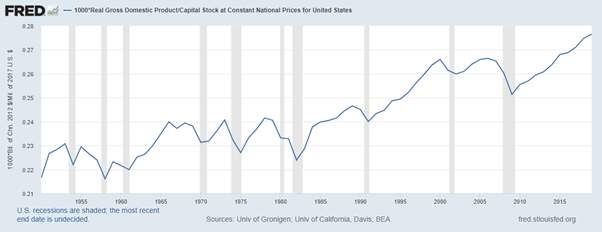
The rise in the ratio also supports to some degree the “decoupling” argument, that over time less and less of GDP is dependent on physical and energetic output—though it’s also important to put this in context: the dependence at the global level of output on energy remains extremely high (the data in Figure 209 comes solely from the USA). When one looks at the long-run global data (Figure 210), and especially data for the last half-century (Figure 211), the correlation between GDP and energy is extremely tight.
Figure 210: Global GDP and energy consumption since 1800
Figure 211: Global GDP and Energy data since 1970
These are both rising trends which generates a spurious correlation of course, but the annual change data is also extremely tightly correlated, and almost 1 for 1—see Figure 212.
Figure 212: Annual change in GDP against change in energy (Correlation 0.83)
However, the rise in the GDP to energy ratio is also apparent at the global level since the 1970s—see Figure 213.
Figure 213: GDP in constant US$ divided by Energy in BTU
However, the long-term data shows that this is a reversal of the trend since the start of the industrial age—see Figure 214.
Figure 214: GDP to Energy since 1800
Interpretation of this long term trend in GDP to Energy is an open question—it quite possibly represents the change from non-fossil to fossil-fuel driven industry over the course of the 19th century. That said, the very tight fit between energy and GDP from the 20th century on, and especially for the period from 1970 till 2017, provides another strong argument for the Leontief Production Function as the proper tool to model the close to linear relationship between energy consumption and GDP.
-
A Goodwin model with Energy
One key element in the previous section was using dimensional analysis to unravel an equation—equation , where the first term on the left was dimensioned in units of energy per year, and the next term was a scalar. It therefore made sense to equate components in the equation with the same dimensions:
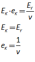
Dimensional analysis is an important technique in science and engineering to check the validity of a model, and it should be in economics too:
The consistent and correct use of dimensions is essential to scientific work involving mathematics. Their very existence creates the potential for errors: omitting them when they should be included, misusing them when they are included, and others. However, their existence also makes possible dimensional analysis, which can be a significant factor in avoiding error. In the equation , if y should have dimensions then so also should , and they should be identical to those of y. If y should not have them then neither should have them… An error revealed by a correctly performed dimensional analysis indicates a fundamental problem. Therefore, the importance of dimensions for science can hardly be overstated. (Barnett II 2004, p. 95).
Economics has ignored dimensional analysis, as is obvious enough in the Cobb Douglas Production function itself. As Barnett points out, the dimensions of the function can only be made reasonable by ascribing a ludicrous set of dimensions to the term:
A typical CD function is given by , in which: Q is the output variable; K and L are the capital and labor input variables, respectively; A, may be a constant or a variable; and, and are the elasticity of output with respect to capital and with respect to labor, respectively…
If dimensions are used correctly, output, capital, and labor each must have both magnitude and dimension(s), while and are pure numbers. Assume, for example, that:
-
Q is measured in widgets/elapsed time (wid/yr);
-
K is measured in units of machine-hours/elapsed time (caphr/yr); and,
-
L is measured in man-hours/elapsed time (manhr/yr). (Barnett II 2004, p. 96)
The only way to balance this equation in dimensional terms is for the A term to have crazy dimensions for something that Neoclassicals, not knowing of Shaikh’s critique, describe as “Total Factor Productivity”:
The “Cobb Douglas Production Function”, as well as being based on a tautology, is also dimensionally weird. What we need instead is a model of the biophysical processes by which inputs of energy, raw materials and intermediate products are turned into usable physical products. This chapter will take the first tentative steps towards this, in models in which energy plays a fundamental role. Our first pass was a model in which the inputs are energy, and the outputs are energy: the production process turns energy in a form that can’t be consumed by humans—say, coal—into one in which it can—say, electricity.
We started from the points established earlier about the Leontief Production Function (LPF), that by using the redefinition of K and L as means by which energy is used to perform useful work:
We can recast the standard LPF:
In terms of energy, so that output , in terms of useful energy per year, equals capacity utilization (a scalar) times the number of machines , times energy per machine per year , times the efficiency with which that energy input is turned into useful work :

This is dimensionally consistent:
The Leontief Production Function in terms of energy per year is mapped across to the standard measure of GDP in Widgets per year by dividing by , where , the energy content of a widget:
For simplicity, I’ll work with as in Goodwin’s original model.
We start from the definition of in terms of :

Labour’s input also has to be converted into energy terms, where we treat the energy output of the representative worker as a constant:
Labour is a derived demand in the Goodwin model: it is equal to the number of workers needed to operate the machines used to produce output. We therefore need to define a machine to worker ratio:

In the original Goodwin model, Goodwin used an output to labour ratio , which he assumed rose over time at a constant rate , and this was the same as the rate of growth of the capital to labour ratio (since there was a linear relationship between output and capital). is therefore equivalent to in (Goodwin 1967). As with Goodwin, we assume that this ratio rises exogenously over time, but as well as giving it a less androgynous term ( rather than ), we use a less androgynous Greek letter kappa () for its rate of growth:

The output to labour ratio in this model is more complicated, since it relates the useful energy from production to the energy input from labour. It therefore includes the dynamics of energy as well as of those of the capital to labour ratio:
, the energy input to the representative machine at time t, is assumed to grow at an exogenously given rate of :

So that the rate of growth of is:

We can now derive by rearranging the first line of equation :

Once is defined, the rest of the model follows logically.
The employment rate is employment divided by population , which is assumed to grow at an exogenously given rate. Goodwin used for this rate; in keeping with our eponymous renaming of the capital to labour ratio, we use (the Greek equivalent of n) instead:

The employment rate determines the rate of change of wages:
The wage times Labour determines the wage bill, which determines profit:

Investment is profit minus depreciation:
Capital times the energy output of capital determines output Q in units of energy per year, closing the causal chain of the model:
-
Derivation
We start from the same system states as in the original Goodwin model, and then expand them out with the new definitions from equations to .
Firstly the derivation of :
Therefore the “percentage rate of change of ” is:
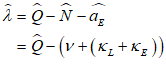
The derivation of starts from the definition of :

Therefore
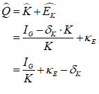
The derivation of  :
:
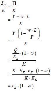
Therefore:
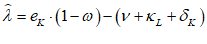
This is identical to the original Goodwin model (with depreciation) with , the efficiency with which machinery turns its input energy into useful work, taking the place of the capital to output ratio.
Secondly, the derivation of :
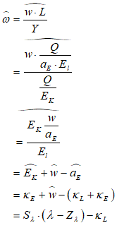
This is strictly identical to the original Goodwin model form:
At this stage the inclusion of energy might look like “much ado about nothing”—see
Figure 215.
Figure 215: Goodwin with energy in system state form
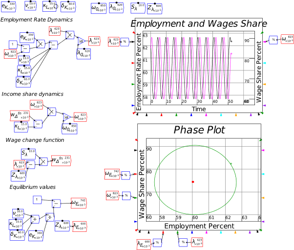
However, there are three ways in which this is an advance:
- The previous empirical regularity of a reasonably constant capital to output ratio is now explained as the efficiency with which energy is converted into useful work;
- The fact that no quantitative change occurs by introducing energy into the Leontief production function, whereas a significant change occurs when doing the same with the Cobb-Douglas production function, indicates that the Leontief form was effectively correct, though based on a statistical regularity (the relatively constant capital to output ratio) rather than on energy; and
- The explicit use of energy in the derivation allows both waste production (consistent with the 2nd Law of Thermodynamics) and resource depletion to be added to the basic Goodwin model.
Point 3 above is covered by firstly defining waste energy as the complement to useful energy in Equation :
Secondly, to simulate resource depletion, we revise Equation to include a factor based on the fraction of remaining fossil fuel reserves:
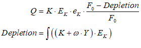
Depletion includes the use of energy in production, and the energy consumed by workers.
This extension is best shown in an absolute values model of Goodwin with energy. This model is shown in Equation and simulated in Minsky in Figure 216 (the Minsky model includes a conversion of waste energy into waste matter, which can be degraded over time—we’re thinking of here obviously).
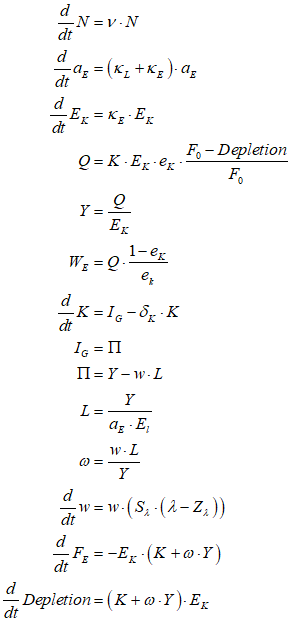
Figure 216: A Minsky system dynamics model of energy in production and resource depletion
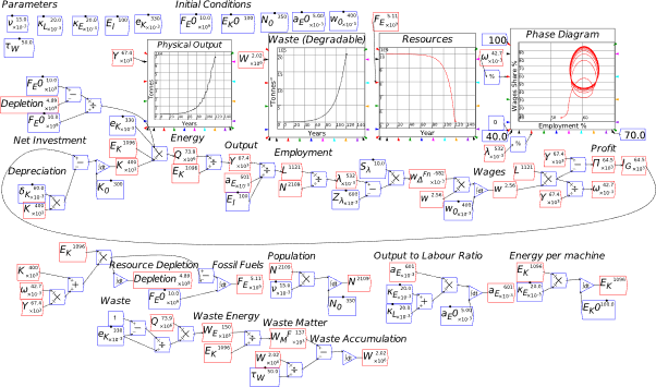
This explains the final figure in Manifesto, but it only scratches the surface of properly incorporating inputs from Nature into economic modelling. Though the previous model does introduce energy into the production function, its treatment of matter is too simplistic, with all the “heavy lifting” between matter and energy done by the conversion factor . A model of production entirely in terms of energy is also an extreme simplification. More realistically, energy is used in production to transform matter from less useful forms (raw materials) to more useful (finished products). The next section develops a model with both energy and matter inputs used to produce useful matter output. This model was derived in collaboration with my friends and research colleagues Tim Garrett, an atmospheric physicist, and Matheus Grasselli, a financial mathematician.
-
A Goodwin model with matter and energy
Our inspiration here was Hicks’s noble but unsuccessful attempt to build a dynamic model of a production economy in the paper “Wages and Interest: The Dynamic Problem” (Hicks 1935), where the output was bread—a consumer good. Though poorly known today, this paper was in fact the real origin of the IS-LM model, as Hicks admitted in 1981 in “IS-LM: An Explanation” (Hicks 1981).
In this paper, Hicks attempted to develop a dynamic theory of economics by reconciling the treatment of capital as a “factor of production” by J.B. Clark with its treatment as a produced means of production by Wicksell:
Most modern theories of capital fall into one or two classes. On the one hand, there is the “timeless” type of theory, which treats capital as a factor of production like any other. Such a theory is that of J. B. Clark. In practice, it assimilates capital to land, treating it as the inexhaustible provider of a regular stream of resources. On the other hand, there is the “period of production” theory of Bohm-Bawerk and Wicksell. This treats capital as “stored-up labour”—labour stored up in the past. (Hicks 1935, p. 456)
Hicks characterised both theories as “stationary”, and “quite satisfactory under that hypothesis, but incapable of extension to meet other hypotheses, and consequently incapable of application” (Hicks 1935, p. 456), because both theories assumed equalities that applied in a stationary state but could not be assumed in a changing one. Hicks warned that assuming such equalities where they did not exist was dangerous:
To found a theory upon an assumed equality, which is not a real equality, is a most dangerous thing to do; for the more complex the theory becomes, the more specialised it becomes. The blinkers grow, until they shut out nearly all the landscape. One distinction blurred over breeds another, until we have in the end only a special case of a special case of a special case. (Hicks 1935, p. 457)
Hicks therefore attempted to abandon the assumption of stationarity and develop a dynamic model. After advocating period analysis over the use of continuous time, Hicks set out his simplifying assumptions, which commenced with:
(1) We shall assume a community which is wholly engaged in the production of a single homogeneous good, which we shall call Bread.
(2) Bread is made by the co-operation of labour (assumed homogeneous) with capital goods (not homogeneous) which we shall call Equipment. Equipment may include land, buildings, machinery, raw materials, and half-finished goods. (Hicks 1935, p. 458)
These assumptions, in the context of a dynamic theory, require a model in which both bread and Equipment are produced—and in which raw materials, including energy, are exploited, as we model here. Had Hicks actually built this model, it would have been a true tour de force. Unfortunately, he did not. Instead, at a later stage in the paper, he reduced Equipment to dated bread:
A production plan can be regarded, on the basis of our simplifying assumptions, as a series of outputs of bread in successive weeks, together with the series of inputs of labour necessary to obtain those outputs. For the entrepreneur has actually to determine, not only how much labour he will employ in the first week, but how he will employ that labour, whether in the production of bread for the next market day, or in the production of bread for the more distant future (activity which, a week after, will only have resulted in the production of equipment). (Hicks 1935, p. 460)
Hicks’s conceptual apparatus thus reduced to a model in which bread is produced using bread and labour alone, and in which bread functions as a consumer good if used this week, and a capital good if not used this week.
When we first attempted to build a model which did achieve what Hicks set out to do, we felt genuine sympathy for his plight, since our attempt to build a model with the same conceptual foundation—an economy producing a single commodity, which functions as both a consumer and an investment good (which is a common feature of the vast majority of economic models, both Neoclassical and Post Keynesian)—led to a similar intellectual impasse. It is very easy to imagine a world in which consumers consume bread, but very difficult to imagine a world in which bread functions as machinery. In the end, Hicks’s sketch of a model described a passingly realistic scenario of consumption, but a trivial and unrealistic scenario for investment.
Our solution was to reverse this dilemma, and to consider a world with a far-fetched model of consumption, but a passingly realistic scenario for investment. What commodity can take the place of bread, and enable a reasonably realistic model of production—including the use of raw materials and energy, and the production of machinery using that commodity as an input—at the probable expense of a rather unrealistic consumption good?
Fiction provided an answer with the cult animated movie The Iron Giant. The deuteragonist of that movie was made of iron—see Figure 217. We therefore imagined a “Planet of the Iron Giants”, in which Iron Giants were the consumers and workers (and capitalists), iron was used to make the capital goods (blast furnace/rolling mill, iron ore and coal mining machines), energy was essential to all three processes, iron was consumed by the workers as their real wage, and physical waste (slag) was necessarily generated by production, as well as waste energy as in our previous model.
 Figure 217: The “Iron Giant”
-
Derivation: constant technology and population
This was more easily said than done. To produce a model in which one commodity—iron—was the final output, we needed to model three sectors: the energy-mining sector (most easily thought of as coal mining, since coal—as coke—is also an input to iron manufacturing, and not solely an energy source); the iron-ore-mining sector; and a factory sector which took inputs of coal and iron ore to produce iron and slag. Each sector needed labour, and specialized capital—made of iron. Our mental framework was that everything was made of sheet iron, which could be shaped in the factory sector into shapes specific for each sector, and also as consumption for our Iron Giant workforce.
We needed three production relations, each with a different type of output, but each of which required energy (and capital and labour) as inputs. The outputs were respectively energy (best thought of as coal), iron ore, and iron plus slag.
In keeping with Keen Ayres & Standish 2019, we treat machinery (“Capital”) as the means to channel energy to perform useful work. The output of an industry per year is the product of the number of machines K, times the energy per machine per year E, times the efficiency of conversion of energy into useful work ε, times the yield of product per unit of energy input y—this is the key extension over the previous model, where all internal processes in the model were in terms of energy only.
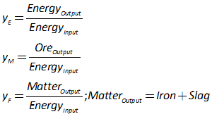
With three sectors (E for mining energy, M for mining iron ore, and F for factory), we have five equations: one for the output of each sector in units of energy per year (Joules/Year), units of iron ore per year (Kilograms/Year), units of physical output consisting of both iron and slag (Kilograms/Year), iron itself Y (our single commodity GDP), and slag YW (physical waste):
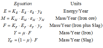
Output that is used for investment adds to the stock of machines , which is denominated in terms of mass: kilograms of iron. This gives us a novel solution to the measurement of capital problem: rather than ignoring the issue entirely as in standard Neoclassical models—despite Samuelson’s concession of defeat in the Cambridge Controversies (Sraffa 1960; Samuelson 1966; Pasinetti et al. 2003; Harcourt 1972)—or measuring capital in terms of dated labour as did Sraffa (Sraffa 1960), we measure capital in terms of kilograms of iron. Using to signify the number of machines, and to signify the weight of each machine, we have:
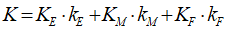
We therefore define as the proportion of capital invested in each industry:
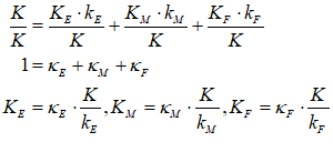
Employment is proportional to the number of machines in each sector. There is a workers per machine ratio such that employment in each industry equals this ratio times K:
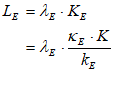
Matching equations apply for employment in mining and fabrication .
We then define as the aggregate ratio of labour to capital:
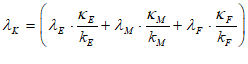
This enables us to define aggregate employment and the employment rate . For simplicity in the first pass, we worked with a constant population , and a constant labour to capital ratio :
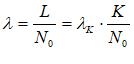
This in turn enabled us to use the same wage change relation as in the previous models, based on the aggregate level of employment:
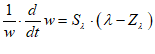
Three output equations are now needed, in contrast to earlier models with just one. A full, multi-commodity-model would require price relations for each of the energy, iron mining and fabrication sectors, as well as stocks of unsold units of output. To generate a less complex single commodity model, we instead assumed proportionality between each sector, with excess capacity in energy and iron ore mining so that their yields adjust to meet the energy needs of the entire economy. This means that the output of the energy sector equals to energy input needs of all three sectors: itself, mining, and fabrication:
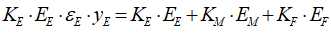
This requires that the yield of the energy sector adjusts to the needs of all three sectors:
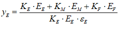
Solving for yields:
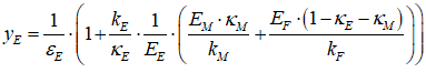
The same assumption for mining, that the yield adjusts to fit the needs of the fabrication sector for material (iron ore) inputs, enables us to link the total output of the two sectors. Since the factory sector converts iron ore to rolled iron sheeting plus slag, then by the conservation of matter, the gross output of the factory in kilograms of iron plus slag equals the input in kilograms of iron ore. Therefore:
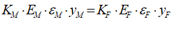
From this we can derive the yield (in kilograms per joule) of the factory sector:
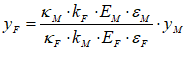
Output from the factory sector can now be defined:
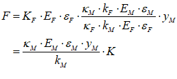
Call the first term—for the ratio between aggregate capital K and factory output (where this is the sum—in kilograms—of both iron and slag ) :

Then output and waste are:
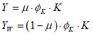
With output, labour and wages defined, it is now possible to derive the model in terms of the wages share of GDP and the employment rate. The rate of change of the wages share of GDP is a linear transformation of the rate of change of wages in this model without technical change or growth in population:
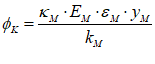
Therefore, the rate of change of wages share is a linear transformation of the wage change function:
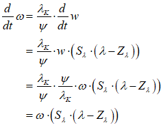
The employment rate is a linear transformation of capital stock:
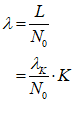
Hence
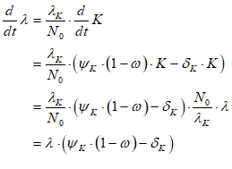
This results in the classic Goodwin model, with taking the place of :
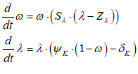
The final step in this process was to introduce a growing population and changing technology, manifest as a falling ratio of workers to machines. This in turn provides the scaffolding on which to add the accumulation of waste in the biosphere.
-
Growth and pollution
We replace a constant population with a growing one, and a constant labour to capital ratio with a falling one:
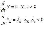
A variable thus replaces in while becomes a variable in . The state space equation for thus becomes:
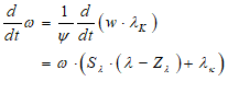
That for becomes:
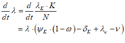
This is once more the classic Goodwin model:
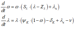
The strengths of this model over the previous versions are:
-
The introduction of the concept of an “energy return on energy invested” in the yield from the energy mining sector, , since the input and the output are both energy. This is a critical concept in biophysical economics (Hall 2011), but, to our knowledge, has not previously been incorporated in a macroeconomic model.
- In this initial model, this is a constant derived from the requirement of the other two sectors. Our ambition is to make this an empirically derived quantity in future extensions, and to consider the extent to which this determines and constrains economic performance.
- It is now possible to link this model directly to the generation of waste matter using equation :
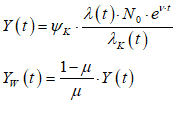
Figure 218 shows a simulation of this model in Minsky, including both output and waste derived from Equation .
Figure 218
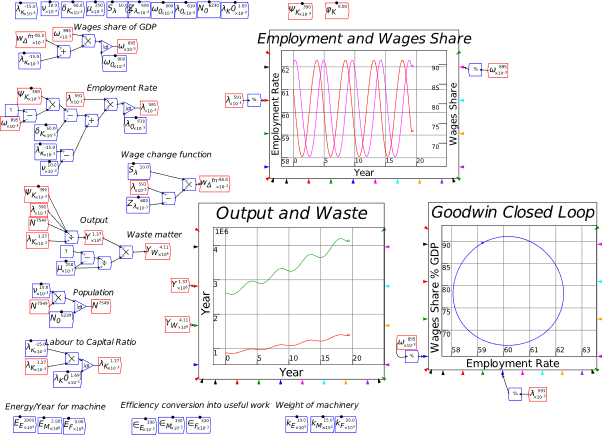
This model thus achieves what Hicks attempted in “Wages and Interest: The Dynamic Problem” (Hicks 1935) in the context of a single commodity model of production. Future extensions will address the unrealism of this foundational model by introducing multiple commodities, and multiple forms of waste as well.
-
Analyzing a Model
This should not be is a difficult chapter, because it is telling you how to do something that you should already know how to do: to work out the qualitative properties of a dynamic system.
However, if you have done a degree in economics—even a PhD—you probably don’t know how to do that. This is regardless of whether you’re a Neoclassical, Austrian, Sraffian, Marxist or Post Keynesian, because most (not all!) modelers in these disparate traditions have one thing in common: they model the economy using equilibrium-oriented methods. This implicitly assumes that the equilibrium of their model—and by implication, the economy itself—is necessarily stable. It’s not, as this chapter will explain.
If you’ve got this far into this book, I am assuming that you know the basics of linear algebra—specifically, what a determinant is and how to work it out. I also assume that you don’t know how they’re applied in dynamic analysis—basically, in working out the stability or otherwise of a dynamic system using “eigenvalues” and “eigenvectors”.
It was also difficult for me to write this chapter, since, though this material used to be second nature to me, after dedicating most of the last two decades to debunking Neoclassical economics (Keen 2001, 2002, 2003e, 2003c, 2003a, 2003d, 2003b, 2004b, 2004a; Lee and Keen 2004; Standish and Keen 2004; Keen 2005; Keen and Standish 2005; Gallegati et al. 2006; Keen and Standish 2006; Keen and Ormerod 2007; Keen 2009; Keen and Standish 2010; Keen 2011a, 2011b, 2011c, 2015; Keen and Standish 2015), I’ve barely used these techniques myself this century. With mathematics, like sports, if you don’t use it, you lose it.
Finally, large scale dynamic systems—and that means anything with more than two dimensions—are extremely hard to analyze qualitatively, and there is a hard limit: the mathematical prodigy Galois proved in 1830 that almost all 5th order and above polynomials do not have a symbolic solution. This matters for analyzing dynamic systems because, as you’ll see below, the qualitative properties of a dynamic model can be reduced to the properties of a polynomial of the same order.
Why is this a problem? Here, what economists do know has led to delusions about what they don’t know.
Virtually all schoolchildren learn the solution to a quadratic, a “second order polynomial”. Figure 219 shows the formulas, using the symbolic engine of the mathematics program Mathcad.
Figure 219: The well-known solutions to a quadratic equation
Pretty simple, right? Most of us learn this by rote at school: “the roots of are minus b, plus and minus the square root of b squared minus 4ac, all divided by 2 times c”. If you don’t study mathematics to an advanced level (say, 2nd year undergraduate), it’s not unusual to think there must be equivalent formulas for higher order polynomials—and that there’s no limit to how high you can go.
So what’s the equivalent line for a cubic? Figure 220 shows the three formulas: you can forget learning them by rote!
Figure 220: The symbolic solutions to
At the next level, a quartic, the equation for even one of the four formulas wouldn’t fit on a single page, and there is no formula—there cannot be a general formula, as Galois proved almost two centuries ago—for a quintic or above.
That’s the bad news. The good news is twofold. Firstly, advances in computing power have meant that the numerical analysis of the properties of a dynamic model are possible. Secondly, the actual number of fundamental dimensions to a model is often below five, even for a very complicated model—for example, even the government-based extension of my model of Minsky, which has six equations (Keen 1995, pp. 625-632), is actually a 3-dimensional model, because its fundamental dimensions are the wages share of GDP, the employment rate, and the private debt to GDP ratio.
However, as is often the case with mathematical analysis, the good news comes with bad news (and so on ad infinitum).
In numerical analysis, the number of dimensions is based not on the fundamental variables in a model, but on its parameters: so a model with 3 variables and ten parameters is ten-dimensional when you wish to work out how the model’s behavior changes with different parameters. If each parameter can take fifteen different values, you have one million billion possible combinations. That’s just too many even for a modern computer to analyze, so mathematicians and computer programmers have worked out ways to explore the parameter space—genetic algorithms, simulated annealing, etc.—without having to check every possible combination of parameters.
In symbolic analysis, while the dimensionality depends on the number of fundamental variables, the task of converting a model into a form where its equations are strictly in terms of the fundamental variables can be extremely difficult. Using my model of Minsky’s Financial Instability Hypothesis as an example again, it had three fundamental dimensions—the wages share of GDP, the employment rate and the private debt to GDP ratio. The mathematician Bernardo Costa-Lima’s devoted his entire PhD thesis to analyzing its properties.
Despite those discouraging remarks, its worth knowing at least the basics of the qualitative interpretation of complex dynamical models. It will, for a start, disavow you of the notion that equilibrium modelling is sufficient. And it will allow you to appreciate the processes that give rise to the complex dynamics of systems like Lorenz’s butterfly effect, and my own models of financial instability.
It will also help you appreciate that the instability of input-output dynamics—something that I think played a large role in Neoclassical economists finally abandoning CGE (“Computable General Equilibrium”) modeling—wasn’t at all due to the fixed proportions involved in an input-output matrix. Even with variable input proportions, these equilibrium models would still have been unstable, because ironically, the linear components of a model determine the stability of its equilibrium, while the nonlinear bits only come into play far from equilibrium. Neoclassicals should not have abandoned Computable General Equilibrium modelling for Dynamic Stochastic General Equilibrium modelling, which was a backward step (Romer 2016): instead, they should have abandoned their fetish for equilibrium, and embraced far from equilibrium dynamics.
-
Of linearity and nonlinearity
One of the quirks of nonlinear models is that the stability of their equilibrium points is determined by their linear components—so that if the equilibrium of a nonlinear model is unstable, it’s because of its linear bits, not the nonlinear ones. Therefore, if the equilibrium of some dynamic process is unstable—as is the case for Computable General Equilibrium models —then adding nonlinear bits to it (say, replacing a Leontief input-output matrix with a different production model that allows for substitution between inputs) won’t help one zot: the equilibrium will remain unstable.
The easiest way to illustrate this is with a Taylor series expansion for a periodic function, like . Imagine a model where the equilibrium is given by . Then, if you’re a long way from this equilibrium—say at —the behavior of the model is dominated by its nonlinear bits, and the linear component is effectively irrelevant: see Figure 221. The linear approximation to is , or about , which is hopelessly wrong, since the actual value is zero. The full 17th order polynomial approximation is , which is only wrong by 1%.
Figure 221: sin(x) and its approximations out to 10
Figure 222 shows the same functions, but for values less than 1. Here, the nonlinear terms add very little to the accuracy of the approximation: the linear approximation to sin(0.1) is 0.1; the actual value of . The higher order terms improve the accuracy of the linear approximation by less than . Near the equilibrium, the linear term rules.
Figure 222: sin(x) and its approximations out to 1
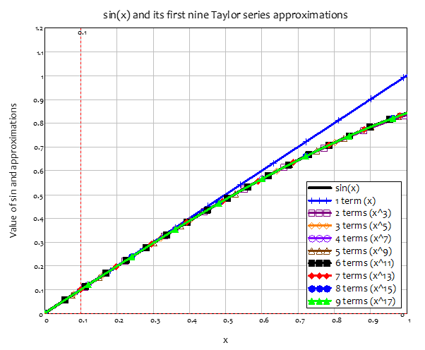
This is because the nonlinear components are the divergence from equilibrium, raised to a power of 2 or more. When you’re a large distance from the equilibrium, these numbers dominate the linear component, since . But when you’re close to the equilibrium, the order is reversed: .
This enables a simple way of analyzing the stability of a nonlinear dynamic model: convert it into a polynomial approximation; drop all but the linear terms to generate a linearized model; and work out whether its rates of change are negative near the equilibrium—which means the system will converge to the equilibrium—or positive—which means the system will diverge. It’s slightly more complicated than this, but that’s the gist.
-
The absolute basics of stability analysis
Let’s give it a try with the simplest complex model we consider in this book, Lotka’s predator-prey model—see Figure 223 (which reproduces Figure 85 on page 64). This generated, to Lotka’s surprise, everlasting cycles, rather than the convergence to equilibrium that he expected:
It was, therefore, with considerable surprise that the writer, on applying his method to certain special cases, found these to lead to undamped, and hence indefinitely continued, oscillations. (Lotka 1920,p. 410)
Figure 223: Lotka’s predator-prey model: everlasting cycles

Equation expresses this as a differential equation, in a way that illustrates that Lotka’s model is the simplest possible extension of a model of exponential growth. If there were no Sharks, the number of fish would grow exponentially, while if there were no Fish, Shark numbers would fall exponentially. But the existence of sharks linearly decreases the growth rate of fish, while also linearly decreasing the death rate of sharks:
The first step in working out why this model generates everlasting cycles is to express it as a vector equation:
Next we create a matrix from this vector, where the entries are the differentials of the equations with respect to F and S. This is known as the Jacobian matrix (I’ll explain why this is needed later):
Then we replace F and S with their equilibrium values. From Equation , if and if :
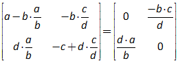
This is now the linear component of the predator-prey model, which, in the vicinity of the equilibrium, dominates the nonlinear components. So, to work out whether the model converges to the equilibrium or diverges from it, we have to analyze Equation —where I’ve used the subscript L to indicate that this is a linearized model:
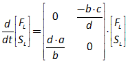
Before we do, it’s easy to add this to the Minsky model of the full nonlinear model, so that we can see how it behaves:
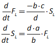
This is a linear model of the deviation of the full system from its equilibrium values (hence the positive and negative values that it generates), and you can see that it reproduces the same closed cycle as the full nonlinear model (though it’s circular in shape, as opposed to the egg-like shape of the full nonlinear model). So the model neither converges to the equilibrium, nor moves away from it.
Figure 224: The Predator-Prey model and its linearized deviation from equilibrium
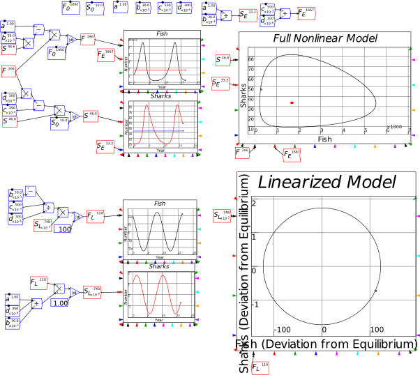
We can now use some algebra to show why this model generates the same magnitude cycles forever. The logic starts from the nature of a single ordinary differential equation, and simply works out how to apply that to a system of equations.
A linear Ordinary Differential Equation is an equation of the form:
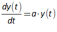
Here is a constant and is a variable, and what we’re trying to find is the correct functional form for . This might be a model of population growth, or radioactive decay. So the general solution for as a function of time is that must be some function whose rate of change equals itself times a constant. The exponential function is the only candidate, since the differential of an exponential function is the coefficient for the exponent times the function. A exponential is of the form:

Its differential is the exponent times the function itself:
We then feed this “guess” into Equation
It’s obvious that our “guess” answer is correct if , but I’m going to labor the point a bit here by rearranging the last line of Equation
:
Equation is only true for non-zero values of if . Therefore the solution to Equation is:

The value of tells you whether a system tends towards zero over time—if —or explodes—if —or doesn’t change—if .
Have I bored you with this exposition? I hope so, because the process for working out the same results for a system of equations like Equation is much more demanding, but it is essentially the same process—only following the rules of matrix mathematics, since we’re working with a pair of equations rather than a single equation.
We start with the linear component of the predator-prey model in Equation —reproduced here:

We presume that the differential of the vector is times the vector:
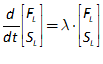
We equate this to the matrix equation in
:
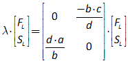
Next we rearrange the equation so that the zero vector is on the right hand side:
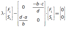
To process this according to the rules of matrix mathematics, we need to multiply the first term by the identity matrix:
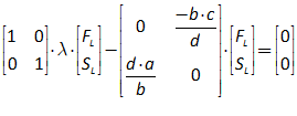
We can now multiply the Identity Matrix by , and group terms on the Left Hand Side (LHS):
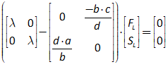
We subtract the second matrix from the first to yield:
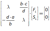
For this equation to allow for non-zero values of and over time, the matrix in must somehow be like in Equation : it must have a magnitude of zero. Then the equation can be solved for non-zero values of and . This will be the case if the determinant of the matrix is zero. The determinant is a quadratic in :
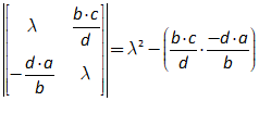
So the roots of this polynomial give us the values of that both solve Equation , and tell us whether this linear system will converge to the equilibrium—if the roots are both negative—or diverge from it—if they are both positive:

However, the roots of this equation are pure complex numbers—numbers including the square root of , symbolized by the letter :
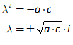
They therefore they describe purely cyclical behavior, as we’ve already seen in the simulation.
In general, there are 4 major classes of behavior:
-
a stable fixed point: both roots—called eigenvalues—are real and negative;
-
an unstable fixed point: both eigenvalues are real and positive;
-
a saddle, which is also unstable: one positive real eigenvalue and one negative; and
-
a cyclical system, where both are complex numbers—which can have positive, negative, or zero real parts.
In a way, this is all rather ho-hum: the behavior is relatively simple, and with computers, we can see the model’s behavior in the simulation anyway. But the behavior isn’t simple when we get to what are called complex systems: systems of three or more nonlinear ordinary differential equations.
-
Analyzing a complex model
As a warmup to analyzing my model of Minsky’s Financial Instability Hypothesis, we’ll analyze the first such system to be numerically simulated: Lorenz’s “butterfly” model of turbulent flow (Lorenz 1963). We simulated—but did not analyze—this in section 9.1 on 180. Its deceptively simple equations in 3 variables with three parameters are:
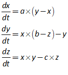
The first step is to work out the equilibria of this model, which is relatively easy to do. We set the differentials in Equation to zero, and then solve for these specific values of :
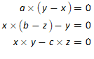
The obvious solution is that all three are zero. One obvious element of the non-zero solutions is that , which is easily derived from the first equation. Feed this into the second and third equations, and you get:
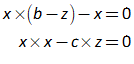
This gives you one value for , and 2 for —which is also the value for :

So the three equilibria of this system are:
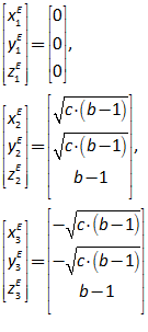
We calculate the “Jacobian” matrix—so called because it was first developed by Carl Gustav Jacob Jacobi—which is a matrix formed by differentiating each function with respect to each variable in the system (I’ll explain why it’s used later):
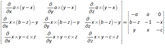
Now we substitute the values of at the equilibria. Starting with the zero equilibrium, this generates the linear component of the model in the vicinity of . Using the subscript L to emphasize that this is linearized rather than the full model, we get this model:
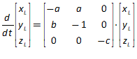
We make the same “ansatz” that the solution is of the form:
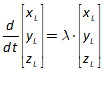
Substituting this into gives us an algebraic equation to solve:
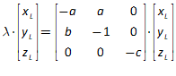
Rearrange it using the rules of matrix algebra:
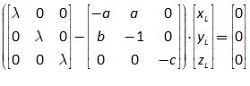
We’re now looking for values of that allow the variabes to take non-zero values. This is revealed by the roots of the polynomial in generated by this determinant:
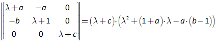
So one root of is obviously , while the quadratic formula is needed to identify the other two:
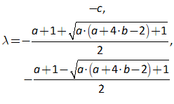
There’s a lot more grunt work to express this fully, but the key point for stability is that, for the equilibrium to be stable, the biggest “real” part (that is, the part that doesn’t involve the square root of minus one) of these numbers—known as the “dominant eigenvalue”—must be negative. We know that is negative, since are all positive numbers; but the value of the other two depends on the magnitude of the square root term. Here we have to plug in numerical values for , which are parameters in fluid mechanics. The realistic values that Lorenz first used were:
When we plug those into Equation we get:
What this means that this equilibrium is stable along two of its three “eigenvectors”, but unstable along the third. So the zero equilibrium is a “saddle node repeller”: it attracts the system along two axes, but repels along the third.
The other two equilibria are symmetric, so we can just consider the second. We feed the values for into the Jacobian:
The linear component of the dynamic system near this second equilibrium is thus:
We assume that this is equivalent to:
Substitution yields:
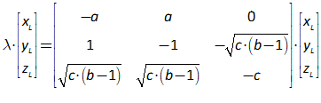
Grouping via the rules of linear algebra yields:
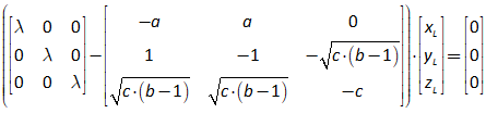
This is true if the determinant of the matrix is zero, which yields this third order polynomial:
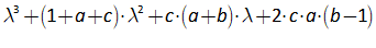
Remember the formula for the roots of a cubic equation in Figure 220? Feed this into that, and you get a nightmare expression that would fill several pages. It’s much easier to fill in the values for the parameters—see Equation . Feed these into Equation and you get one real root (the negative number on its own) and a pair of “imaginary” numbers—numbers involving :
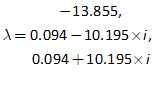
The first root shows that this equilibrium is a strong attractor along one of its dimensions (eigenvectors). But the next two show that it is cyclical (the two complex numbers generate cyclical behavior) and that it is a repeller: the real part of the pair of complex roots is greater than zero. This means that as the system approaches this equilibrium, it is repelled from it in a cyclical fashion—which is what we saw in the simulation.
The whole model has one equilibrium which attracts along two dimensions and repels along a third, and two equilibria which attract along one dimension and repel cyclically on a plane. Figure 225 shows its three equilibria, and the dynamics of the Lorenz model, projected onto the and planes. This behavior had never been seen in a mathematical model before Lorenz, and the equilibria were dubbed “strange attractors” as a result.
Figure 225: The dynamic behavior of the Lorenz model projected onto the x,y and z planes
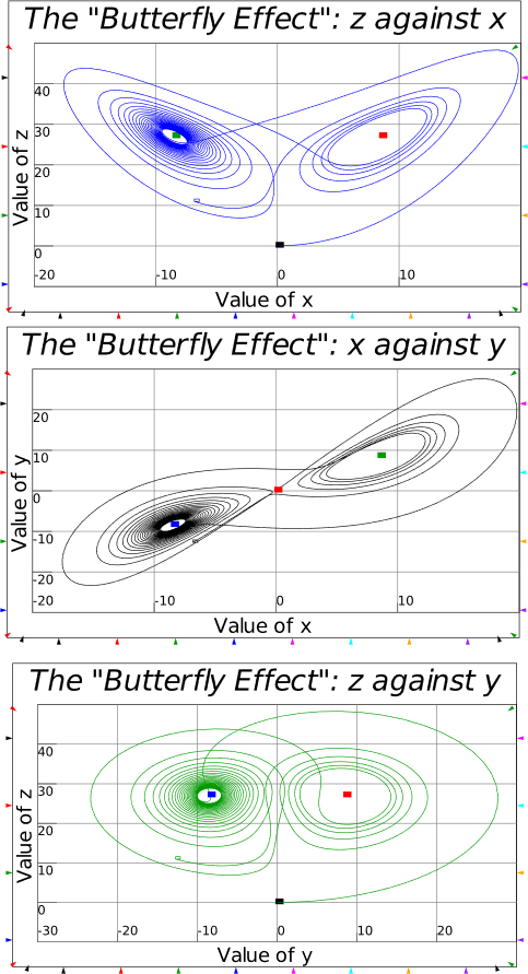
This also illustrates why equilibrium modelling is a waste of time if the underlying system is complex—and that is true when the system in question has three or more dimensions that interact with each other in nonlinear ways (Li and Yorke 1975). A complex system will almost certainly never be in any of its feasible equilibrium states: if you want to model it, you have to use modelling techniques that can handle far-from-equilibrium behavior.
This discovery convinced meteorologists of Lorenz’s point, that weather forecasting should not use equilibrium techniques. If his simple model, which was derived from the complicated equations that describe fluid flow, generated chaotic behavior, then the weather—where the fluid is air—must also be chaotic. Equilibrium models of the weather were therefore useless.
This was not the only factor involved, but there then ensued a revolution in meteorology which has led to the advanced capacity meteorologists have to predict the weather today—within limits also determined by the properties of complex systems. This is why the disaster of Cyclone Sandy had such a tiny impact on human life: meteorologists were able to predict where it would make landfall to a far higher degree of accuracy than was possible before Lorenz, and therefore people could be advised to evacuate before the disaster hit.
But in economics? In 2007, economists advised that politicians that the economy would sail smoothly into 2008, since their equilibrium-based economic models predicted it would be a year of tranquil economic growth.
-
Analyzing the Keen model of Minsky’s Financial Instability Hypothesis
I predicted something different—a financial crisis—because I was informed by the non-equilibrium model I had built of Minsky’s Financial Instability Hypothesis, way back in August of 1992 (Keen 1995). That model used a nonlinear Phillips curve function devised by John Blatt (Blatt 1983, p. 213) for the express purpose of avoiding nonsense outcomes like an employment rate of more than 1; in this book, I have used a linear Phillips curve, not because I believe it is linear—anything but, as I explain in Section 5.2.1, starting on page 49—but because it’s easier to mathematically analyze a model with linear rather than nonlinear functions.
It also means, as Carl Chiarella emphasized (Chiarella and Flaschel 2000; Chiarella 2005; Asada et al. 2006), that if you use linear behavioral functions in an otherwise nonlinear model, the nonlinearities in the model itself arise not from the functions (which inevitably involve assumptions by the modeler) but from the structure of the model itself: they are intrinsic. Once these are identified and analyzed, nonlinear functions can be added at a later stage when you are attempting to fit your model to data.
My solution to the problem Blatt identified with linear functions—that they can give you a employment rate of more than 100%–was to use the employment to population ratio (which is about 60%) rather than the employment to workforce ratio (which is about 90-95%). That way, the countervailing intrinsic nonlinearities in the model will kick in well before the model reaches an employment to population ratio of 100%, even with an unrealistic linear Phillips curve.
The model—which as I show in Section 9.2 on page 183, can be derived directly from the macroeconomic definitions for the employment rate, the wages share of GDP, and the private debt ratio—is reproduced in Equation , with the intrinsic nonlinearities, generated when one variable is multiplied by another, highlighted in red.
The full analysis of this model’s stability properties is in (Grasselli and Costa Lima 2012). I won’t attempt that level of detail here, because it would just be too lengthy, and also because examining just one equilibrium is hard enough on its own—so hard in fact, that I debated whether or not I should include this section at all.
In the end, I decided to keep it, because it reveals the role of symbolic analysis in explaining why some phenomena that can be seen in a simulation actually occur. The two specific features of my model that cannot be explained by the equations themselves, nor understood simply by looking at a simulation, are that:
-
The crisis is preceded by a period of diminishing volatility in the rate of economic growth—a “Great Moderation”; and
-
Before it collapses in a final crisis, the capitalist share of income fluctuates around a constant level, while the workers’ share of GDP falls as the debt ratio rises.
Both these phenomena are apparent in Figure 226. But neither were either predictions by Minsky in his Financial Instability Hypothesis, nor assumptions built into the model itself.
Minsky did say “stability … is destabilizing”, but this was with reference to a single cycle—that a period of tranquil growth would lead to rising and eventually euphoric expectations, leading to a boom which changed the distribution of income, and caused a bust. However, he did not predict that the scale of cycles would get smaller before they got larger: that was something that was first seen in the simulations for my 1995 paper. The phenomenon was so striking that I ended the paper with a rhetorical flourish about it:
The chaotic dynamics explored in this paper should warn us against accepting a period of relative tranquility in a capitalist economy as anything other than a lull before the storm. (Keen 1995, p. 634)
Figure 226: The Keen-Minsky model (same equations as but with compact functions to save space)

The fact that the profit share was stable (before it collapsed at the end of the simulation), while the wages share fell as the debt level rose, was also an enigma: how come workers’ share of GDP falls as debt rises, even though—in this model—workers did not borrow?
The solution to this enigma became obvious when I first tried to work out the model’s equilibria in terms of its three system states: the wages share , the employment rate , and the debt ratio . An equilibrium will be defined in terms of the model’s parameters, which was easy to do for the employment rate. But the “equilibrium” wages share included the “equilibrium” debt ratio as one of its arguments: try as I might, I either couldn’t eliminate a variable from the solution, or I got something too complicated to work with. So I decided to work with the profit share instead:
That results in a much more compact set of equations:
Given that and are both positive, we can simplify finding the equilibrium to solving the following equations:
The first two are relatively easy to work out, while the third, for the debt ratio, is quite involved. Equation
shows the equations using the substitution of the profit share, which allows us to express both the equilibrium profit share and equilibrium employment rate in terms of the model’s parameters:
We have to go further to express the debt ratio in terms of the model’s parameters only though, since the profit share itself is part of the debt ratio. Making this substitution yields the unholy mess in Equation :
This complicated expression simplifies drastically once you realize that part of it is the expression for the equilibrium rate of profit from Equation . Using superscripted (as in ) to emphasize that these are equilibrium values, we have:
Even this isn’t the end of the process, because the differential equations in Equation are in terms of the wages share, not the profit share. We either have to derive the equilibrium wages share, or convert the wages share differential equation into a profit share equation. The easier route is the former, and it also reveals something interesting. Firstly, we define the equilibrium wages share in terms of the equilibrium profit rate and debt ratio:
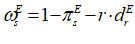
Remember that this model was derived from strictly true macroeconomic definitions? Since the equilibrium profit share is a constant, then a higher rate of interest means a lower wages share of GDP. In the dynamic model as well as in this equilibrium calculation, the higher the debt level, the lower the workers’ share of GDP. This explains the phenomenon we can see in the dynamic path of the model as well: as the debt level rises, the wages share falls. A higher interest rate also leads to a lower wages share. The real class struggle in capitalism is not between workers and capitalists, but between workers and bankers.
That fun observation aside, we still need to substitute the expressions for the equilibrium profit share and debt ratio from Equation into to generate equilibrium values for the wages share, employment ratio and debt ratio. Using the expression for yields this relatively compact statement of the values of the “good” equilibrium:
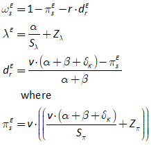
These equilibrium values have to be substituted into the Jacobian—which is just too big to show in full form here, so I’ll represent what it is instead: the partial derivatives of each of the functions in the system (Equation ) with respect to each of the variables
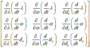
Fortunately a fair degree of cancellation occurs, so that the Jacobian isn’t quite as horrific as it could have been—but it’s still pretty horrific:
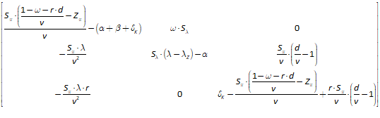
We’re not home and hosed yet: this is the linear component of the model in the vicinity of this equilibrium, and to know whether this linear model will converge to the equilibrium, we need to calculate the roots of the polynomial that results from the same process as shown for the Lorenz model. These roots are just too complicated to calculate symbolically, so—as is often the case in complex systems analysis—we are forced to numerical means: we calculate the polynomial for given parameter values.
The key parameters that shape the system’s behavior are the interest rate, the slope of the investment function , and the point at which investment equals profits (and therefore, firms don’t borrow) . The key behavior of the model—a flip from a stable to an unstable equilibrium—can be seen in the equations below: where the slope of the function , is 8.4, 8.5 and 8.6 respectively:
Each set of eigenvalues includes a negative real value, which attracts the system towards it. Each also contains a pair of complex eigenvalues, which makes the system cycle. The key difference is that, in the first case, the “real part of the complex eigenvalues” is negative—which means the system will converge to the equilibrium; in the second, the real part is zero—so it will repeat the same cycle indefinitely, neither converging on the equilibrium, nor diverging from it; in the third however, we get “strange attractor” behavior, because the real part is positive—it repels the system from the equilibrium. So the system is attracted along one axis and cyclically repelled along another.
This doesn’t mean that the value of 8.5 is a critical one for the system—the behavior of this linearized model only properly characterizes the full nonlinear model in the immediate vicinity of the equilibrium, so if you start much further away, as do the simulations I’ve done of it in this book, then instability can apply at a lower value for the slope of the investment function. But it does indicate that there are conditions under which the model can be stable, and others under which it can be unstable, so the model “bifurcates” when the parameters change across this critical value.
Figure 227 shows a simulation with a low value () for the slope of the investment function, and you can see the model converging to the equilibrium values over time.
Figure 227: Linear Keen-Minsky model with a low value for the slope of the investment function
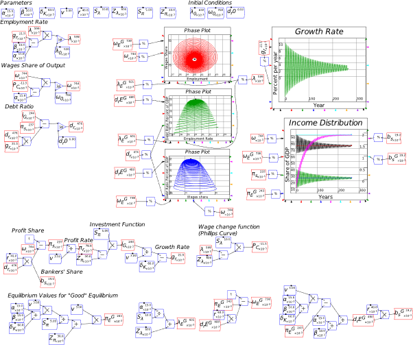
Figure 228 shows what happens with a higher value (7.5), and starting from a long way from the equilibrium position (the debt ratio I start the simulation with is zero, while the equilibrium debt ratio is 252%). The model starts to converge on the equilibrium, but then diverges—and ultimately it will collapse onto the “bad” equilibrium of zero employment, zero wages share, and an infinite private debt to GDP ratio. This is the stylized equivalent of a debt-deflation, which implies a total breakdown of society—and it’s why “Big Government” is needed, according to Hyman Minsky, because the government’s counter-cyclical spending can prevent this collapse from occurring.
Figure 228: Linear Keen-Minsky model with a high value for the slope of the investment function
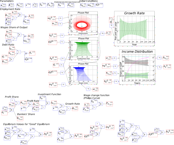
This simple model emphasizes a key point from a genuine dynamic model, as opposed to fake dynamics of “Dynamic Stochastic General Equilibrium” modelling: you can’t reduce the behavior of a complex system to the properties of its equilibrium.
-
Why the Jacobian?
The easiest way to explain why the Jacobian matrix—a matrix formed by differentiating each function with respect to each variable—is needed as part of this process is by analogy to what happens when you try to approximate a function like using a polynomial.
What you are doing in that instance is declaring that the numerical value of is equal to the numerical value of an infinite sum of polynomials, which is an infinite sum of terms of a constant, plus another constant times t, plus another constant times t squared, and so on:
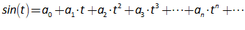
The unknowns here are just the coefficients and so on. If we take the simplest case, where , we know that . With , all the terms on the right hand side are zero, except for the first constant . So we know therefore that . That’s easy, but how do we work out what is? English mathematician Brook Taylor realized that these could be found using differentiation. If you differentiate , you get . Differentiating the right hand side—the polynomial—gets rid of the first constant (the differential of a constant is zero), leaves the second constant standing on its own, while the other terms are all multiplied by powers of t:
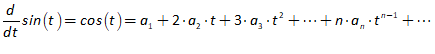
Use again, we know that , while all the subsequent terms are zero. So we know that . There’s more to know about this process itself, but this is enough for our needs: we have worked out that the linear approximation to is just itself:
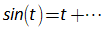
It’s a reasonable approximation for between and :
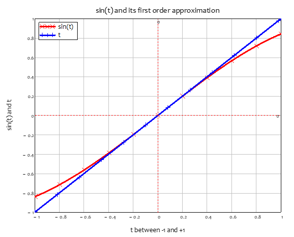
This is already “too much information” for what you need to know here (were you feeling that way? Sorry!), which is that the linear term in this whole process is the first differential of the function. This rule for a “scalar function”—a function of just one variable, in this case, t—is the first differential of the function with respect to .
The Jacobian just generalizes this to a “vector function”—a function of more than one variable, in the case of the Keen-Minsky model, the variables of . The Jacobian is the first differential of every function with respect to every variable. So by deriving it, we build a linear approximation of the system, and the properties of this linear approximation dominate the system’s behavior around its equilibrium.
If this linear system is stable—if it converges to the equilibrium—then so will be the full nonlinear system, but only if it starts “close enough” to the equilibrium that the linear forces can “do their thing”. It is possible to have a system whose equilibria are stable, but only if you start close to those equilibria where the linear components dominate. If you start further away, then the nonlinear terms dominate—which can be seen in the simulation shown in Figure 228, since the value of is below the critical level for stability of the equilibrium, and yet the simulation still diverges from it.
This behavior of a complex system leads to the concept of a “basin of attraction”: a region around an equilibrium where the system will converge to the equilibrium—or remain within a finite distance of it that is less than the overall phase space of the system—if the initial conditions lie within this basin. Other concepts that turn up at this level of analysis include the Lyapunov exponent, to determine whether a system is chaotic or not (a system can generate aperiodic cycles, but not actually be chaotic). Were I twenty years younger, and that much closer to my own mathematical education, I’d attempt an explanation here. But having wasted so much time fighting Neoclassical economists, I’ve forgotten much of what would be needed to give a decent explanation. So, if you want to understand these concepts—and they are worth understanding if you wish to really contribute to nonequilibrium economics—then I suggest either doing a course in complex systems at your local University mathematics department, or undertaking self-tuition via online resources like The Chaos Book (https://chaosbook.org/).
-
Model fitting notes from a non-statistician
The science fiction author Ray Cummings once wrote that “time is what keeps everything from happening at once”. Time, or the lack of it, is also what keeps some things from happening at all. In my case, the lack of time has meant that statistical analysis is the least developed part of my personal intellectual portfolio.
It is also, for reasons of lack of funding, the least developed aspect of Minsky. We hope to be able to extend Minsky at some stage to implement some methods for parameter estimation in complex systems, but for the moment, if you wish to fit a Minsky model to data, you’re going to have to do that by exporting the model to another program. Minsky currently supports model exporting to Matlab (it’s an option in the “Export Canvas” command on the File menu) for that purpose; it should soon support export to Vensim; at some stage we will add model exporting to R; and you can export the data from a Minsky simulation to a CSV file, which can be loaded into any data analysis program.
Fitting models to data is, of course, a large part of conventional economics, with its own sub-discipline of econometrics—and its own intellectual problems. Fitting a complex systems model to data opens yet more cans of worms, fundamentally because a complex systems model necessarily violates the conditions for linear regression (which is the mainstay of econometrics) that elements of a model predominantly interact additively. The inherent nonlinearity of complex systems models, along with the far-from-equilibrium behavior that most models generate, means that the values of parameters also interact with each other in nonlinear ways—normally multiplicatively, as in my model. This creates a “fitness landscape” for those parameters with numerous mountains and valleys (in terms of the model’s deviation from real world data) that can trap a standard least squares parameter fitting process in a local minima which is close to the initial guess values, but far removed from the model’s actual minimum deviation from real-world data.
This weakness of standard techniques cannot be addressed by a “brute force” approach of examining every permutation of the parameters, because the number of permutations is overwhelming. For example, the Keen-Minsky model shown in Figure 228 has nine parameters. If we try just twenty different values for each parameter, then there are , or over 12 million trillion, different combinations of parameters to consider. This is simply too large a number of possibilities to test, so mathematicians and computer scientists have developed a range of techniques to sample a subset of possible combinations, and have reasonable confidence that your eventual choice of parameters is a global minimum, rather than a local one.
These techniques include genetic algorithms, simulated annealing, neural networks, plus a range of variations on least squares techniques—such as the Adam Optimization Algorithm (the name is derived from “adaptive moment estimation”)—all of which are designed to overcome the problem of the parameter estimation technique getting locked onto a local minimum (deviation of the model from the data) which is not the global minimum.
My main interest in fitting models is not finding the best parameter values to enable a given model to replicate real world data, but in seeing whether or not the empirical data qualitatively conforms to a given model. If there are qualitative similarities, then the model, while it might not be able to replicate the empirical data precisely—or even closely—can provide insights into the real-world system.
This was the point of Lorenz’s model, which was constructed by stripping down an extremely accurate high-dimensional model of fluid turbulence to an extremely simple model with just 3 variables and 3 parameters. Lorenz didn’t construct this model to fit the data on turbulence, but to show the underlying factors causing that turbulence were the interaction of aspects of the weather—wind speed, temperature, humidity, pressure gradients, etc.—in highly nonlinear ways. In doing so, he “discovered” chaos (though it had first been identified logically by Poincare at the end of the 19th century), and a whole new way of modelling the weather was born.
I had a similar ambition for my model of Minsky’s Financial Instability Hypothesis. I wanted to do what Minsky had not managed to do, to produce a mathematical model of his verbal intuitions about the role of private debt and credit in causing both cycles and crises in capitalism. I did that with a model in which I made a range of simplifying assumptions that removed other possible sources of instability apart from the nonlinear interactions of the model’s system states—the rate of employment, the oncldistribution of income, and the private debt to GDP ratio.
Some obvious sources of cyclical behavior in capitalism are variations in the rate of interest, changes in the capital to output ratio, intersectoral production and monetary dynamics, changes in the rate of population growth and technological change… All these were effectively held constant in my basic model. All that was left were the interactions of those three system states, and out of them arose two unexpected properties—in the sense that neither of them were predictions of Minsky’s verbal model.
The Keen-Minsky model shown in Figure 228 has four key qualitative features:
-
A rising level of private debt to GDP over time;
-
An eventual debt-deflationary crisis—which in technical terms is convergence of the model onto the “bad equilibrium” of zero employment, zero wages, and an infinite debt to GDP ratio;
-
Cycles in the rate of economic growth diminishing and then rising before a crisis; and
-
The shift in the distribution of income over time, with a rising private debt ratio causing a declining workers’ share of income, while the profit share of income is cyclical but unaffected by the rising debt ratio.
Only the first two characteristics that Minsky had described in his hypothesis, and that I had expected to emanate from the model. The latter two were what are known in complex systems as “emergent properties”: behaviors of a model that are not built into it by its designer, but result from the nonlinear interactions of the components.
The second property in particular was striking. Though Minsky had famously stated that “Stability—or tranquility—in a world with a cyclical past and capitalist financial institutions is destabilizing” (Minsky 1982, p. 101), this was in relation to the process within one cycle, where a period of tranquil growth would lead to rising expectations, turning a period of tranquil growth into a credit-fuelled boom. Minsky also expected that, in the absence of “Big Government”, there debt to GDP ratio would increase over a series of booms and busts, until a level of debt was accumulated that overwhelmed the economy and caused a Depression.
But he did not expect that these booms and busts would get smaller in magnitude for a while, and then get larger—which was the first emergent property of my model. Nor did he think that the rising debt ratio, and rising debt servicing costs, would come at the expense of workers and not capitalists (until the final crisis occurred). These predictions were a direct product of the mathematical model, which I first developed in August of 1992.
-
Conclusion
I hope that the preceding chapters give you a reasonable introduction to modelling in Minsky, as well as an explanation of why continuous time system dynamics modelling is an excellent foundation for a monetary, far-from-equilibrium, biophysical approach to modelling capitalism.
There are some features of Minsky that I haven’t discussed, mainly because their implementation at present is incomplete. One obvious such feature is grouping: as noted on section 6.2 on page 67, grouping still has significant bugs which make it advisable not to use this feature at present. We have also enabled unit analysis in Minsky, which is a powerful means of checking the logic of a model, but the implementation doesn’t as yet work smoothly enough to recommend its use. I’ve probably spent too much time in theoretical digressions rather than simply explaining how to build a model as well. I’ll try to return to this manual/book and improve those aspects of it as time permits.
For now, I would be delighted if you started using Minsky to build Post Keynesian oriented dynamic models of capitalism, and biophysical models of the dependence of the economy on the biosphere. One positive-negative of the current state of development of Post Keynesian economics is that, since most Post Keynesian models use “time periods”, there is a lot of low-hanging fruit in re-implementing these models in continuous time. A second positive-negative is that the field of dynamic integrated biophysical monetary modelling is virtually pristine: there is so much to be done. If you do embark upon modelling with Minsky, you won’t run out of research projects any time soon—and the existence of relatively easily solved “puzzles”, Kuhn notes, is an important part of the development of a “Normal Science” after a period of revolutionary upheaval:
The scientific enterprise as a whole does from time to time prove useful, open up new territory, display order, and test long-accepted belief. Nevertheless, the individual engaged on a normal research problem is almost never doing any one of these things. Once engaged, his motivation is of a rather different sort. What then challenges him is the conviction that, if only he is skilful enough, he will succeed in solving a puzzle that no one before has solved or solved so well. Many of the greatest scientific minds have devoted all of their professional attention to demanding puzzles of this sort. (Kuhn 1970)
As I argued in Manifesto, economics has been locked in a pre-scientific state ever since Walras, Jevons and Menger in the 1870s, and arguably, ever since Smith distorted the empirically sound foundations of the Physiocrats with the argument that the division of labour—and not the “free gift of nature”—was the basis on which the economy and economic growth were built. Even progressive rival schools of thought like Post Keynesian economics and MMT have remained either based on Neoclassical modelling foundations that they should have abandoned—primarily, equilibrium-oriented modelling and the use of “time periods” rather than continuous time—or they have not developed a widespread practice of dynamic modelling because the technology to do it properly was accessible only to a tiny cohort of suitably trained non-mainstream economists.
Minsky is far from perfect, and far from finished, but I believe it is sufficiently well designed and sufficiently complete to enable a community of modelers to grow around it, to share models, and to illustrate how much more fruitful and realistic a dynamic, non-equilibrium, monetary, energy-aware approach to economics is when compared to the stale, equilibrium-fixated, barter-based, energy-ignorant work of Neoclassicals.
Please help turn this belief into reality.
-
Appendix: the credit dynamics of house prices

This is an extract from an as yet unpublished paper undertaken with Paul Ormerod and Nyman Rickard.
Arguments over whether there is or is not a bubble in housing are endless and seemingly futile. Proponents of the bubble hypothesis point to various metrics when they exceed historic norms, such as house prices relative to rents or household income. Opponents argue that such divergences simply reflect the balance of the forces of supply and demand, or propose reasons why these price to income ratios should in fact rise over time. Bubble proponents slate the blame for the perceived bubble to the banking sector; opponents of the bubble hypothesis blame inflexible supply for any perceived deviation of prices from affordability metrics.
The current state of this debate is thus akin to the irresolvable question of “which came first: the chicken or the egg”? Given the importance of housing both socially and economically, this is an unsatisfactory state of affairs.
Clearly there are causal factors working in multiple directions: is it possible to disentangle them to work out what is the predominant factor, and thus determine whether housing is or is not in a bubble? In this paper we propose a causal analysis, and apply a well-known—if limited by its linear assumptions—statistical test to resolve this dispute.
-
The argument
We commence with an argument couched in terms of supply and demand. The supply of housing has two major components: the turnover of existing properties (whether for speculative, demographic or social reasons), and additions to the stock of properties by construction. We can therefore specify the physical flow of supply onto the market at a point in time as having one factor relating to the fraction of existing stock supplied to the market each year, and another consisting of construction or the change in stock:
The monetary demand for housing has two components as well: the deposits needed by prospective purchasers, and the flow of new mortgage debt . Given that, even in the 1960s, the typical loan to deposit ratio was 2.5:1, and today the ratio is closer to 10:1, we neglect deposits here and treat the monetary demand for housing as being equivalent to the flow of new mortgages . This flow, divided by the price level ruling at the time of purchase , determines the physical demand for housing :
The market demand and supply factors thus have monetary forces on one side (change in mortgage debt and the house price level) and physical supply on the other, with numerous potential causal channels: rising mortgage debt might drive house prices; rising house prices might encourage people to take on mortgage debt; rigid supply meeting flexible demand may push house prices up; rising house prices might encourage more circulation of existing stock, and new construction, and so on. Stating the causal dynamics in an agnostic way, and dropping the time argument for notational simplicity, we start with the relation between demand and supply shown in equation :

Restating this in terms of the house price index yields:

We are interested in the change in house prices—which immediately suggests that one factor in the change in house prices is not the rate of change of mortgage debt, but its acceleration:
Expanding this out yields:
A simplification makes this relation more tractable: we note that equation suggests that can be substituted for :
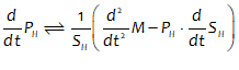
If we now divide by to derive the percentage rate of change of prices, we get:
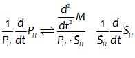
Equation expresses the rate of change of house prices as a function of supply and demand, as participants in this debate all agree. However, what may be unexpected is that this relationship includes acceleration terms for both mortgage debt and housing supply. Substituting into ( yields:
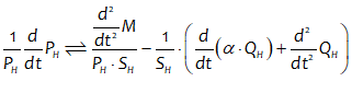
This implies that for house prices to rise, the acceleration of mortgage debt must be positive, and greater (when deflated by the current monetary value of transactions on the housing market) than the supply-deflated sum of the rate of change of the physical housing stock times its turnover rate, plus the rate of change of new construction (and thus the acceleration of the housing stock).
We have revealed a potential relationship between the rate of change of house prices and the acceleration of mortgage debt: but which causes which? Do rising house prices cause people to decide to take on mortgage debt, or does accelerating mortgage debt cause house prices to rise?
If the former, then the supply “chicken” leads the demand “egg”, and those who argue that there is no bubble have a case. If there is a policy desire to reduce the rate of growth of house prices, then that policy must focus on the supply of housing. There is also no reason why sustained price rises cannot continue.
But if it is the latter, then the demand “egg” leads the supply “chicken”, and the argument that there is a debt-financed bubble driving house prices has legs: limits on the capacity of banks to create mortgages would impact upon house price growth. There is also a very good reason why house price rises must ultimately stop: they depend on the acceleration of mortgage debt being not merely permanently positive but substantially greater than zero, to counter the impact of the two supply factors. This is impossible, since nothing, not even mortgage debt, can accelerate forever.
References
Adamczewska, Agnieszka M., and Stephen Morris. 2001. ‘Ecology and Behavior of Gecarcoidea natalis, the Christmas Island Red Crab, During the Annual Breeding Migration’, The Biological Bulletin, 200: 305-20.
Asada, Toichiro, Pu Chen, Carl Chiarella, and Peter Flaschel. 2006. ‘Keynesian Dynamics and the Wage-Price Spiral: A Baseline Disequilibrium Model’, Journal of Macroeconomics, 28: 90-130.
Barnett II, William. 2004. ‘Dimensions and Economics: Some Problems’, Quarterly Journal of Austrian Economics, 7: 95-104.
Blatt, John M. 1983. Dynamic economic systems: a post-Keynesian approach (Routledge: New York).
Borio, Claudio, and William R. White. 2004. “Whither monetary and financial stability? the implications of evolving policy regimes.” In BIS Working Papers. Basel: Bank for International Settlements.
Braun, Martin. 1993. Differential Equations and Their Applications: An Introduction to Applied Mathematics (Springer: New York).
Carter, Scott. 2011. ‘”On the Cobb-Douglas and all that …”: the Solow-Simon correspondence over the aggregate neoclassical production function’, J POST KEYNESIAN EC, 34: 255-74.
Chapman, Brian, and Steve Keen. 2006. ‘Hic Rhodus, Hic Salta! Profit in a Dynamic Model of the Monetary Circuit’, Storia del Pensiero Economico: Nuova Serie: 137-54.
Chen, Yu‐Ming. 2018. ‘Dynamics of a Lorenz‐type multistable hyperchaotic system’, MATH METHOD APPL SCI, 41: 6480-91.
Chiarella, Carl. 2005. Foundations for a disequilibrium theory of the business cycle : qualitative analysis and quantitative assessment / Carl Chiarella, Peter Flaschel, Reiner Franke (Cambridge : Cambridge University Press: Cambridge).
Chiarella, Carl, and Peter Flaschel. 2000. The Dynamics of Keynesian Monetary Growth (Cambridge University Press: Cambridge).
Cobb, Charles W., and Paul H. Douglas. 1928. ‘A Theory of Production’, The American Economic Review, 18: 139-65.
Coolidge, Calvin. 1928. “State of the Union Address: Calvin Coolidge (December 4, 1928).” In.
Desan, Christine. 2015. Making money : coin, currency, and the coming of capitalism / Christine Desan (Oxford : Oxford University Press).
Fisher, Franklin M. 1971. ‘Aggregate Production Functions and the Explanation of Wages: A Simulation Experiment’, The Review of Economics and Statistics, 53: 305.
Forrester, Jay W. 2003 [1956]. ‘Dynamic models of economic systems and industrial organizations’, System Dynamics Review, 19: 329-45.
———. 2013. Industrial dynamics (Mansfield Centre, CT : Martino Publishing).
Friedman, Milton. 1969. ‘The Optimum Quantity of Money.’ in, The Optimum Quantity of Money and Other Essays (MacMillan: Chicago).
Gallegati, Mauro, Steve Keen, Thomas Lux, and Paul Ormerod. 2006. ‘Worrying trends in econophysics’, Physica A: Statistical Mechanics and its Applications, 370: 1-6.
Garrett, T.J. 2011. ‘Are there basic physical constraints on future anthropogenic emissions of carbon dioxide?’, Climatic Change, 104: 437–55.
———. 2012a. ‘Modes of growth in dynamic systems’, Proceedings Of The Royal Society A: Mathematical, Physical And Engineering Sciences, 468.
———. 2012b. ‘No way out? The double-bind in seeking global prosperity alongside mitigated climate change’, Earth System Dynamics, 3: 1-17.
———. 2014. ‘Long-run evolution of the global economy: 1. Physical basis’, Earth’s Future, 2: 127–51.
———. 2015. ‘Long-run evolution of the global economy II: Hindcasts of innovation and growth’, Earth System Dynamics, 6: 655–98.
Giraud, Gaël, and Matheus Grasselli. 2019. ‘Household debt: The missing link between inequality and secular stagnation’, Journal of Economic Behavior & Organization.
Godley, Wynne. 1999. ‘Money and Credit in a Keynesian Model of Income Determination’, Cambridge Journal of Economics, 23: 393-411.
Godley, Wynne, and Marc Lavoie. 2007a. ‘Fiscal Policy in a Stock-Flow Consistent (SFC) Model’, Journal of Post Keynesian Economics, 30: 79-100.
———. 2007b. Monetary Economics: An Integrated Approach to Credit, Money, Income, Production and Wealth (Palgrave Macmillan: New York).
Goodwin, Richard M. 1967. ‘A growth cycle.’ in C. H. Feinstein (ed.), Socialism, Capitalism and Economic Growth (Cambridge University Press: Cambridge).
Graeber, David. 2011. Debt: The First 5,000 Years (Melville House: New York).
Grasselli, M., and B. Costa Lima. 2012. ‘An analysis of the Keen model for credit expansion, asset price bubbles and financial fragility’, Mathematics and Financial Economics, 6: 191-210.
Grasselli, Matheus R., and Aditya Maheshwari. 2017. ‘A comment on ‘Testing Goodwin: growth cycles in ten OECD countries”, Cambridge Journal of Economics, 41: 1761-66.
Grasselli, Matheus R., and Adrien Nguyen-Huu. 2018. ‘Inventory growth cycles with debt-financed investment’, Structural Change and Economic Dynamics, 44: 1-13.
Graziani, Augusto. 1989. ‘The Theory of the Monetary Circuit’, Thames Papers in Political Economy, Spring: 1-26.
Hall, Charles A. S. 2011. ‘Introduction to Special Issue on New Studies in EROI (Energy Return on Investment)’, Sustainability (Basel, Switzerland), 3: 1773-77.
Harcourt, G. C. 1972. Some Cambridge Controversies in the Theory of Capital (Cambridge University Press: Cambridge).
Hicks, J. R. 1935. ‘Wages and Interest: The Dynamic Problem’, The Economic Journal, 45: 456-68.
———. 1937. ‘Mr. Keynes and the “Classics”; A Suggested Interpretation’, Econometrica, 5: 147-59.
Hicks, John. 1981. ‘IS-LM: An Explanation’, Journal of Post Keynesian Economics, 3: 139-54.
Holmes, Alan R. 1969. “Operational Constraints on the Stabilization of Money Supply Growth.” In Controlling Monetary Aggregates, edited by Frank E. Morris, 65-77. Nantucket Island: The Federal Reserve Bank of Boston.
Kaldor, Nicholas. 1957. ‘A Model of Economic Growth’, The Economic journal (London), 67: 591-624.
Keen, Steve. 1995. ‘Finance and Economic Breakdown: Modeling Minsky’s ‘Financial Instability Hypothesis.”, Journal of Post Keynesian Economics, 17: 607-35.
———. 2001. Debunking economics: The naked emperor of the social sciences (Pluto Press Australia & Zed Books UK: Annandale Sydney & London UK).
———. 2002. ‘Debunking Efficient Markets? Comments’, Quantitative Finance, 2: 406-07.
———. 2003a. ‘Economists Have No Ears.’ in Edward Fullbrook (ed.), The Crisis in Economics (Routledge: London).
———. 2003b. ‘The mad method of economics.’ in G. Argyrous and S. Stilwell (eds.), Economics as a Social Science – New edition: Readings in Political Economy (Pluto Press: Leichhardt).
———. 2003c. ‘Nudge nudge, wink wink, Say No More.’ in Steven Kates (ed.), Two Hundred Years of Say’s Law (Edward Elgar: Cheltenham).
———. 2003d. ‘The Russian Defeat of Economic Orthodoxy.’ in Edward Fullbrook (ed.), The Crisis in Economics (Routledge: London).
———. 2003e. ‘Standing on the toes of pygmies:: Why econophysics must be careful of the economic foundations on which it builds’, Physica A: Statistical Mechanics and its Applications, 324: 108-16.
———. 2004a. ‘Deregulator: Judgment Day for Microeconomics’, Utilities Policy, 12: 109-25.
———. 2004b. ‘Improbable, Incorrect or Impossible? The Persuasive but Flawed Mathematics of Microeconomics.’ in Edward Fullbrook (ed.), A Guide to What’s Wrong with Economics (Anthem Press: London).
———. 2005. ‘Why Economics Must Abandon Its Theory of the Firm.’ in Massimo Salzano and Alan Kirman (eds.), Economics: Complex Windows (New Economic Windows series. Springer: Milan and New York: ).
———. 2009. ‘A pluralist approach to microeconomics.’ in John Reardon (ed.), The Handbook of Pluralist Economics Education (Routledge: London).
———. 2011a. Debunking economics: The naked emperor dethroned? (Zed Books: London).
———. 2011b. ‘Debunking Macroeconomics’, Economic Analysis & Policy, 41: 147-67.
———. 2011c. ‘Madness in their method.’ in S. Stilwell and G. Argyrous (eds.), Readings in Political Economy (Tilde University Press: Prahran).
———. 2015. ‘Is neoclassical economics mathematical? Is there a non-neoclassical mathematical economics?’ in Jamie Morgan (ed.), What is Neoclassical Economics? Debating the origins, meaning and significance (Routledge: Abingdon).
———. 2020a. ‘Burying Samuelson’s Multiplier-Accelerator and resurrecting Goodwin’s Growth Cycle in Minsky.’ in Robert Y. Cavana, Brian C. Dangerfield, Oleg V. Pavlov, Michael J. Radzicki and I. David Wheat (eds.), Feedback Economics : Applications of System Dynamics to Issues in Economics (Springer: New York).
———. 2020b. ‘Emergent Macroeconomics: Deriving Minsky’s Financial Instability Hypothesis Directly from Macroeconomic Definitions’, Review of Political Economy, 32: 342-70.
———. 2021. The New Economics: A Manifesto (Polity Press: Cambridge, UK).
Keen, Steve, Robert U. Ayres, and Russell Standish. 2019. ‘A Note on the Role of Energy in Production’, Ecological Economics, 157: 40-46.
Keen, Steve, and P. Ormerod. 2007. ‘From Economics to Econophysics—towards a true science of economics?’ in A. Ezhov (ed.), Econophysics (Troitsk Institute for Innovation and Fusion Research, Moscow Engineering Physics Institute: Moscow).
Keen, Steve, and Russell Standish. 2005. ‘Irrationality in the neoclassical definition of rationality’, American Journal of Applied Sciences, Special Issue: 61-68.
———. 2006. ‘Profit maximization, industry structure, and competition: A critique of neoclassical theory’, Physica A: Statistical Mechanics and its Applications, 370: 81-85.
———. 2010. ‘Debunking the theory of the firm—a chronology’, Real World Economics Review, 54: 56-94.
———. 2015. ‘Response to David Rosnick’s “Toward an Understanding of Keen and Standish’s Theory of the Firm: A Comment’, World Economic Review, 2015: 130.
Keynes, J. M. 1936. The general theory of employment, interest and money ( Macmillan: London).
———. 1937. ‘Alternative theories of the rate of interest’, Economic Journal, 47: 241-52.
Keynes, John Maynard. 1920. The economic consequences of the peace (New York : Harcourt,Brace: New York).
Krugman, Paul. 2012a. End this Depression Now! (W.W. Norton: New York).
———. 2012b. “Minsky and Methodology (Wonkish).” In The Conscience of a Liberal. New York: New York Times.
Kudryashov, Nikolay A. 2015. ‘Analytical solutions of the Lorenz system’, Regul. Chaot. Dyn, 20: 123-33.
Kuhn, Thomas. 1970. The Structure of Scientific Revolutions (University of Chicago Press: Chicago).
Kummel, Reiner. 2011. The Second Law of Economics: Energy, Entropy, and the Origins of Wealth (Springer: New York).
Kümmel, Reiner, Robert U. Ayres, and Dietmar Lindenberger. 2010. ‘Thermodynamic laws, economic methods and the productive power of energy’, Journal of Non-Equilibrium Thermodynamics, 35: 145-79.
Kümmel, Reiner, Dietmar Lindenberger, and Florian Weiser. 2015. ‘The economic power of energy and the need to integrate it with energy policy’, Energy Policy, 86: 833-43.
Labini, Paolo Sylos. 1995. ‘Why the interpretation of the Cobb-Douglas production function must be radically changed’, Structural Change and Economic Dynamics, 6: 485-504.
Lavoie, Marc, and Gennaro Zezza. 2020. ‘A Simple Stock-Flow Consistent Model with Short-Term and Long-Term Debt: A Comment on Claudio Sardoni’, Review of Political Economy, 32: 459-73.
Lee, Frederic S., and Steve Keen. 2004. ‘The Incoherent Emperor: A Heterodox Critique of Neoclassical Microeconomic Theory’, Review of Social Economy, 62: 169-99.
Leeson, Robert. 1994. ‘A. W. H. Phillips M.B.E. (Military Division)’, Economic Journal, 104: 605-18.
Leontief, W. W. 1946a. ‘Exports, Imports, Domestic Output, and Employment’, The Quarterly Journal of Economics, 60: 171-93.
Leontief, Wassily. 1944. ‘Output, Employment, Consumption, and Investment’, The Quarterly Journal of Economics, 58: 290-314.
———. 1946b. ‘Wages, Profit and Prices’, The Quarterly Journal of Economics, 61: 26-39.
Leontief, Wassily W. 1936. ‘Quantitative Input and Output Relations in the Economic Systems of the United States’, The Review of Economics and Statistics, 18: 105-25.
Li, Tien-Yien, and James A. Yorke. 1975. ‘Period Three Implies Chaos’, The American Mathematical Monthly, 82: 985-92.
Lindenberger, Dietmar, and Reiner Kümmel. 2011. ‘Energy and the state of nations’, Energy, 36: 6010-18.
Lorenz, Edward N. 1963. ‘Deterministic Nonperiodic Flow’, Journal of the Atmospheric Sciences, 20: 130-41.
Lotka, A. J. 1920. ‘Analytical Note on Certain Rhythmic Relations in Organic Systems’, Proceedings of the National Academy of Sciences of the United States of America, 6: 410-15.
Mankiw, N. Gregory. 1997. ‘[The Neoclassical Revival in Growth Economics: Has It Gone Too Far?]: Comment’, NBER Macroeconomics Annual, 12: 103-07.
———. 2016. Macroeconomics (Macmillan: New York).
Mankiw, N. Gregory, Edmund S. Phelps, and Paul M. Romer. 1995. ‘The Growth of Nations’, Brookings Papers on Economic Activity, 1995: 1: 275-326.
Marx, Karl, and Friedrich Engels. 1885. Capital II (Progress Publishers: Moscow).
McLeay, Michael, Amar Radia, and Ryland Thomas. 2014. ‘Money creation in the modern economy’, Bank of England Quarterly Bulletin, 2014 Q1: 14-27.
Meadows, Donella H., Jorgen Randers, and Dennis Meadows. 1972. The limits to growth (Signet: New York).
Minsky, Hyman P. 1957. ‘Monetary Systems and Accelerator Models’, The American Economic Review, 47: 860-83.
———. 1959. ‘A Linear Model of Cyclical Growth’, The Review of Economics and Statistics, 41: 133-45.
———. 1982. Can “it” happen again? : essays on instability and finance (M.E. Sharpe: Armonk, N.Y.).
Moore, Basil J. 1979. ‘The Endogenous Money Supply’, Journal of Post Keynesian Economics, 2: 49-70.
———. 1988a. ‘The Endogenous Money Supply’, Journal of Post Keynesian Economics, 10: 372-85.
———. 1988b. Horizontalists and Verticalists: The Macroeconomics of Credit Money (Cambridge University Press: Cambridge).
Murphy, Thomas W. 2021. Energy and Human Ambitions on a Finite Planet: Assessing and Adapting to Planetary Limits (University of California: San Diego).
Pasinetti, Luigi L. 1969. ‘Switches of Technique and the “Rate of Return” in Capital Theory’, The Economic Journal, 79: 508-31.
Pasinetti, Luigi L., Franklin M. Fisher, Jesus Felipe, J. S. L. McCombie, and Robert L. Greenfield. 2003. ‘Cambridge Capital Controversies’, The Journal of Economic Perspectives, 17: 227-32.
Phillips, A. W. 1954. ‘Stabilisation Policy in a Closed Economy’, The Economic Journal, 64: 290-323.
———. 1958. ‘The Relation between Unemployment and the Rate of Change of Money Wage Rates in the United Kingdom, 1861-1957’, Economica, 25: 283-99.
Pomeau, Yves, and Paul Manneville. 1980. ‘Intermittent transition to turbulence in dissipative dynamical systems’, Communications in Mathematical Physics, 74: 189-97.
Ramsey, F. P. 1928. ‘A Mathematical Theory of Saving’, The Economic Journal, 38: 543-59.
Romer, Paul. 2016. “The Trouble with Macroeconomics.” In.
Samuelson, Paul A. 1966. ‘A Summing Up’, Quarterly Journal of Economics, 80: 568-83.
Sardoni, C. 2019. ‘Investment and Saving in a Dynamic Context: The Contributions of Athanasios (Tom) Asimakopulos’, Review of Political Economy, 31: 233-46.
Sargent, Thomas J., and John Stachurski. 2020a. “Advanced Quantitative Economics with Python.” In.
———. 2020b. “Quantitative Economics with Python.” In.
Shaikh, Anwar. 1974. ‘Laws of Production and Laws of Algebra: The Humbug Production Function’, Review of Economics and Statistics, 56: 115-20.
———. 1980. ‘Laws of production and laws of algebra: Humbug II.’ in Edward J. Nell (ed.), Growth, Profits and Property (Cambridge University Press).
———. 2005. ‘Nonlinear Dynamics and Pseudo-Production Functions’, Eastern Economic Journal, 31: 447-66.
Solow, R. M. 1974a. ‘Intergenerational Equity and Exhaustible Resources’, Review of Economic Studies, 41: 29.
Solow, Robert M. 1974b. ‘Law of Production and Laws of Algebra: The Humbug Production Function: A Comment’, The Review of Economics and Statistics, 56: 121-21.
Sraffa, Piero. 1960. Production of commodities by means of commodities: prelude to a critique of economic theory (Cambridge University Press: Cambridge).
Standish, Russell, and Steve Keen. 2004. ‘Emergent Effective Collusion in an Economy of Perfectly Rational Competitors’, Proceedings 7th Asia-Pacific Conference on Complex Systems, arXiv:nlin.AO/0411006.
Stiglitz, Joseph. 1974a. ‘Growth with Exhaustible Natural Resources: Efficient and Optimal Growth Paths’, The Review of Economic Studies, 41: 123-37.
Stiglitz, Joseph E. 1974b. ‘Growth with Exhaustible Natural Resources: The Competitive Economy’, Review of Economic Studies, 41: 139.
Vague, Richard. 2019. A Brief History of Doom: Two Hundred Years of Financial Crises (University of Pennsylvania Press: Philadelphia).


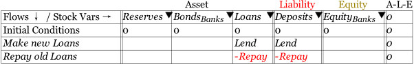
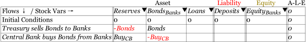
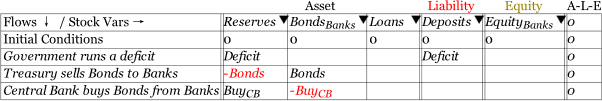
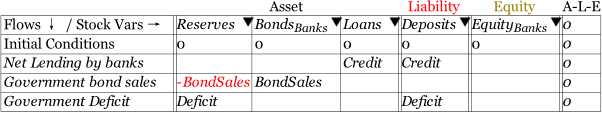
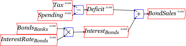
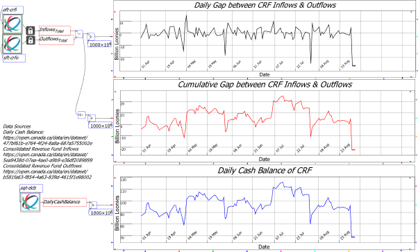
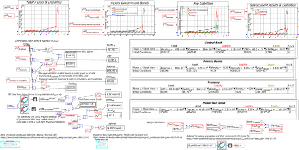
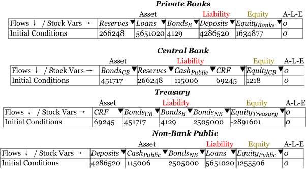
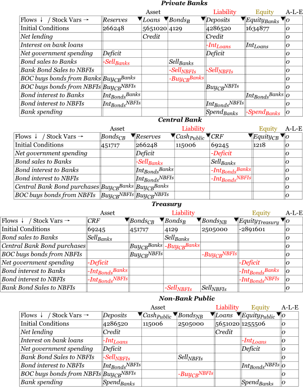
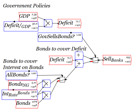
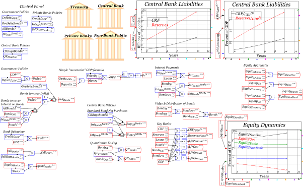
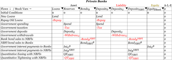
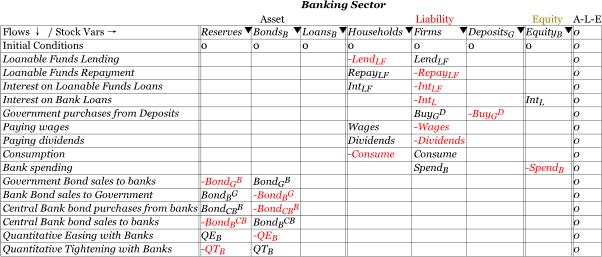
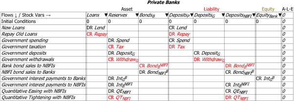
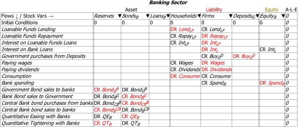
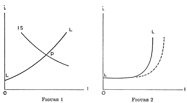
 The thought occurred to me that, rather than using a realistic consumption good (bread) with no imaginable investment good (stale bread???), why not imagine a world where an unrealistic consumption good exists (iron, eaten by the workers on the Planet of the Iron Giants), which can also be a realistic investment good (iron, made into blast furnaces, rolling mills, and mining equipment to mine both iron ore and coal)?

 widget on the toolbar;

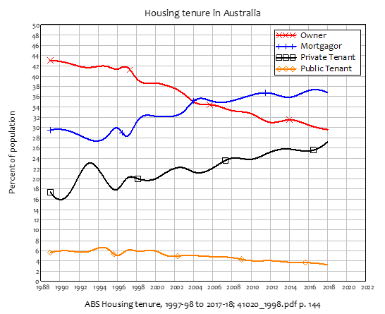
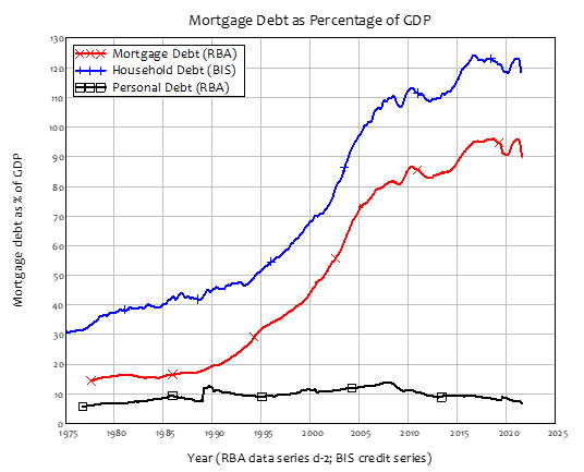

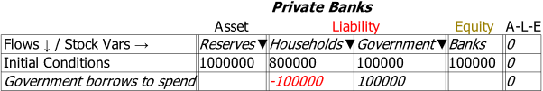 However, this model is wrong. Though, like most governments, the Australian Government has accounts at private banks,